Ethics in data science is a fundamental consideration throughout the lifecycle of any project. Data science ethics refers to the principles and practices that guide responsible and fair use of data to ensure that individual rights are respected, societal welfare is prioritized, and harmful outcomes are avoided. Ethical frameworks like the Belmont Report (Protection of Human Subjects of Biomedical & Research, 1979)} and regulations such as the Health Insurance Portability and Accountability Act (HIPAA) (Health & Services, 1996) have established foundational principles that inspire ethical considerations in research and data use. This section explores key principles of ethical data science and provides guidance on implementing these principles in practice.
5.1.2 Principles of Ethical Data Science
5.1.2.1 Respect for Privacy
Safeguarding privacy is critical in data science. Projects should comply with data protection regulations, such as the General Data Protection Regulation (GDPR) or the California Consumer Privacy Act (CCPA). Techniques like anonymization and pseudonymization must be applied to protect sensitive information. Beyond legal compliance, data scientists should consider the ethical implications of using personal data.
The principles established by the Belmont Report emphasize respect for persons, which aligns with safeguarding individual privacy. Protecting privacy also involves limiting data collection to what is strictly necessary. Minimizing the use of identifiable information and implementing secure data storage practices are essential steps. Transparency about how data is used further builds trust with stakeholders.
5.1.2.1.1 Example: Netflix Prize Data
Netflix released an ``anonymized’’’ movie-rating dataset for a public competition; researchers later showed individuals could be re-identified by linking a few ratings to public profiles or IMDB reviews.
Other examples: + Mobility/location traces indentify individuals + Financial transanctions + Health/EHR data leaks via ZIP + birthdate + sex
TipTake-home message (click to expand)
“Removing names” isn’t enough. High-dimensional behavioral data can be re-identified, so share less, aggregate more, and assess re-identification risk before releasing data.
Need aggregration, differential privacy, etc.
5.1.2.2 Commitment to Fairness
Bias can arise at any stage of the data science pipeline, from data collection to algorithm development. Ethical practice requires actively identifying and addressing biases to prevent harm to underrepresented groups. Fairness should guide the design and deployment of models, ensuring equitable treatment across diverse populations.
To achieve fairness, data scientists must assess datasets for representativeness and use tools to detect potential biases. Regular evaluation of model outcomes against fairness metrics helps ensure that systems remain non-discriminatory. The Americans with Disabilities Act (ADA) (Congress, 1990) provides a legal framework emphasizing equitable access, which can inspire fairness in algorithmic design. Collaborating with domain experts and stakeholders can provide additional insights into fairness issues.
5.1.2.2.1 Example: Bias in Predictive modeling
We want to train a model for predicting suicide risk with EHR data. Is a model that can predict with 97% accuracy good?
TipTake-home message (click to expand)
Training data could be very unbalanced. In this problem, it is likely that the number of cases in the data is less than 3%. So a naive model that always predicts ``0’’ can easily reach 97% accuracy.
Model accuracy high overall but terrible for minorities
Better model evaluation and bias awareness/adjustment.
Other examples: + Face recognition errors by skin tone. + Lending/credit scoring bias. + Bias in generative models such as LLMs.
5.1.2.3 Emphasis on Transparency
Transparency builds trust and accountability in data science. Models should be interpretable, with clear documentation explaining their design, assumptions, and decision-making processes. Data scientists must communicate results in a way that stakeholders can understand, avoiding unnecessary complexity or obfuscation.
Transparent practices include providing stakeholders access to relevant information about model performance and limitations. The Federal Data Strategy (Team, 2019) calls for transparency in public sector data use, offering inspiration for practices in broader contexts. Visualizing decision pathways and using tools like LIME or SHAP can enhance interpretability. Establishing clear communication protocols ensures that non-technical audiences can engage with the findings effectively.
5.1.2.3.1 Example: deep learning vs. logistic regression
Which would you deploy in a hospital triage setting if they have similar performance?
5.1.2.4 Focus on Social Responsibility
Data science projects must align with ethical goals and anticipate their broader societal and environmental impacts. This includes considering how outputs may be used or misused and avoiding harm to vulnerable populations. Data scientists should aim to use their expertise to promote public welfare, addressing critical societal challenges such as health disparities, climate change, and education access.
Engaging with diverse perspectives helps align projects with societal values. Ethical codes, such as those from the Association for Computing Machinery (ACM) (Computing Machinery (ACM), 2018), offer guidance on using technology for social good. Collaborating with policymakers and community representatives ensures that data-driven initiatives address real needs and avoid unintended consequences. Regular impact assessments help measure whether projects meet their ethical objectives.
+ Police send patrols where past arrests are high
+ More patrols lead to more arrests
+ Model ``learns'' area has more crime
TipTake-home message (click to expand)
Data \(\neq\) ground truth
Feedback loops amplify inequality
Other examples: + Recommender systems used by social media platforms + Insurance pricing penalizing poor neighborhoods
5.1.2.5 Adherence to Professional Integrity
Professional integrity underpins all ethical practices in data science. Adhering to established ethical guidelines, such as those from the American Statistical Association (ASA) (American Statistical Association (ASA), 2018), ensures accountability. Practices like maintaining informed consent, avoiding data manipulation, and upholding rigor in analyses are essential for maintaining public trust in the field.
Ethical integrity also involves fostering a culture of honesty and openness within data science teams. Peer review and independent validation of findings can help identify potential errors or biases. Documenting methodologies and maintaining transparency in reporting further strengthen trust.
5.1.2.5.1 Examples
p-hacking
cherry picking
misleading graphs
no reproducibility
5.1.3 Ensuring Ethics in Practice
5.1.3.1 Building Ethical Awareness
Promoting ethical awareness begins with education and training. Institutions should integrate ethics into data science curricula, emphasizing real-world scenarios and decision-making. Organizations should conduct regular training to ensure their teams remain informed about emerging ethical challenges.
Workshops and case studies can help data scientists understand the complexities of ethical decision-making. Providing access to resources, such as ethical guidelines and tools, supports continuous learning. Leadership support is critical for embedding ethics into organizational culture.
5.1.3.2 Embedding Ethics in Workflows
Ethics must be embedded into every stage of the data science pipeline. Establishing frameworks for ethical review, such as ethics boards or peer-review processes, helps identify potential issues early. Tools for bias detection, explainability, and privacy protection should be standard components of workflows.
Standard operating procedures for ethical reviews can formalize the consideration of ethics in project planning. Developing templates for documenting ethical decisions ensures consistency and accountability. Collaboration across teams enhances the ability to address ethical challenges comprehensively.
5.1.3.3 Establishing Accountability Mechanisms
Clear accountability mechanisms are essential for ethical governance. This includes maintaining documentation for all decisions, establishing audit trails, and assigning responsibility for the outputs of data-driven systems. Organizations should encourage open dialogue about ethical concerns and support whistleblowers who raise issues.
Periodic audits of data science projects help ensure compliance with ethical standards. Organizations can benefit from external reviews to identify blind spots and improve their practices. Accountability fosters trust and aligns teams with ethical objectives.
5.1.3.4 Engaging Stakeholders
Ethical data science requires collaboration with diverse stakeholders. Including perspectives from affected communities, policymakers, and interdisciplinary experts ensures that projects address real needs and avoid unintended consequences. Stakeholder engagement fosters trust and aligns projects with societal values.
Public consultations and focus groups can provide valuable feedback on the potential impacts of data science projects. Engaging with regulators and advocacy groups helps align projects with legal and ethical expectations. Transparent communication with stakeholders builds long-term relationships.
5.1.3.5 Continuous Improvement
Ethics in data science is not static; it evolves with technology and societal expectations. Continuous improvement requires regular review of ethical practices, learning from past projects, and adapting to new challenges. Organizations should foster a culture of reflection and growth to remain aligned with ethical best practices.
Establishing mechanisms for feedback on ethical practices can identify areas for development. Sharing lessons learned through conferences and publications helps the broader community advance its understanding of ethics in data science.
5.1.4 Conclusion
Data science ethics is a dynamic and integral aspect of the discipline. By adhering to principles of privacy, fairness, transparency, social responsibility, and integrity, data scientists can ensure their work contributes positively to society. Implementing these principles through structured workflows, stakeholder engagement, and continuous improvement establishes a foundation for trustworthy and impactful data science.
5.2 Effective Data Science Communication
This section is by Abby White, a senior majoring in Statistical Data Science with a concentration in Advanced Statistics.
5.2.1 Introduction
Data science communication is about more than presenting results; it is about helping others understand and act on them. A clear visualization, a well-phrased sentence, or a reproducible workflow can determine whether your analysis makes an impact or gets lost in translation.
In this presentation, I will discuss:
1. Why communication matters in data science.
2. Key principles for clarity and transparency.
3. How visualization and storytelling improve understanding.
4. The role of reproducibility and ethics in reporting results.
5. How to connect insights to action.
5.2.2 Why Communication Matters
Even the best analysis doesn’t mean much if people cannot understand it. Clarity, honesty, and reproducibility are what make results useful.
5.2.2.1 Example: Framing a Finding Clearly
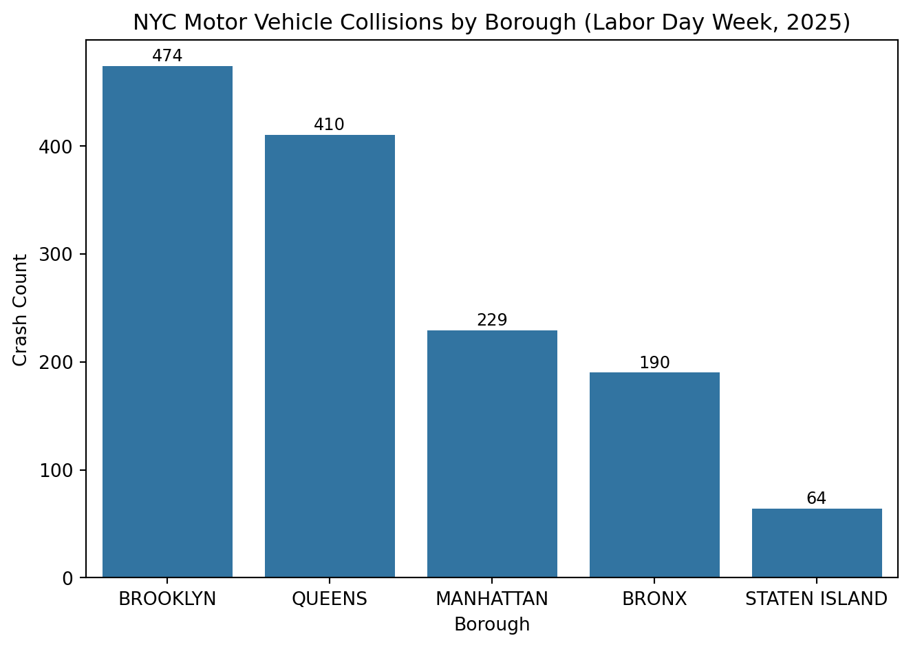
import pandas as pdimport seaborn as snsimport matplotlib.pyplot as plt# Load the cleaned NYC crash datacrash_df = pd.read_feather("../ids-s26/data/nyc_crashes_cleaned.feather")# Count crashes by boroughborough_counts = crash_df["borough"].value_counts().reset_index()borough_counts.columns = ["borough", "crash_count"]sns.barplot( data=borough_counts, x="borough", y="crash_count", order=borough_counts.sort_values("crash_count", ascending=False)["borough"],)plt.title("NYC Motor Vehicle Collisions by Borough (Labor Day Week, 2025)")plt.xlabel("Borough")plt.ylabel("Crash Count")# Add labels above barsfor i, val inenumerate(borough_counts["crash_count"]): plt.text(i, val + (0.01* borough_counts["crash_count"].max()),f"{val:,}", ha="center", fontsize=9)# Add 5% headroom above the tallest barplt.ylim(0, borough_counts["crash_count"].max() *1.05)plt.tight_layout()plt.show()
This bar chart shows total crashes by borough. Without labels, the pattern is visible but vague. Adding numbers and sorting by count makes the trend clear. Brooklyn and Queens lead due to population and road density.
Visuals that highlight why something happens, not just that it happens, communicate far more effectively.
Poor phrasing:
“Brooklyn has the highest number of crashes.”
Better phrasing:
“During Labor Day week 2025, Brooklyn recorded the most motor vehicle collisions, followed by Queens and Manhattan. This pattern likely reflects each borough’s larger population, higher traffic volume, and denser road networks.”
The first sentence is technically correct but empty of insight. The second version connects data to why it matters. It is specific, comparative, and interpretable.
Good communication translates data into meaning. When presenting findings, always lead with a clear takeaway before showing details.
5.2.3 Clarity and Context
Clarity comes from balancing accuracy with accessibility. The goal is to make complex analysis understandable without oversimplifying it.
Guidelines for clear communication:
- Lead with the main takeaway before showing details.
- Define all technical terms (e.g., “injury severity index”).
- Provide relative comparisons, not just counts.
- Add short interpretations under visuals.
5.2.3.1 Example: Turning Output into Insight
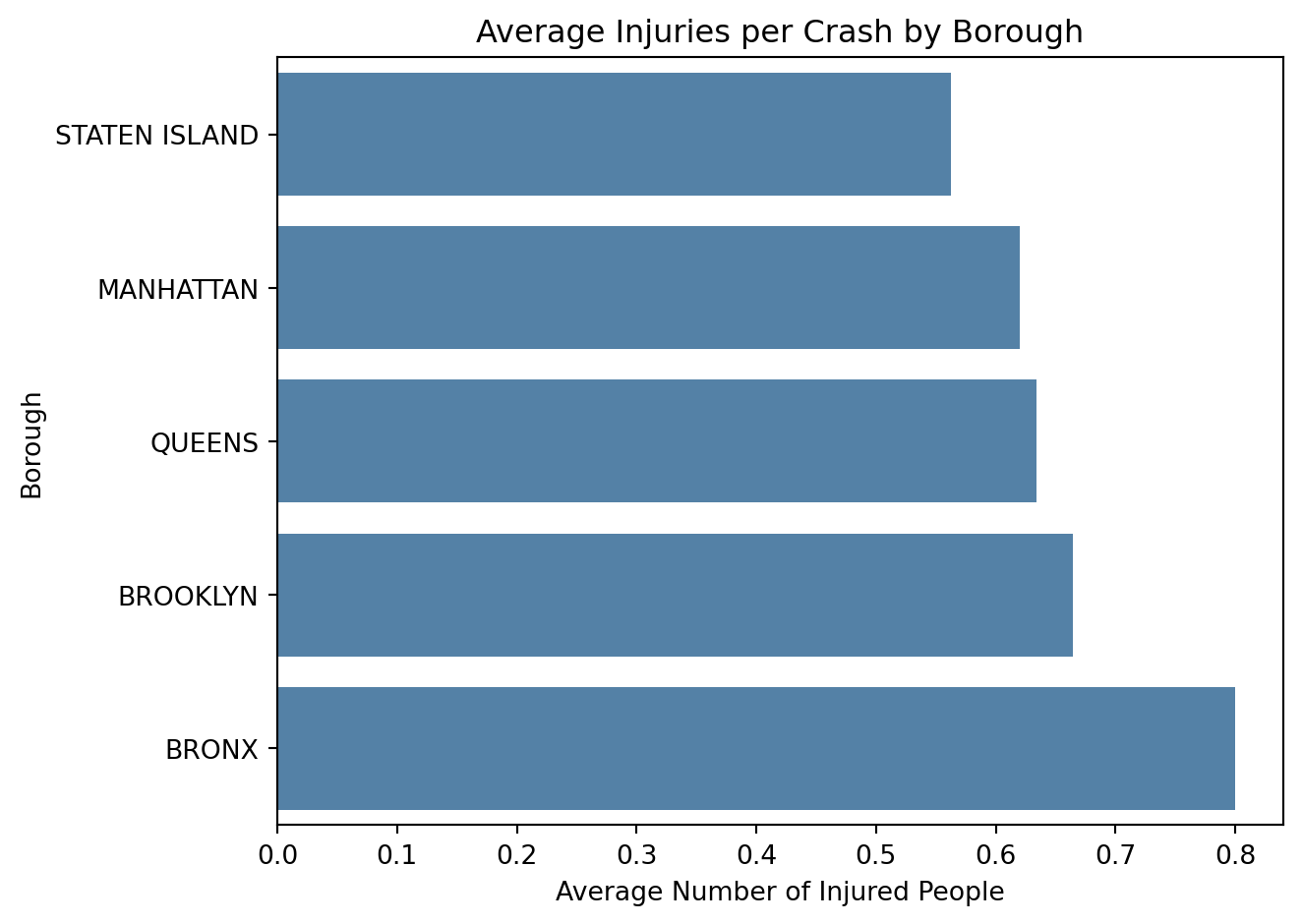
# Calculate the average number of people injured per crash by boroughinjury_summary = ( crash_df.groupby("borough")["number_of_persons_injured"] .mean() .sort_values())injury_summary
Technical phrasing:
“Mean injuries per crash differ by borough.”
Clear phrasing:
“On average, crashes in the Bronx result in the highest injury rates (about 0.8 people injured per crash), while Staten Island has the lowest (around 0.56). Differences are modest but suggest slightly greater crash severity in more densely populated areas.”
The first phrasing is correct but vague. It does not tell the audience how or by how much boroughs differ. The clearer version adds real numbers, ranks, and a hint of interpretation (density and traffic volume). Good phrasing gives context so the audience immediately grasps what the data shows.
To make this pattern easier to see visually:
sns.barplot( x=injury_summary.values, y=injury_summary.index, color="steelblue"# same color for all bars)plt.title("Average Injuries per Crash by Borough")plt.xlabel("Average Number of Injured People")plt.ylabel("Borough")plt.tight_layout()plt.show()
The bar chart shows that the Bronx leads with the highest average injuries per crash, while Staten Island has the lowest. Clear labeling, ordered categories, and a clean layout make the trend easy to interpret without visually exaggerating small differences.
5.2.4 Visual Storytelling
Visuals are often the clearest way to communicate a pattern. Strong visual design helps people notice relationships quickly and remember them longer.
A good graphic should make the takeaway obvious in a few seconds. Titles, captions, and color choices all guide the audience toward what matters most.
5.2.4.1 Example: Highlighting a Trend
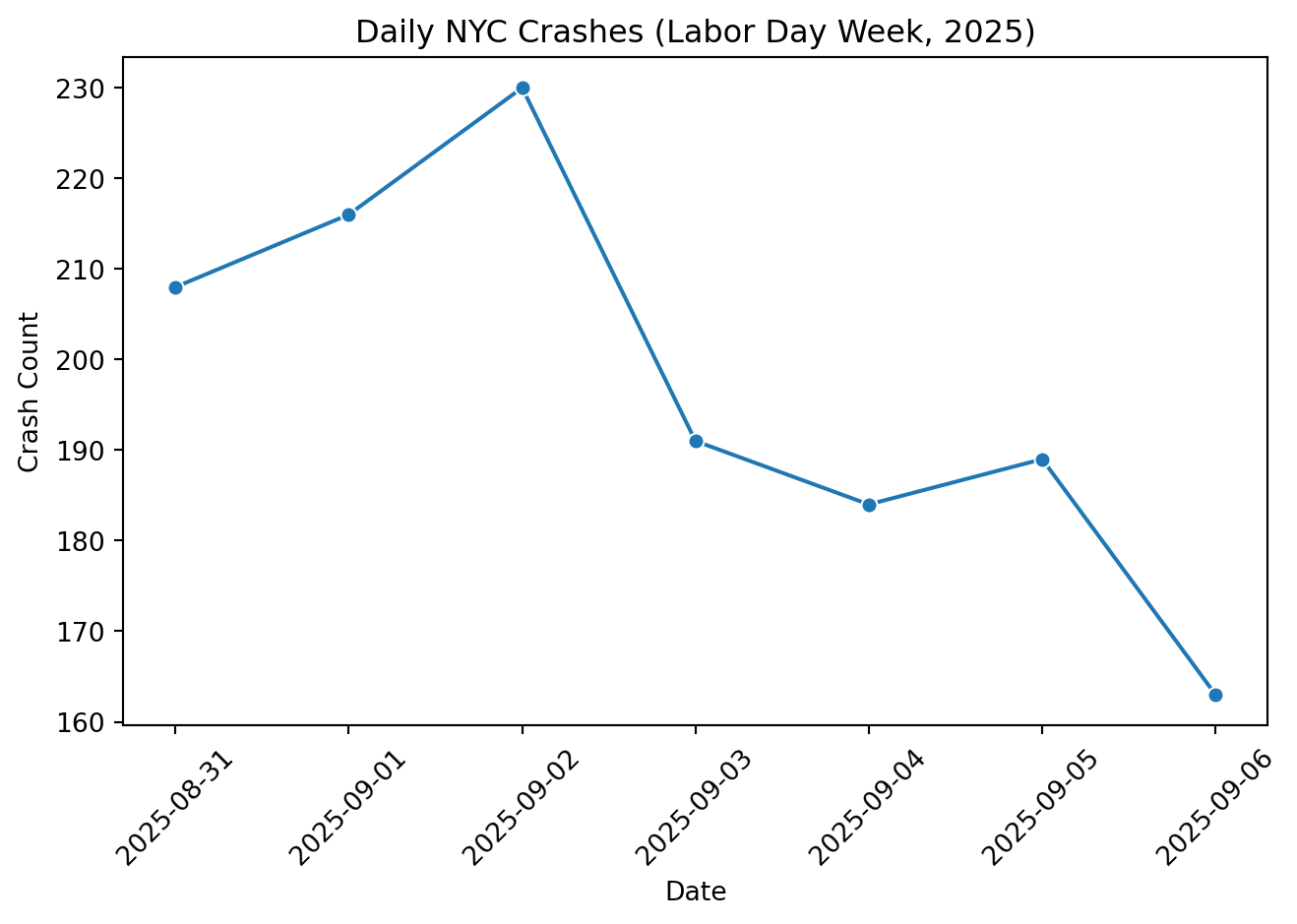
# Make sure datetime is parsedcrash_df["crash_datetime"] = pd.to_datetime( crash_df["crash_datetime"], errors="coerce")# Group by day daily = ( crash_df.groupby(crash_df["crash_datetime"].dt.date) .size() .reset_index(name="count") .rename(columns={"crash_datetime": "date"}))# Convert date column back to datetime64[ns] for plottingdaily["date"] = pd.to_datetime(daily["date"])sns.lineplot( data=daily.sort_values("date"), x="date", y="count", marker="o")plt.title("Daily NYC Crashes (Labor Day Week, 2025)")plt.xlabel("Date")plt.ylabel("Crash Count")plt.xticks(rotation=45)plt.tight_layout()plt.show()
This line chart shows how crash frequency changed across Labor Day week 2025. The dataset covers a short time window, so we see day-to-day variation rather than long-term trends. Clear labeling and a simple layout make the pattern easy to interpret without overstating the limited time frame.
A clear title, readable x-axis, and minimal clutter make the trend easy to interpret.
A short caption might read:
“Daily crash counts fluctuate slightly over the observed period, reflecting normal day-to-day variation in traffic volume.”
That single sentence turns a small snapshot of data into an understandable story without overstating what the time range can show. Once we understand how visuals convey meaning, the next step is choosing the chart type that best fits our data.
5.2.5 Choosing the Right Chart Type
Selecting the right chart is just as important as making it look clean. The wrong type can hide a pattern or even mislead the audience, while the right one highlights exactly what matters.
When deciding how to visualize data, start with the question you want to answer. Every chart should answer one specific question rather than trying to show everything at once. Different chart types serve different purposes:
Compare Categories:
- Chart: Bar or column chart
- Example: Average injuries per crash by borough shows differences clearly without exaggeration.
Show Change Over Time:
- Chart: Line chart
- Example: Daily or hourly crash counts reveal rush-hour spikes or weekend dips.
Display Proportions:
- Chart: Pie or stacked bar chart
- Example: Percent of crashes involving pedestrians vs. motorists shows relative risk.
Reveal Relationships:
- Chart: Scatter plot
- Example: Plotting vehicle speed vs. injury severity could show how risk increases with speed.
Show Distributions:
- Chart: Histogram or box plot
- Example: A histogram of crash times shows when collisions are most common across a day.
These choices matter because each chart highlights a specific relationship between variables. For instance, the line chart of hourly injuries works better than a bar chart because it emphasizes flow and continuity across time. Conversely, comparing borough averages suits a bar chart since categories are discrete.
When in doubt, simplicity and intent guide good design. Avoid flashy visuals or 3D effects that distract from the message. Instead, use consistent colors, clear labels, and honest axes to help the audience see what you want them to see.
5.2.6 Reproducibility and Transparency
Reproducibility builds trust in your analysis. Transparent workflows including data sources, software versions, and assumptions, allow others to verify and extend your work. In data science, reproducibility isn’t just about rerunning code; it’s about clear communication of process.
Good practices for transparency:
- Combine code and writing in a single Quarto or Jupyter file.
- Record where and when data was retrieved.
- Comment on all major data-cleaning steps.
- Use readable variable names and consistent file structure.
5.2.6.1 Example: Adding Reproducible Metadata
# Data source: NYC Open Data (accessed October 2025)# File: ids-f25/data/nyc_crashes_cleaned.feather# Environment: Python 3.11 | pandas 2.2 | seaborn 0.13print(crash_df.info())
Including the info() output and environment details helps document your data’s structure. Anyone revisiting your project can quickly see how the dataset was formatted and what columns were used. This kind of metadata makes collaboration and replication straightforward.
5.2.7 Ethical and Responsible Communication
Ethical communication means presenting your data truthfully and clearly. When data visuals or summaries are misleading, even unintentionally, they can distort public understanding. Effective communicators focus on honesty and clarity.
Common pitfalls:
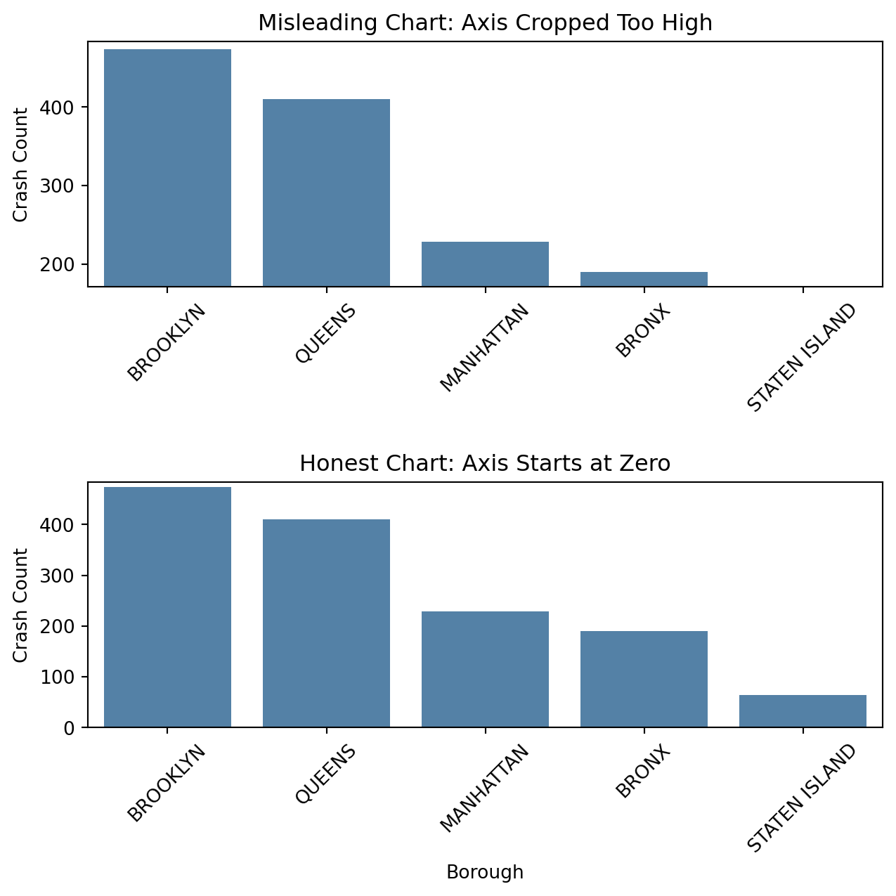
- Cropping or compressing axes to exaggerate trends.
- Omitting missing data or uncertainty.
- Implying causation when showing correlation.
Better habits:
- Start axes at zero when showing counts.
- Provide notes or error ranges when possible.
- Write captions that clarify context and limitations.
When the y-axis is cropped so it starts just below the smaller bars, Brooklyn’s crash count looks dramatically higher than the other boroughs. The honest version, which starts the y-axis at zero, shows that the differences are real but not as extreme. This demonstrates how axis limits can exaggerate scale, even when the underlying data is unchanged.
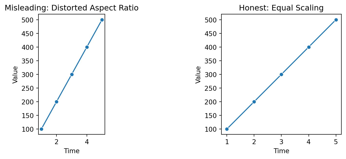
Changing the aspect ratio alters the apparent steepness of trends. The left plot exaggerates change by compressing the x-axis, while the right plot uses consistent scaling to display the real rate of change. Aspect distortion is subtle but powerful, it can make normal variation seem dramatic.
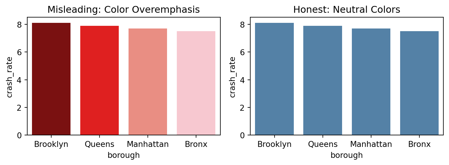
Color choices can easily mislead. The chart on the left uses intense red tones to suggest large differences between boroughs, even though the variation is small. The right chart uses a neutral palette to draw attention to data values instead of emotional cues.
Ethical visualization respects the audience’s ability to interpret data fairly. This connects to the broader issue of abusing a plot which involves using design choices to distort perception. Such misuse can involve altering aspect ratios, exaggerating colors, omitting context, or adjusting baselines to amplify change. True integrity in visualization means clarity over drama. We should show data as it is, not as we wish it looked.
5.2.8 Connecting Insights to Action
Great communication doesn’t stop at describing what happened, it explains what should happen next. Visuals paired with short, concrete takeaways make insights actionable.
5.2.8.1 Example: Turning Findings into Decisions
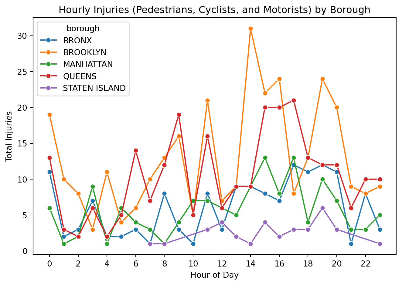
# Filter crashes with any injuries (pedestrians, cyclists, or motorists)injury_df = crash_df[ (crash_df["number_of_pedestrians_injured"] >0)| (crash_df["number_of_cyclist_injured"] >0)| (crash_df["number_of_motorist_injured"] >0)].copy()# Extract hour of dayinjury_df["hour"] = injury_df["crash_datetime"].dt.hour# Create a combined total injury columninjury_df["total_injuries"] = ( injury_df["number_of_pedestrians_injured"]+ injury_df["number_of_cyclist_injured"]+ injury_df["number_of_motorist_injured"])# Group by borough and hourinjuries_by_hour = ( injury_df.groupby(["borough", "hour"])["total_injuries"] .sum() .reset_index())# Plot total injuries by hour for each boroughsns.lineplot( data=injuries_by_hour, x="hour", y="total_injuries", hue="borough", marker="o")plt.title("Hourly Injuries (Pedestrians, Cyclists, and Motorists) by Borough")plt.xlabel("Hour of Day")plt.ylabel("Total Injuries")plt.xticks(range(0, 24, 2))plt.tight_layout()plt.show()
This plot shows how total traffic-related injuries (pedestrians, cyclists, and motorists combined) change by hour in each borough. Injuries stay relatively low overnight, then rise during the afternoon and peak in the late day and early evening; most noticeably in Brooklyn and Queens, with a smaller but similar bump in the Bronx and Manhattan. Staten Island stays consistently lower overall. These rush-hour spikes line up with high activity on the roads where there are more cars, more people moving, and more chances for conflict. That suggests a clear intervention window.
“Injuries across Brooklyn and Queens jump in the late afternoon and evening, which lines up with commuting traffic. Targeted enforcement, traffic calming, and signal timing changes during these peak hours could help reduce harm.”
Here, the analysis leads directly to a recommendation. That bridge from insight to action turns analysis into impact. Communicating findings this way helps decision-makers use data effectively.
5.2.9 Recommendations for Effective Communication and Presentation
Good data communication does not end with a well-designed chart. It extends to how findings are framed, timed, and delivered. Clear, focused communication helps turn technical results into insights that people can actually use.
5.2.9.1 General Recommendations
Lead with purpose by explaining why the data matters before discussing details.
Show the story, not the spreadsheet, visuals should clarify, not overwhelm.
Keep design elements consistent so colors, scales, and fonts feel cohesive.
Anticipate how non-technical audiences might interpret results and add context when needed.
Connect each chart or finding to its real-world relevance or next steps.
5.2.9.2 Being Time-Aware
Know your total time and plan the pacing of your talk accordingly.
Prioritize the most important findings, it’s better to explain a few points clearly than to rush through many.
Practice transitions between sections so the flow feels natural and on schedule.
Keep visuals simple so they can be understood quickly without overexplaining.
Leave a few minutes for questions or discussion at the end if possible.
If you run short on time, skip details that don’t change the main takeaway.
5.2.9.3 Giving a Strong Presentation
Start with a clear message so your audience knows what to expect.
Guide the audience through each visual: what to notice and why it matters.
Keep slides uncluttered, focusing on one key idea at a time.
Speak at a steady pace, pausing briefly after key visuals to let points sink in.
Avoid jargon and tailor explanations to your audience’s background.
End with a short summary that reinforces the main insight and next step.
Delivering data effectively means combining clarity, timing, and empathy for your audience. When visuals, pacing, and delivery align, data becomes insight rather than just information.
5.2.10 Conclusion
Effective data science communication blends clarity, accuracy, reproducibility, and ethics. When practiced together, these elements transform complex analyses into stories people can understand and act on.
The NYC crash dataset shows how simple design, transparent documentation, and ethical framing make results meaningful far beyond the numbers.
Below are additional real-world examples to illustrate communication choices (wording, context, and visualization ethics). Each item includes a short description and source links.
American Statistical Association (ASA). (2018). Ethical guidelines for statistical practice.
Computing Machinery (ACM), A. for. (2018). Code of ethics and professional conduct.
Congress, U. S. (1990). Americans with disabilities act of 1990 (ADA).
Health, U. S. D. of, & Services, H. (1996). Health insurance portability and accountability act of 1996 (HIPAA).
Protection of Human Subjects of Biomedical, N. C. for the, & Research, B. (1979). The belmont report: Ethical principles and guidelines for the protection of human subjects of research.
Team, F. D. S. D. (2019). Federal data strategy 2020 action plan.