import numpy as np
import matplotlib.pyplot as plt

r = np.arange(0, 2, 0.01)
theta = 2 * np.pi * r
fig, ax = plt.subplots(subplot_kw={"projection": "polar"})
ax.plot(theta, r)
ax.set_rmax(2.0)
ax.grid(True)
plt.show()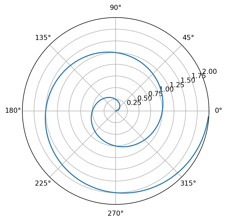
Quarto and Git setup: Quarto and Git are two important tools for data science: Quarto for communicating results (reports/websites/books) and Git/GitHub for version control and collaboration. This homework is about getting familiar with them through the following tasks.
Your goal: produce a short, beginner-friendly step-by-step manual for yourself (and future students) that documents what you did, what went wrong, and how you fixed it. Please use the templates/hw.qmd as your starting point. Use the command line interface.
Work in your GitHub Classroom repository (the private repo created for you when you accept the assignment link). Use the command line interface unless a step explicitly requires a browser (e.g., adding an SSH key).
Submission (What should be included in your repo)
hw.qmd (your completed manual)hw.html (rendered from hw.qmd)hw.pdfTasks
git --versiongit config --global user.name "Your Name"git config --global user.email "XXX@uconn.edu" (use the email tied to your GitHub account if different).online tutorials with more details.ls -al ~/.sshid_ed25519 and id_ed25519.pub, create a new key:
ssh-keygen -t ed25519 -C "your_email@example.com"~/.ssh/id_ed25519)eval "$(ssh-agent -s)"ssh-add ~/.ssh/id_ed25519cat ~/.ssh/id_ed25519.pubssh -T git@github.comgit clone git@github.com:<ORG>/<REPO>.gitcd <REPO>hw.qmd.git statusgit add hw.qmdgit commit -m "Start HW1"git pushquarto --versionquarto checkIn hw.qmd, record exactly what you installed (version + method), and any issues you hit (PATH problems are common) and how you fixed them.
hw.qmd using a Python code cell that produces a polar line plot with Matplotlib. For example:import numpy as np
import matplotlib.pyplot as plt
r = np.arange(0, 2, 0.01)
theta = 2 * np.pi * r
fig, ax = plt.subplots(subplot_kw={"projection": "polar"})
ax.plot(theta, r)
ax.set_rmax(2.0)
ax.grid(True)
plt.show()
Render the homework into a HTML. Print the HTML file to a pdf file and put the file into a release in your GitHub repo.
This part of the homework is to make sure that you know how to contribute to our classnotes by making pull request and to complete updating of your wishlist and presentation topic.
To contribute to the classnote repository, you need to have a working copy of the sources on your computer. Document the following steps in a qmd file in the form of a step-by-step manual, as if you are explaining them to someone who wants to contribute too. Make at least 5 commits for this task, each with an informative message.
The grading will be based on whether you can successfully make pull requests to update your wishlist and presentation topic on time.
Define a sequence \(\{a_n\}\) by
where \(c_1, c_2\) are integers. Note that Fibonacci sequence corresponds to \(c_1 = 1, c_2 = 1\).
Based on the Fibonacci example in the notes, implement four functions:
seq_rs(n, c1, c2) (naive recursion)seq_dm(n, c1, c2) (memoization)seq_dbu(n, c1, c2) (bottom-up with list)seq_dbu_m(n, c1, c2) (bottom-up constant memory)(optional) Add input checks and raise ValueError with a helpful message if:
n is not an integer or n < 1c1 or c2 is not an integerBenchmark all four methods for:
n = 10, 20, 40(c1, c2) = (1, 1) and (2, 1)n=10,(c1, c2) = (2, 1). The correct answer should be 1393.%timeit or timeit and present results in a small table.Briefly explain (2–5 sentences):
For the recurrence \(a_n = c_1 a_{n-1} + c_2 a_{n-2}\), define the matrix:
\[ M = \begin{pmatrix} c_1 & c_2 \\ 1 & 0 \end{pmatrix} \]
Then, one can show that:
\[ \begin{pmatrix} a_n \\ a_{n-1} \end{pmatrix} = M^{n-2} \begin{pmatrix} a_2 \\ a_1 \end{pmatrix} \quad \text{for } n \ge 2. \]
It turns out this gives a very efficient way for computing the sequence (in fact the most efficient way with complexity O(log n)).
seq_log(n, c1, c2) that computes \(a_n\). You may use the matrix functions provided below.
n=10,(c1, c2) = (2, 1). The correct answer should be 1393.seq_dbu_m vs seq_log for large n (choose values like 10**3, 10**4 or as large as your machine can handle).Render your homework into a HTML. Print the HTML file to a pdf file and put them together with source files (.qmd) into a release in your GitHub repo.
Example code: 2×2 matrices + operations
Here are some functions of matrices that could be useful to you. You may direct use these defined functions in implementing seq_log(n, c1, c2).
# A 2x2 matrix is represented as:
# [[a, b],
#  [c, d]]

def mat2_mul(A, B):
    """Multiply two 2x2 matrices A and B."""
    return [
        [
            A[0][0] * B[0][0] + A[0][1] * B[1][0],
            A[0][0] * B[0][1] + A[0][1] * B[1][1],
        ],
        [
            A[1][0] * B[0][0] + A[1][1] * B[1][0],
            A[1][0] * B[0][1] + A[1][1] * B[1][1],
        ],
    ]

def mat2_vec_mul(A, v):
    """Multiply 2x2 matrix A by 2-vector v = [x, y]."""
    return [
        A[0][0] * v[0] + A[0][1] * v[1],
        A[1][0] * v[0] + A[1][1] * v[1],
    ]

def mat2_pow(M, n):
    """
    Compute M^n for a 2x2 matrix M and integer n >= 0
    using exponentiation by squaring.
    """
    if not isinstance(n, int) or n < 0:
        raise ValueError("n must be an integer >= 0")

    # Identity matrix I
    result = [[1, 0],
              [0, 1]]
    base = M

    while n > 0:
        if n % 2 == 1:
            result = mat2_mul(result, base)
        base = mat2_mul(base, base)
        n //= 2

    return result


# Quick sanity checks
I = [[1, 0], [0, 1]]
A = [[2, 3], [4, 5]]

assert mat2_mul(I, A) == A
assert mat2_mul(A, I) == A
assert mat2_pow(A, 0) == I
assert mat2_pow(A, 1) == AYou are asked to model a binary outcome using a set of features. The data come from two groups: + Group A (large) + Group B (small)
You are asked to use the provided code to run the analysis and answer the questions at the end. The code simulates a dataset with a strong signal for group A and a relatively weaker signal + higher noise for group B, and then runs three different model strategies, namely, 1) a pooled model, 2) two separate models, and 3) a partial pooling model.
import numpy as np
import pandas as pd

from sklearn.model_selection import train_test_split
from sklearn.pipeline import make_pipeline
from sklearn.preprocessing import StandardScaler
from sklearn.linear_model import LogisticRegression
from sklearn.metrics import accuracy_score, roc_auc_score, confusion_matrix

# -----------------------------
# 0) Create a dataset
# -----------------------------
rng = np.random.default_rng(3255)

nA = 2500   # large group
nB = 120    # small group
p_noise = 40

def sim_group(n, group):
    x1 = rng.normal(0, 1, n)
    x2 = rng.normal(0, 1, n)
    noise = {f"z{i}": rng.normal(0, 1, n) for i in range(p_noise)}

    # Group-specific relationship between features and outcome
    # A: strong signal, easier to learn
    # B: weaker signal + higher noise, hard to learn with small n
    if group == "A":
        b0, b1, b2, sig = -0.2,  2.2, -1.4, 1.0
    else:
        b0, b1, b2, sig = -0.2, -0.8,  0.6, 1.0

    lin = b0 + b1*x1 + b2*x2 + rng.normal(0, sig, n)
    p = 1 / (1 + np.exp(-lin))
    y = rng.binomial(1, p)

    d = {"group": group, "x1": x1, "x2": x2, "y": y}
    d.update(noise)
    return pd.DataFrame(d)

df = pd.concat([sim_group(nA, "A"), sim_group(nB, "B")], ignore_index=True)

print("Counts:\n", df["group"].value_counts())
print("Base rate y=1 overall:", round(df["y"].mean(), 3))
print("Base rate by group:\n", df.groupby("group")["y"].mean().round(3))
Counts:
group
A 2500
B 120
Name: count, dtype: int64
Base rate y=1 overall: 0.472
Base rate by group:
group
A 0.472
B 0.458
Name: y, dtype: float64# Split within each group so both groups appear in train/test
train_parts, test_parts = [], []
for g, sub in df.groupby("group"):
tr, te = train_test_split(sub, test_size=0.30, random_state=1, stratify=sub["y"])
train_parts.append(tr)
test_parts.append(te)
train = pd.concat(train_parts).sample(frac=1, random_state=1)
test = pd.concat(test_parts).sample(frac=1, random_state=1)
features = ["x1", "x2"] + [f"z{i}" for i in range(p_noise)]
Xtr = train[features]
ytr = train["y"]
Xte = test[features]
yte = test["y"]
gte = test["group"]
# -----------------------------
# Helper: evaluate by group
# -----------------------------
def eval_by_group(model, X_test, y_test, g_test):
proba = model.predict_proba(X_test)[:, 1]
pred = (proba >= 0.5).astype(int)
rows = []
for g in sorted(g_test.unique()):
idx = (g_test == g)
yt = y_test[idx]
pb = proba[idx]
pr = pred[idx]
acc = accuracy_score(yt, pr)
auc = roc_auc_score(yt, pb) if yt.nunique() == 2 else np.nan
tn, fp, fn, tp = confusion_matrix(yt, pr, labels=[0, 1]).ravel()
fpr = fp / (fp + tn) if (fp + tn) else np.nan
fnr = fn / (fn + tp) if (fn + tp) else np.nan
rows.append({"group": g, "n_test": idx.sum(), "acc": acc, "auc": auc, "FPR": fpr, "FNR": fnr})
return pd.DataFrame(rows)# -----------------------------
# 1) POOLED model
# -----------------------------
pooled = make_pipeline(StandardScaler(), LogisticRegression(max_iter=5000))
pooled.fit(Xtr, ytr)
print("\n=== 1) Pooled (ignores group) ===")
print(eval_by_group(pooled, Xte, yte, gte).round(3))
=== 1) Pooled (ignores group) ===
  group  n_test    acc    auc    FPR    FNR
0     A     750  0.768  0.856  0.197  0.271
1     B      36  0.361  0.310  0.474  0.824
# -----------------------------
# 2) SEPARATE models
# -----------------------------
print("\n=== 2) Separate models (A model, B model) ===")
rows = []
for g in ["A", "B"]:
tr_g = train[train["group"] == g]
te_g = test[test["group"] == g]
m = make_pipeline(StandardScaler(), LogisticRegression(max_iter=5000))
m.fit(tr_g[features], tr_g["y"])
res = eval_by_group(m, te_g[features], te_g["y"], te_g["group"])
rows.append(res)
sep_results = pd.concat(rows, ignore_index=True)
print(sep_results.round(3))
=== 2) Separate models (A model, B model) ===
  group  n_test    acc    auc    FPR    FNR
0     A     750  0.779  0.860  0.184  0.263
1     B      36  0.556  0.563  0.421  0.471
# -----------------------------
# 3) "Partial pooling"
# -----------------------------
def add_interactions(dfX_with_group):
X = dfX_with_group.copy()
gB = (X["group"] == "B").astype(int)
X = X.drop(columns=["group"])
X["gB"] = gB
X["x1_gB"] = dfX_with_group["x1"] * gB
X["x2_gB"] = dfX_with_group["x2"] * gB
return X
Xtr_int = add_interactions(train[["group"] + features])
Xte_int = add_interactions(test[["group"] + features])
partial = make_pipeline(StandardScaler(), LogisticRegression(max_iter=5000))
partial.fit(Xtr_int, ytr)
print("\n=== 3) One model with group interaction (regularized) ===")
print(eval_by_group(partial, Xte_int, yte, gte).round(3))
=== 3) One model with group interaction (regularized) ===
  group  n_test    acc    auc    FPR    FNR
0     A     750  0.773  0.861  0.189  0.268
1     B      36  0.639  0.666  0.316  0.412
Explain the data generating process and how the two groups differ in terms of signal and noise. Why is it harder to learn for group B?
Explain the evaluation metrics (accuracy, AUC, FPR, FNR) and what they mean in this binary classification context.
Explain how the pooled model works and how it performs for each group. Why does it perform worse for B?
Explain how separate models work and how they perform for each group. Why does the B model perform better?
Explain how the interaction model works and how it performs for each group. Why does it lead to the best performance for B?
What’s the ethical/real-world lesson here about how to handle small groups in modeling?
This homework asks you to carefully study the case studies from our notes.
Submission
hw4.qmdhw4.htmlhw4.pdfAnswer the following questions based on 01-case-study/01-case-study.qmd and 04-case-study/04-case-study-multiple-testing.qmd.
This part focuses on two ideas from the case study:
You may use the starter code below and extend it as needed.
import numpy as np
import pandas as pd
import matplotlib.pyplot as plt

from scipy.stats import poisson
from statsmodels.stats.multitest import multipletests

def simulate_districts(
  n_districts=120,
  base_rate=15 / 10000,
  pop_low=800,
  pop_high=20000,
  elevated_idx=None,
  elevated_rate=30 / 10000,
  seed=3255,
):
  """
  Generate district-level counts from a Poisson model.

  Parameters
  ----------
  elevated_idx : list-like of integer row positions or None
    Districts with truly elevated rates (used in Q4).
  """
  rng = np.random.default_rng(seed)
  pop = rng.integers(pop_low, pop_high, size=n_districts)

  true_rate = np.full(n_districts, base_rate, dtype=float)
  if elevated_idx is not None and len(elevated_idx) > 0:
    true_rate[np.array(elevated_idx, dtype=int)] = elevated_rate

  lam = pop * true_rate
  count = rng.poisson(lam)

  out = pd.DataFrame(
    {
      "district": [f"D{i:03d}" for i in range(n_districts)],
      "population": pop,
      "count": count,
      "true_rate": true_rate,
      "expected_count": lam,
    }
  )
  out["rate"] = out["count"] / out["population"]
  out["rate_per_10k"] = out["rate"] * 10000
  out["is_elevated"] = out["true_rate"] > base_rate
  return out


def poisson_two_sided_pvalue(count, pop, rate0):
  """Two-sided exact p-value against H0: count ~ Poisson(pop * rate0)."""
  mu = pop * rate0
  p_lo = poisson.cdf(count, mu)
  p_hi = poisson.sf(count - 1, mu)
  return min(1.0, 2 * min(p_lo, p_hi))


def add_poisson_tests(df, rate0=15 / 10000, alpha=0.05):
  """Add raw and adjusted p-values (BH/FDR and Bonferroni) to a copy of df."""
  out = df.copy()

  # Extract one p-value per district.
  out["p_raw"] = [
    poisson_two_sided_pvalue(c, p, rate0)
    for c, p in zip(out["count"], out["population"])
  ]

  # Multiple-testing adjustments.
  out["p_bh"] = multipletests(out["p_raw"], method="fdr_bh")[1]
  out["p_bonf"] = multipletests(out["p_raw"], method="bonferroni")[1]

  # Decision columns at alpha.
  out["sig_raw"] = out["p_raw"] < alpha
  out["sig_bh"] = out["p_bh"] < alpha
  out["sig_bonf"] = out["p_bonf"] < alpha
  return out
Rare-event instability
Simulate one dataset under a common true rate of 15 per 10,000 for all districts.
rate_per_10k versus population.Then answer briefly: what pattern do you see, and why should this make us cautious about ranking districts only by raw observed rate?
df1 = simulate_districts(seed=3255)

# TODO: make a scatterplot of rate_per_10k vs population, identify top 10 districts, and report their population and count.
Repeat the simulation many times
Repeat the simulation in Question 1 at least 300 times.
For each simulated dataset, record:
Summarize your results in a small table and one plot. Then explain what this says about instability in rare-event settings.
records = []

for s in range(300):
  d = simulate_districts(seed=9000 + s)
  i = d["rate_per_10k"].idxmax()
  records.append(
    {
      "sim": s,
      "max_rate_per_10k": d.loc[i, "rate_per_10k"],
      "top_population": d.loc[i, "population"],
      "top_pop_below_3000": d.loc[i, "population"] < 3000,
    }
  )

rep = pd.DataFrame(records)

# TODO: summarize results in a small table and one plot, and explain the instability pattern.
Screening districts against a statewide benchmark
For one simulated dataset, test each district against the true rate using a two-sided Poisson test.
p < 0.05.In this simulation, all districts truly have the same rate. Explain why raw p-values can still produce “discoveries.”
tested = add_poisson_tests(df1, rate0=15 / 10000, alpha=0.05)

# Extract district-level p-values.
pvalue_table = tested[
  ["district", "population", "count", "p_raw", "p_bh", "p_bonf"]
].sort_values("p_raw")
pvalue_table.head(10)

# TODO: count how many districts satisfy p < 0.05, and explain why raw p-values can produce "discoveries" even when all districts have the same true rate.| district | population | count | p_raw | p_bh | p_bonf | |
|---|---|---|---|---|---|---|
| 24 | D024 | 19043 | 17 | 0.027965 | 1.0 | 1.0 |
| 85 | D085 | 15057 | 34 | 0.029700 | 1.0 | 1.0 |
| 5 | D005 | 10268 | 25 | 0.029854 | 1.0 | 1.0 |
| 2 | D002 | 8950 | 22 | 0.038740 | 1.0 | 1.0 |
| 94 | D094 | 6728 | 4 | 0.055119 | 1.0 | 1.0 |
| 76 | D076 | 18095 | 38 | 0.056310 | 1.0 | 1.0 |
| 93 | D093 | 14978 | 32 | 0.067418 | 1.0 | 1.0 |
| 61 | D061 | 7969 | 19 | 0.072484 | 1.0 | 1.0 |
| 13 | D013 | 12227 | 11 | 0.094144 | 1.0 | 1.0 |
| 86 | D086 | 18920 | 38 | 0.096791 | 1.0 | 1.0 |
Answer the following questions based on 02-case-study/02_case_study_simpsons_paradox.qmd.
You may use the starter code below and extend it as needed.
import numpy as np
import pandas as pd
import matplotlib.pyplot as plt

simpson_df = pd.DataFrame(
    {
        "group": ["A", "A", "B", "B"],
        "difficulty": ["Easy", "Hard", "Easy", "Hard"],
        "success_rate": [0.90, 0.60, 0.85, 0.55],
        "n": [100, 900, 900, 100],
    }
)

simpson_df["successes"] = np.round(simpson_df["success_rate"] * simpson_df["n"]).astype(int)
simpson_df["failures"] = simpson_df["n"] - simpson_df["successes"]
simpson_df| group | difficulty | success_rate | n | successes | failures | |
|---|---|---|---|---|---|---|
| 0 | A | Easy | 0.90 | 100 | 90 | 10 |
| 1 | A | Hard | 0.60 | 900 | 540 | 360 |
| 2 | B | Easy | 0.85 | 900 | 765 | 135 |
| 3 | B | Hard | 0.55 | 100 | 55 | 45 |
Verify the paradox numerically
Using the starter table:
Present your results in one clean table.
# TODO: compute overall success rates, compute within-difficulty success rates, and show the paradox in a clean table.

# TODO: point out where A > B and where A < B.
Visualize the reversal
Create at least two plots:
Then write 3–5 sentences explaining what a careless analyst might conclude from the overall plot alone.
# TODO: create one plot for within-difficulty comparison and one plot for overall comparison, and explain the potential misinterpretation from the overall plot alone.