7 Exploratory Data Analysis
Exploratory Data Analysis (EDA) is the practice of using graphs and numerical summaries to become familiar with a dataset before formal modeling. The term was popularized by John Tukey in his influential book Exploratory Data Analysis (Tukey, 1977), and it remains a cornerstone of modern data science. The purpose of EDA is to reveal the main characteristics of the data, detect unusual cases, check the quality of measurements, and generate hypotheses that can guide later modeling. Unlike confirmatory analysis, which tests specific hypotheses with formal statistical procedures, EDA is open ended and iterative. Analysts move back and forth between plotting, summarizing, and transforming data, refining their understanding at each step.
Figure 7.1 shows the data science workflow in a compact layout, generated directly in R. Compared with embedding static images, this approach keeps your notes reproducible and editable. The flowchart emphasizes that exploratory data analysis sits between data transformation and modeling. It also highlights feedback loops: visualization can suggest new transformations, and communication can lead back to data collection.
We will use ggplot2::diamonds as a running example. It contains about fifty four thousand round‑cut diamonds with carat, cut, color, clarity, depth, table, price, and x/y/z dimensions. The dataset is big enough to be realistic while still rendering quickly in class.
Tip
Tip. Always write your EDA as runnable code. Reproducible EDA makes your figures defensible and your insights repeatable.
7.1 Questions to consider
When beginning an EDA it is useful to ask two broad questions that frame all of the work. These questions remind us that analysis is about patterns, not isolated numbers.
What type of variation occurs within variables?
Variation refers to the tendency of a variable to take different values from one observation to another. Even for simple variables like eye color or carat weight, no two individuals are exactly the same. Understanding the spread and shape of this variation is the first task of EDA.What type of covariation occurs between variables?
Covariation describes the way two or more variables move together in a related fashion. For instance, diamond carat and price tend to increase together. Examining such relationships gives insight into possible explanations and later modeling choices.
7.1.1 Useful terms
Clear vocabulary helps organize thinking during EDA.
Variable. A measurable characteristic such as carat, cut, or price. Variables may be quantitative or qualitative.
Value. The state of a variable when it is measured. Values can differ across observations; for example, two diamonds can have different carat weights.
Observation. A set of measurements recorded on the same unit at the same time. In
diamonds, each row is one diamond with values for all variables.Tabular data. A collection of values arranged with variables in columns and observations in rows. Data is called tidy when each value occupies its own cell, making manipulation and visualization straightforward.
Code
library(tidyverse)
glimpse(diamonds)
Rows: 53,940
Columns: 10
$ carat <dbl> 0.23, 0.21, 0.23, 0.29, 0.31, 0.24, 0.24, 0.26, 0.22, 0.23, 0.…
$ cut <ord> Ideal, Premium, Good, Premium, Good, Very Good, Very Good, Ver…
$ color <ord> E, E, E, I, J, J, I, H, E, H, J, J, F, J, E, E, I, J, J, J, I,…
$ clarity <ord> SI2, SI1, VS1, VS2, SI2, VVS2, VVS1, SI1, VS2, VS1, SI1, VS1, …
$ depth <dbl> 61.5, 59.8, 56.9, 62.4, 63.3, 62.8, 62.3, 61.9, 65.1, 59.4, 64…
$ table <dbl> 55, 61, 65, 58, 58, 57, 57, 55, 61, 61, 55, 56, 61, 54, 62, 58…
$ price <int> 326, 326, 327, 334, 335, 336, 336, 337, 337, 338, 339, 340, 34…
$ x <dbl> 3.95, 3.89, 4.05, 4.20, 4.34, 3.94, 3.95, 4.07, 3.87, 4.00, 4.…
$ y <dbl> 3.98, 3.84, 4.07, 4.23, 4.35, 3.96, 3.98, 4.11, 3.78, 4.05, 4.…
$ z <dbl> 2.43, 2.31, 2.31, 2.63, 2.75, 2.48, 2.47, 2.53, 2.49, 2.39, 2.…7.1.2 Variation
Every variable has its own pattern of variation, and these patterns often reveal important information. The best way to learn about the variation of a variable is to visualize its distribution.
- For categorical variables, variation shows up in the relative frequencies of categories.
- For quantitative variables, variation appears in the spread and shape of the distribution.
Code
# variation in cut (categorical)
diamonds |>
  count(cut) |>
  mutate(prop = n / sum(n))
Code
# variation in carat (numeric)
ggplot(diamonds, aes(carat)) +
  geom_histogram(binwidth = 0.1, boundary = 0, closed = "left") +
  labs(title = "Variation in carat", x = "Carat", y = "Count")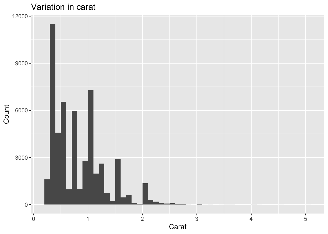
7.1.3 Visualizing distributions
How to visualize a distribution depends on the type of variable.
Categorical variables take one of a small set of levels and are usually stored as factors or character vectors in R. Bar charts are a natural choice for displaying their distributions.
Code
    ggplot(diamonds, aes(cut)) +
      geom_bar() +
      labs(title = "Distribution of cut", x = NULL, y = "Count")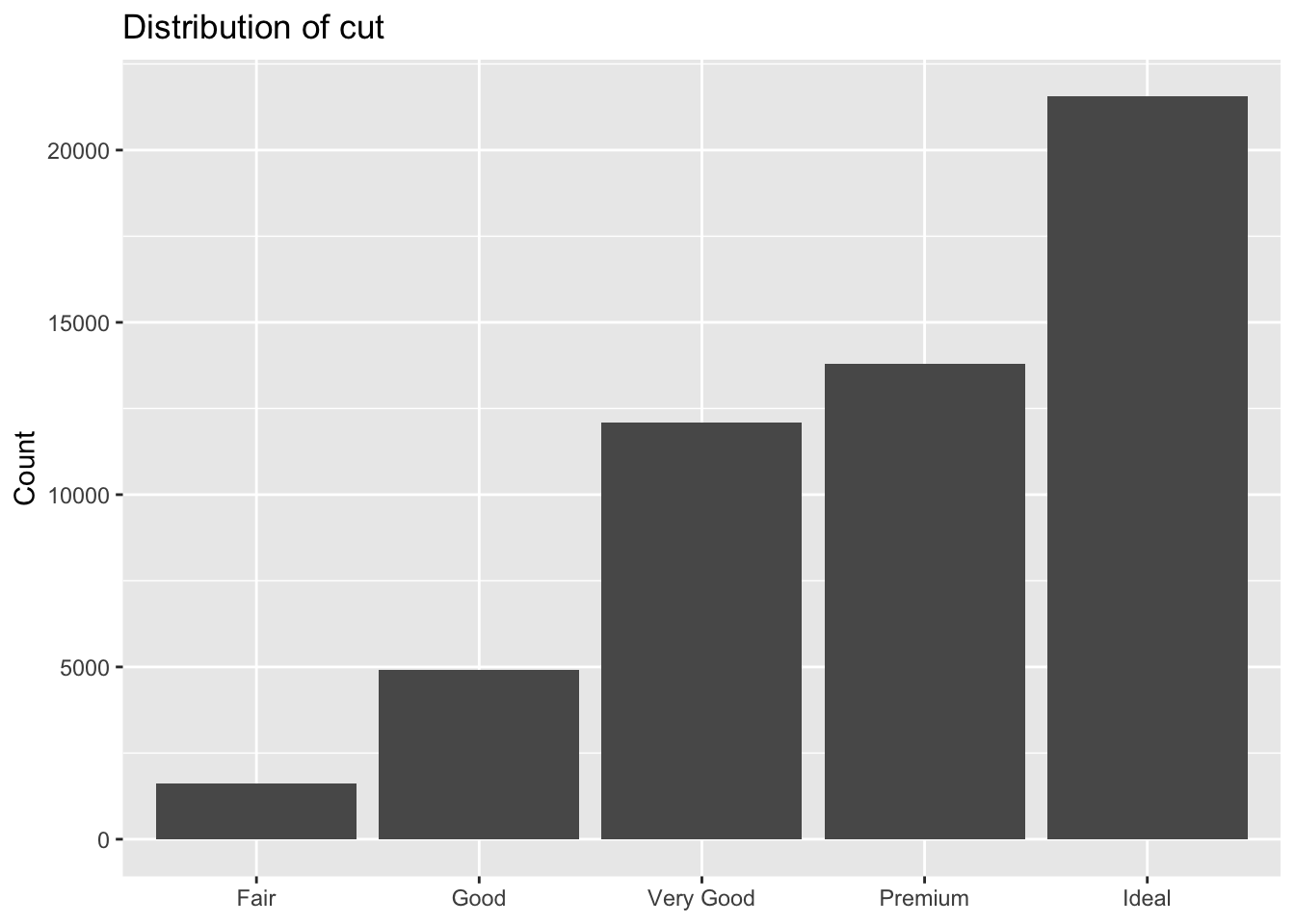
Quantitative variables take on a wide range of values. Their distributions can be displayed in several ways:
- Histograms divide the range of the variable into bins and count how many observations fall into each bin. They are useful for seeing the overall shape of a distribution.
Code
    ggplot(diamonds, aes(price)) +
      geom_histogram(binwidth = 500, boundary = 0, closed = "left") +
      labs(title = "Distribution of price (histogram)",
           x = "Price (USD)", y = "Count")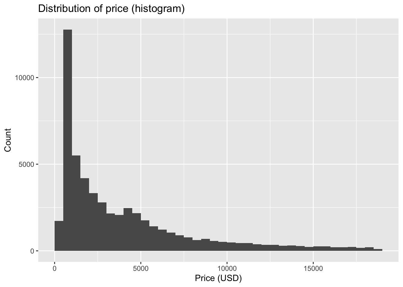
- Boxplots summarize the distribution using the median and quartiles.
- The box spans the interquartile range (IQR), from the first quartile (Q1, 25th percentile) to the third quartile (Q3, 75th percentile).
- The whiskers usually extend from the box out to the most extreme data points that are not considered outliers. A common rule is that the whiskers reach to the smallest and largest data points within 1.5 × IQR of Q1 and Q3.
- The dots are outliers, data points beyond the whiskers (i.e., more than 1.5 × IQR away from Q1 or Q3).
Code
    ggplot(diamonds, aes(x = cut, y = price)) +
      geom_boxplot() +
      labs(title = "Price by cut (boxplot)", x = "Cut", y = "Price (USD)")
- Violin plots combine a boxplot with a rotated density curve, showing both summary statistics and the shape of the distribution.
Code
    ggplot(diamonds, aes(x = cut, y = price)) +
      geom_violin(trim = FALSE) +
      labs(title = "Price by cut (violin plot)", x = "Cut", y = "Price (USD)")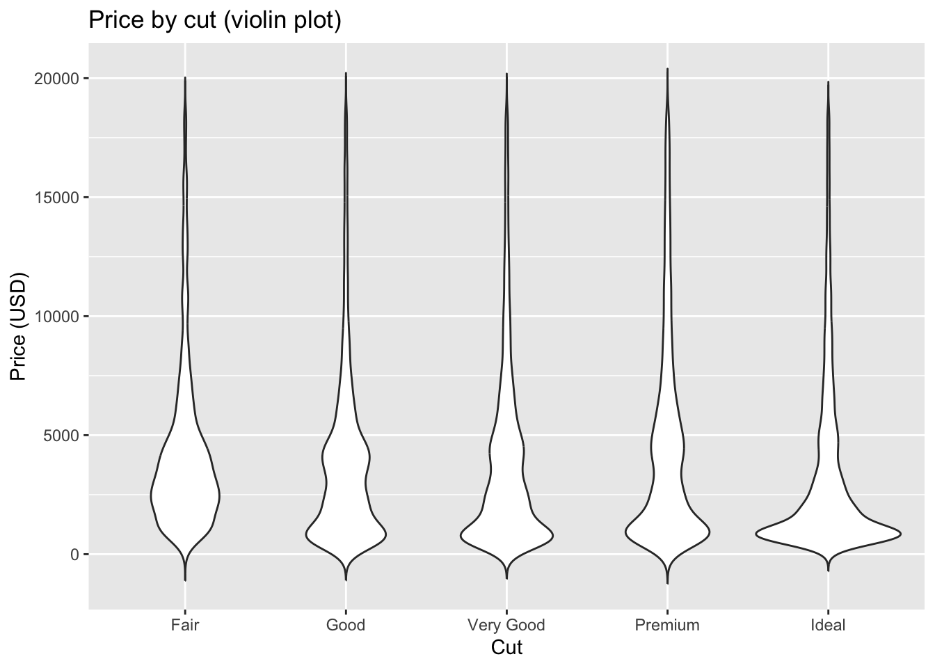
These three methods are closely related. A histogram provides a binned view of the data, while a density curve offers a smoothed version of the histogram. A violin plot takes that density curve, mirrors it to make the violin shape, and overlays summary statistics similar to a boxplot. Together they form a family of tools that balance detail, smoothing, and summary depending on the purpose of the visualization.
7.1.4 Outliers
Outliers are observations that fall far outside the general pattern of a distribution. They may represent data entry errors, unusual cases, or rare but valid observations. Outliers are important to detect because they can strongly influence summary statistics and models.
The diamonds dataset has some striking examples.
- Histogram of
y(length)
Code
ggplot(diamonds) +
geom_histogram(mapping = aes(x = y), binwidth = 0.5) +
labs(title = "Distribution of diamond length (y)",
x = "Length (mm)", y = "Count")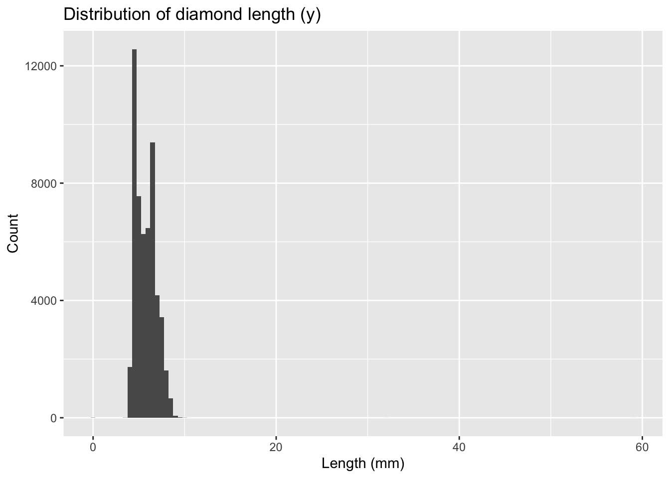
Most diamonds have lengths between 3 and 10 mm. However, there are odd spikes at 0, 30, 50, and 60 mm, which are not physically plausible. These are likely data recording errors.
Code
unusual <- diamonds %>%
  filter(y < 3 | y > 20) %>%
  select(price, x, y, z) %>%
  arrange(y)

unusual- The y variable measures one of the three dimensions of these diamonds in mm. Diamonds can’t have a width of 0mm.
- Measurements of 32mm and 59mm are implausible. Those diamonds are over an inch long, but don’t cost hundreds of thousands of dollars
Confirmed invalid values could be replaced with NA, using the ifelse() function.
Code
diamonds2 <- diamonds %>%
  mutate(y = ifelse(y < 3 | y > 20, NA, y))

diamonds2 |> filter(is.na(y))- Histogram of
x(width)
Code
ggplot(diamonds) +
geom_histogram(mapping = aes(x = x), binwidth = 0.5) +
labs(title = "Distribution of diamond width (x)",
x = "Width (mm)", y = "Count")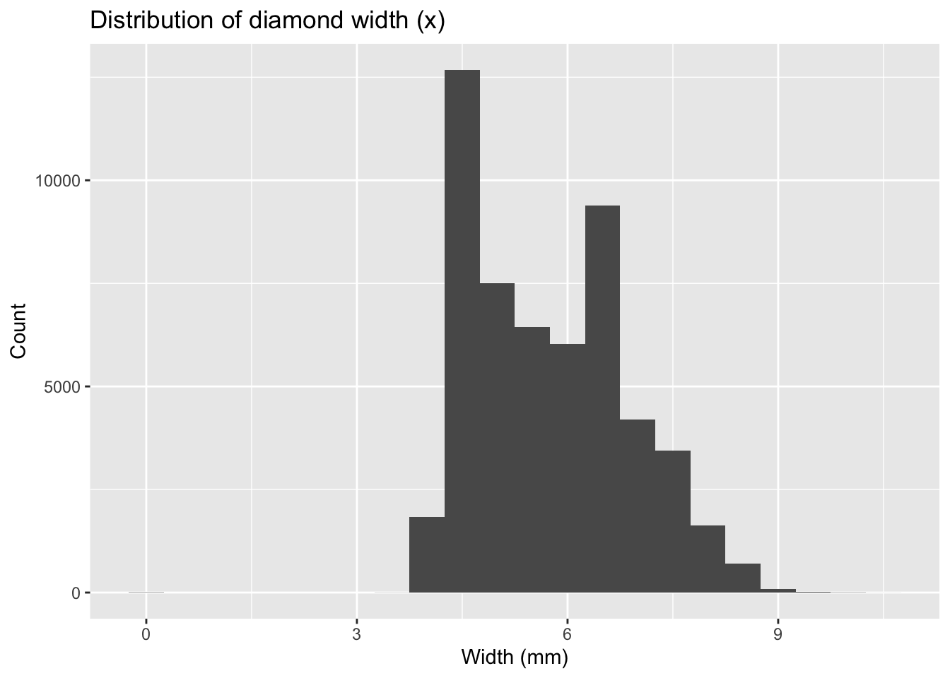
Again, most values are in a reasonable range, but there are suspicious zeros and unusually large values.
- Boxplot of
pricebycut
Code
ggplot(diamonds, aes(x = cut, y = price)) +
geom_boxplot() +
labs(title = "Price by cut (boxplot)", x = "Cut", y = "Price (USD)")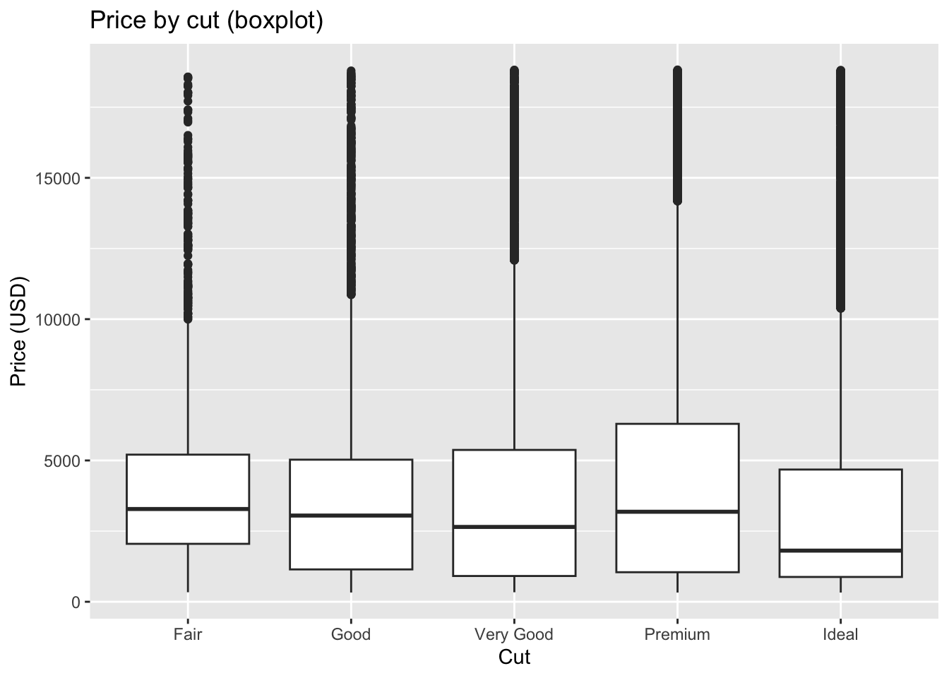
The boxplot reveals outliers as individual points beyond the whiskers. These highlight diamonds with unusually high or low prices relative to others of the same cut.
- Scatterplot of
caratvs.price
Code
ggplot(diamonds, aes(x = carat, y = price)) +
geom_point(alpha = 0.3) +
labs(title = "Price vs. Carat", x = "Carat", y = "Price (USD)")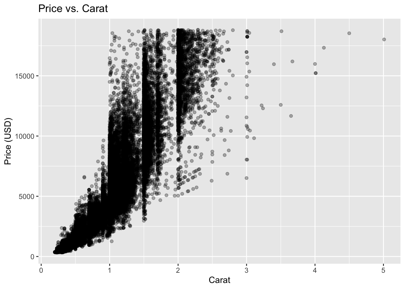
Most diamonds follow a clear increasing trend. Outliers appear as points far above or below the main cloud — either unusually expensive small diamonds or unusually cheap large ones.
- Boxplot of
z(depth) bycut
Code
ggplot(diamonds, aes(x = cut, y = z)) +
geom_boxplot() +
labs(title = "Depth (z) by cut", x = "Cut", y = "Depth (mm)")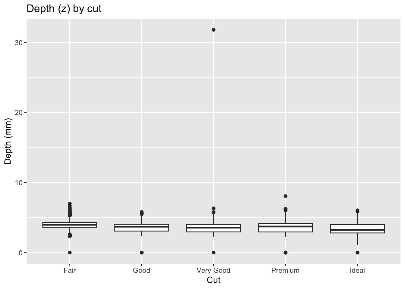
Here too, implausible depths like 0 or 30+ mm appear as obvious outliers.
These examples illustrate different ways to detect outliers: - Histograms reveal spikes or extreme bars. - Boxplots show individual points beyond whiskers. - Scatterplots highlight deviations from a trend.
Together, they demonstrate that careful visualization is essential for spotting unusual data values before moving on to modeling.
Note
Note. Not every outlier should be removed. Some may hold the key to a new insight, while others may be errors worth correcting. Document any decisions you make.
7.2 Conditional statements
Sometimes, creating new variable relies on a complex combination of existing variables. Utilize the ifelse() or case_when() command.
Code
diamonds %>%
  mutate(size_category = case_when(
    carat < 0.25 ~ "tiny",
    carat < 0.5  ~ "small",
    carat < 1    ~ "medium",
    carat < 1.5  ~ "large",
    TRUE         ~ "huge"
  )) %>%
  select(size_category, carat) %>%
  head()
Many insights arise from studying how a variable behaves given the level of another variable. These conditional relationships are the basis for understanding covariation.
- Numeric given categorical. Compare distributions of a numeric variable across categories.
- Numeric given numeric. Study scatterplots, possibly with facets, to see how the relationship changes across groups.
Code
# price conditional on cut
ggplot(diamonds, aes(cut, price)) +
  geom_boxplot(outlier.alpha = 0.2) +
  labs(title = "Price distribution by cut", x = NULL, y = "Price (USD)")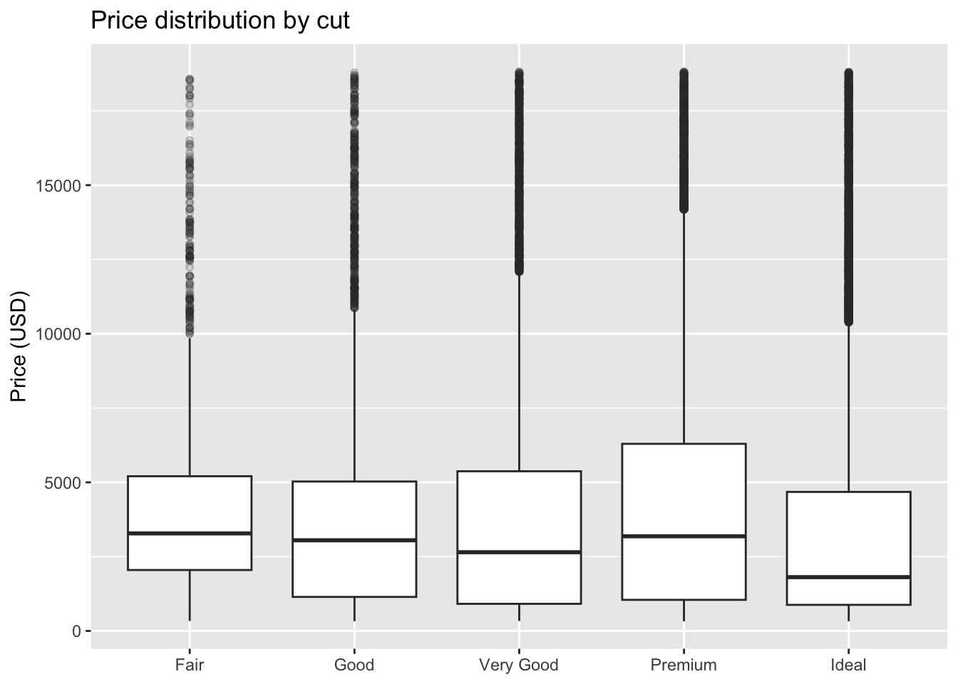
Code
# carat vs. price conditional on clarity
set.seed(1)
d_small <- diamonds[sample(nrow(diamonds), 8000), ]
ggplot(d_small, aes(carat, price)) +
  geom_point(alpha = 0.35) +
  facet_wrap(~ clarity) +
  labs(title = "Price vs. carat by clarity",
       x = "Carat", y = "Price (USD)")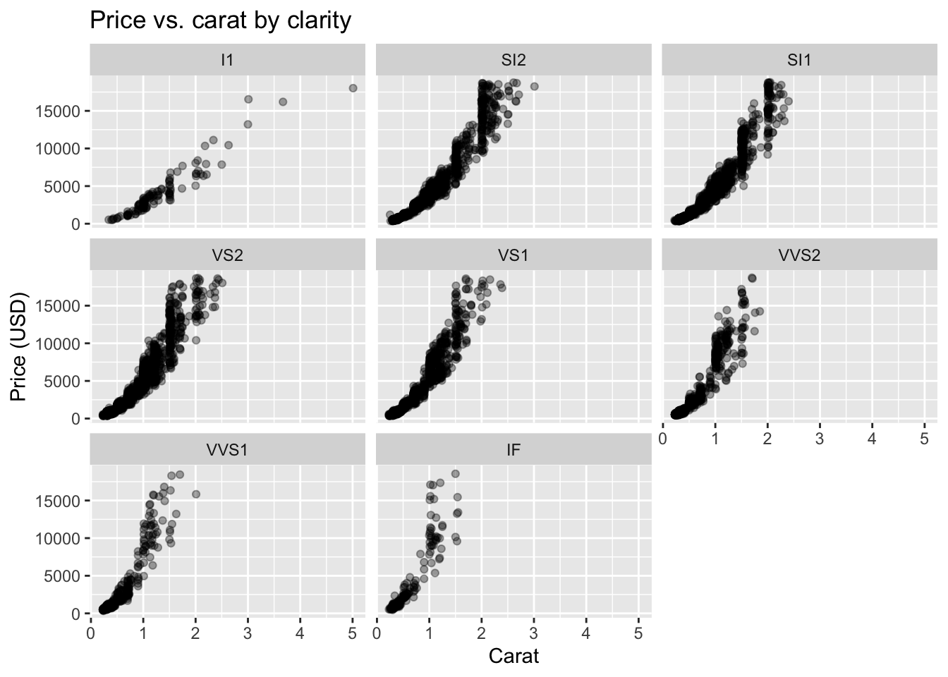
Tip
Tip. Faceting is usually clearer than mapping too many aesthetics at once. Use small multiples to keep comparisons interpretable.
7.3 Good Practices
- Prefer simple, readable graphics over clever ones.
- Keep code blocks short and name intermediate objects clearly.
- Mix visual and tabular summaries; each catches different issues.
- Record every data change. EDA often uncovers fixes that matter later.
- Revisit EDA after modeling; residuals are just another dataset.