Code
### simple scatter using built-in `mtcars`
plot(mtcars$wt, mtcars$mpg,
     main = "Fuel efficiency vs. weight",
     xlab = "Weight (1000 lbs)", ylab = "MPG",
     pch = 19, col = "steelblue")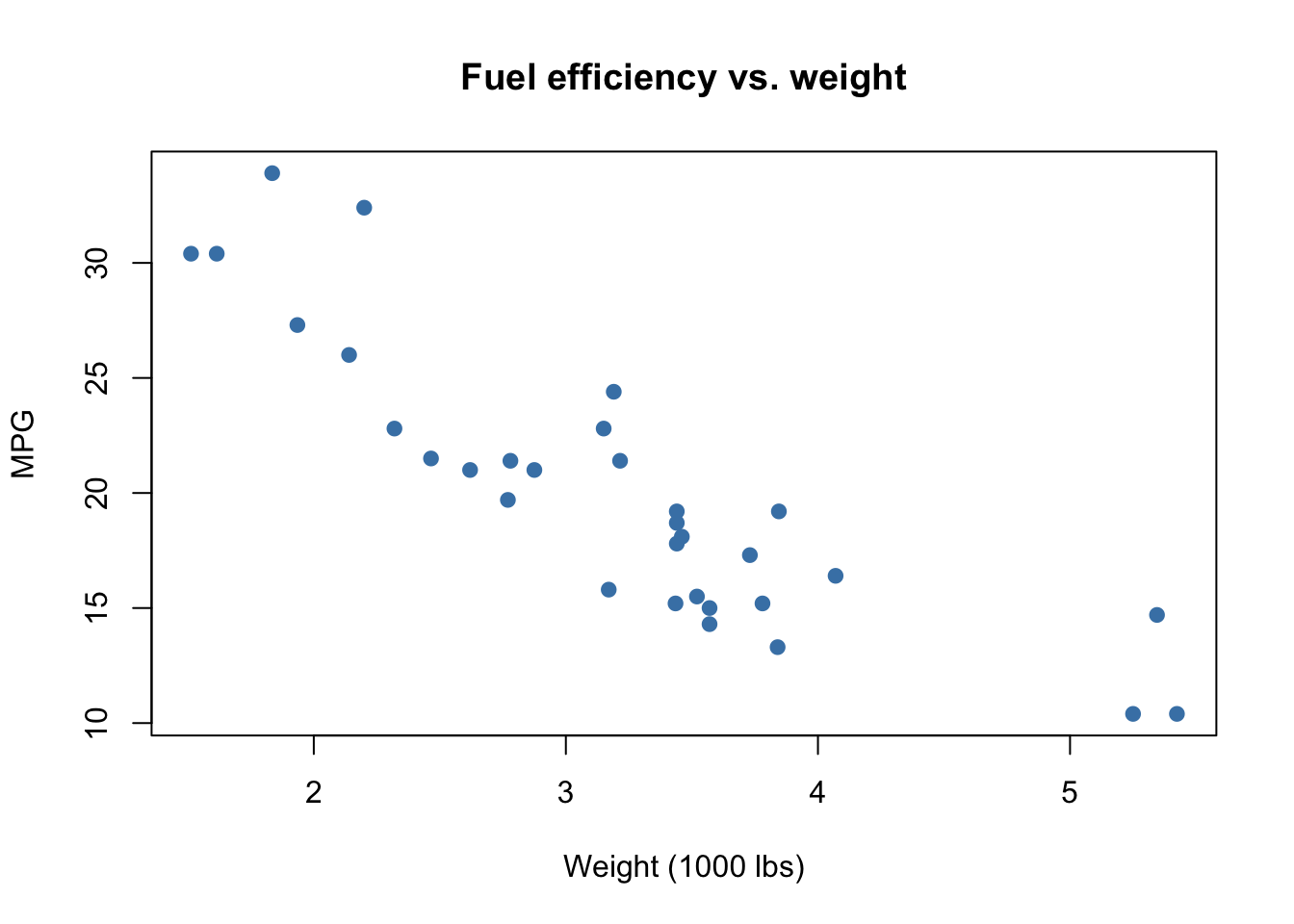
Data visualization is one of the most powerful tools in the data scientist’s toolbox. Visuals allow us to quickly summarize complex data, spot trends and outliers, and communicate results to both technical and non-technical audiences. A good visualization can illuminate patterns that might remain hidden in tables or numerical summaries, while a poor visualization can obscure the truth or even mislead. In this chapter, we explore both base R graphics and the ggplot2 package, emphasizing good practices and illustrating common pitfalls. We will also critique real world examples of misleading charts and learn how to improve them.
plot()R has a built-in graphics system that allows us to create plots quickly. The plot() function is versatile: depending on the type of data it is given, it can produce scatterplots, line plots, or even factor-based displays. This makes plot() an excellent starting point for beginners.
Scatterplots display the relationship between two continuous variables. In the example below, we investigate how car weight relates to fuel efficiency using the built-in mtcars dataset.
### simple scatter using built-in `mtcars`
plot(mtcars$wt, mtcars$mpg,
main = "Fuel efficiency vs. weight",
xlab = "Weight (1000 lbs)", ylab = "MPG",
pch = 19, col = "steelblue")
When data are ordered, such as time series or physical measurements, line plots are appropriate. The following plot shows how pressure changes with temperature.
## line plot via type='l'
plot(pressure$temperature, pressure$pressure,
     type = "l", lwd = 2,
     main = "Pressure vs. Temperature",
     xlab = "Temperature", ylab = "Pressure")
Tip. Use options like pch, col, cex, and type to control appearance in base graphics. These adjustments can make exploratory plots more readable and more informative.
Base R graphics are quick and convenient, but they can be inconsistent and limited when creating complex or publication-quality graphics. This motivates the use of a more systematic framework.
ggplot2 BasicsAlthough base R allows us to make plots quickly, its commands are not always consistent, and combining multiple layers can be challenging. This is where the Grammar of Graphics comes in (Wilkinson, 1999). The the strongest reason is that grammar teaches you to think systematically about how graphics are constructed, not just how to make a specific chart.
That means instead of thinking “I want a scatterplot” or “I want a bar chart,” you think in terms of layers of grammar:
The ggplot2package (Wickham, 2016) implements this grammar, making it possible to build complex visualizations piece by piece. Because of this structure, ggplot2 is:
The syntax involves calling ggplot() with a dataset and aesthetic mappings (via aes()), then adding layers such as geom_point() or geom_line() with the + operator. Additional layers for smoothing, faceting, and themes give us rich control over the appearance of plots.
For more syntax, see ggplot Cheatsheet
We begin by loading the tidyverse, which includes ggplot2, and looking at the mpg dataset.
library(tidyverse)

mpg
Here, mpg is a data frame containing information on car models, including engine displacement, highway mileage, and class.
glimpse(mpg)
View(mpg)
?mpg
The functions glimpse() and View() allow us to quickly inspect the structure of the dataset, while ?mpg shows documentation.
Before plotting, we might check available geoms:
?ggplot
?geom_point
?geom_linePipes make code easier to read by passing the result of one expression into the next. Instead of nesting functions, we can write a sequence of operations in the order we think about them. There are two main pipes in R: the base R pipe |> (available since R 4.1) and the magrittr pipe %>% (commonly used in the tidyverse).
Both pipes take the left-hand side and feed it into the first argument of the right-hand side.
# Base R pipe
mpg |> head()# Magrittr pipe (needs library(magrittr) or tidyverse)
mpg %>% head()We can now create a basic scatterplot of engine displacement vs highway mileage.
mpg |>
  ggplot() +
  geom_point(aes(displ, hwy))
This produces a scatterplot with displ on the x-axis and hwy on the y-axis. Swapping the variables simply flips the axes:
mpg |>
  ggplot() +
geom_point(aes(hwy, displ))We can add additional layers. For example, combining points with a line layer:
mpg %>%
  ggplot() +
  geom_point(aes(displ, hwy)) +
geom_line(aes(displ, hwy), color = "tomato")Color can highlight categories such as car class:
mpg %>%
  ggplot() +
geom_point(aes(displ, hwy, color = class))A smoothing curve helps reveal overall trends.
mpg %>%
  ggplot() +
  geom_point(aes(displ, hwy, color = class)) +
  geom_smooth(aes(displ, hwy))
Themes can alter the look of the plot:
mpg %>%
  ggplot() +
  geom_point(aes(displ, hwy, color = class)) +
  geom_smooth(aes(displ, hwy)) +
theme_bw()We can set fixed aesthetics outside aes():
mpg %>%
  ggplot(aes(displ, hwy)) +
  geom_point(color = "steelblue", size = 3)
Transparency can improve clarity:
mpg %>%
  ggplot(aes(displ, hwy, color = class)) +
geom_point(size = 2, alpha = 0.8)We can fit smoothers with different methods:
mpg %>%
  ggplot(aes(displ, hwy)) +
  geom_point(aes(color = class)) +
geom_smooth(se = FALSE)mpg %>%
ggplot(aes(displ, hwy)) +
geom_point(aes(color = class)) +
geom_smooth(method = "lm", se = FALSE)mpg %>%
ggplot(aes(displ, hwy, color = class)) +
geom_point(size = 2) +
labs(
title = "Fuel efficiency vs. engine displacement",
x = "Engine displacement (liters)",
y = "Highway MPG"
) +
theme_minimal()We can split data into subplots by categories.
mpg %>%
  ggplot(aes(displ, hwy, color = class)) +
  geom_point(size = 2) +
facet_wrap(~ class)mpg %>%
ggplot(aes(displ, hwy)) +
geom_point() +
facet_grid(drv ~ cyl)Bar charts summarize categorical data:
mpg %>%
  ggplot(aes(class)) +
  geom_bar()
Histograms show distributions:
mpg %>%
  ggplot(aes(hwy)) +
  geom_histogram(bins = 20)
Density plots are another way to display distributions:
mpg %>%
  ggplot(aes(hwy)) +
geom_density()ggplot functionscoord_flip flips the x and y axis to improve the readability of plotsscales change the formatting of x and y axesplotly makes plots interactive; you can hover over points/lines for more informationlabs allows you to add/edit a title, subtitle, a caption, and change the x and y axis labelsgganimate allows you to animate plots into gifsVisualizations can be abused to mislead. It is important to learn how to critically assess charts we see in the media. The following real-world examples show common problems and better alternatives.
approval <- data.frame(year = c(2000, 2005), percent = c(77, 65))
barplot(approval$percent, names.arg = approval$year,
        ylim = c(60, 80), col = "tomato",
        main = "Approval Ratings (misleading)")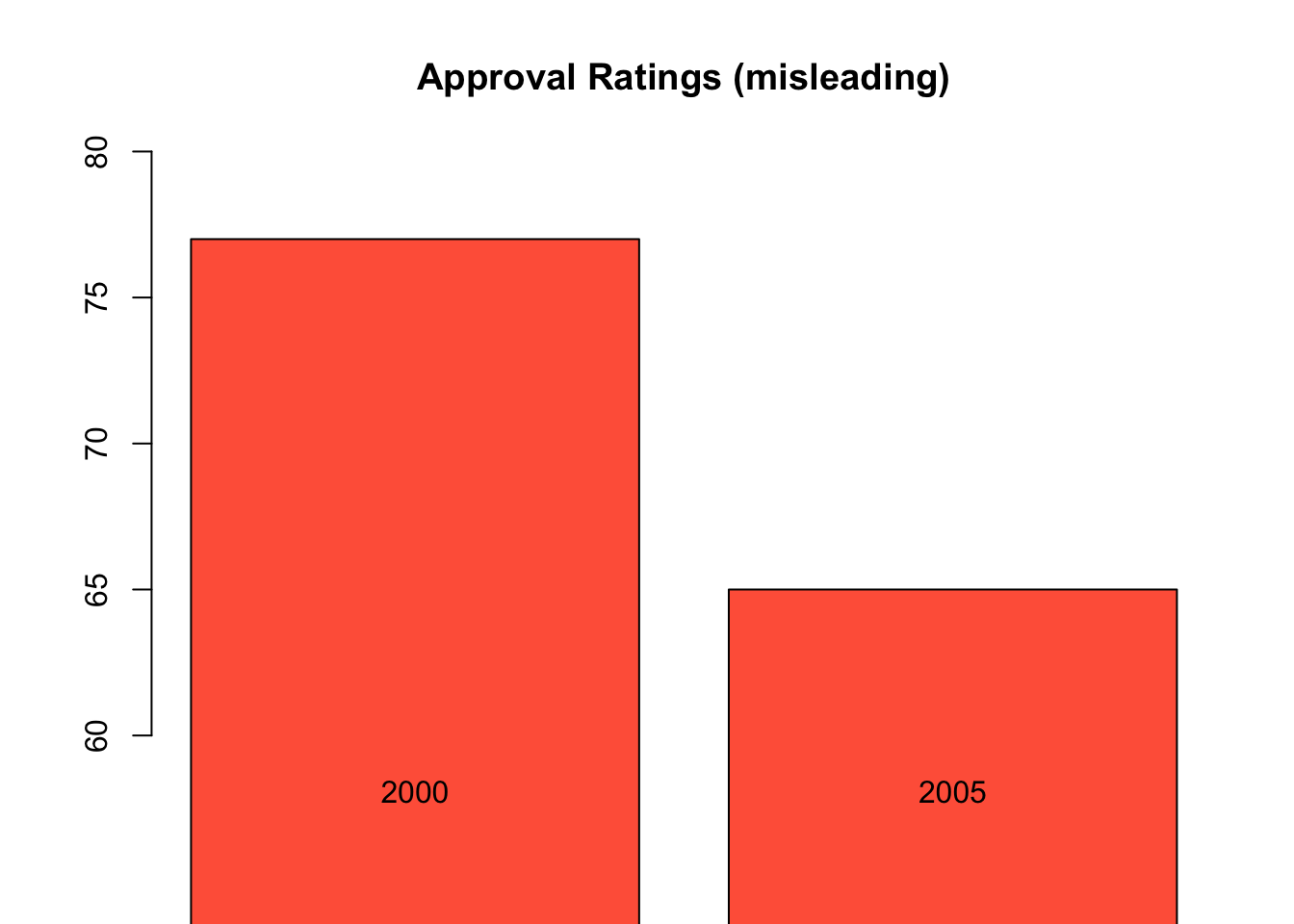
barplot(approval$percent, names.arg = approval$year,
        ylim = c(0, 100), col = "steelblue",
        main = "Approval Ratings (truthful)")
poll <- data.frame(candidate = c("A", "B", "C", "D"),
                   support = c(22, 18, 15, 10))
barplot(poll$support, names.arg = poll$candidate,
        col = c("red", "blue", "green", "purple"),
        main = "Poll Results (misleading)")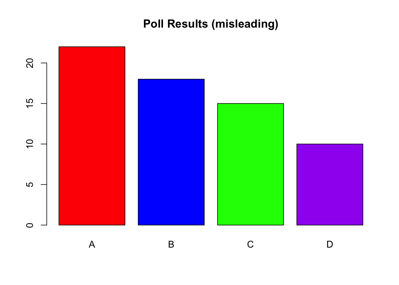
library(ggplot2)
poll |> ggplot(aes(x = reorder(candidate, support), y = support)) +
  geom_col(fill = "steelblue") +
  coord_flip() +
  labs(title = "Poll Results (truthful)",
       x = "Candidate", y = "Support (%)")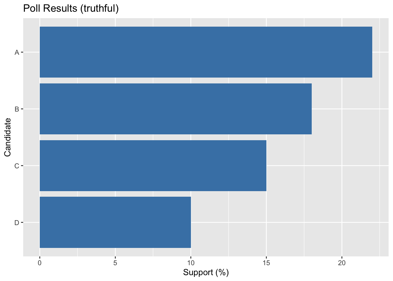
shares <- data.frame(group = c("X", "Y", "Z"), value = c(30, 50, 20))
shares |> ggplot(aes(x = 2, y = value, fill = group)) +
  geom_col(width = 1, color = "white") +
  coord_polar(theta = "y") +
  xlim(0.5, 2.5) +
  theme_void() +
  labs(title = "Shares (donut, misleading)")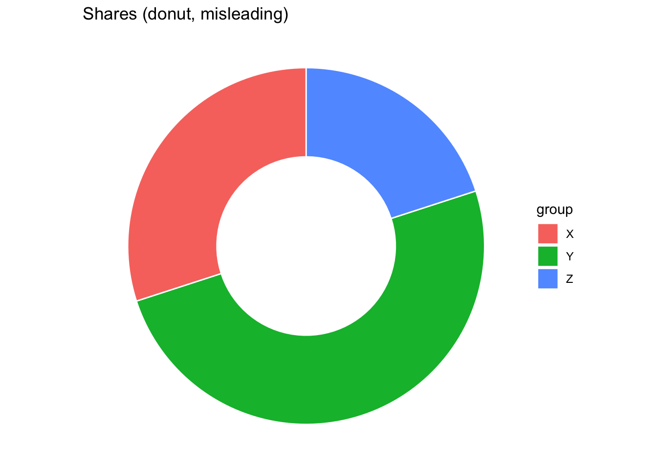
shares |> ggplot(aes(x = group, y = value, fill = group)) +
  geom_col() +
  labs(title = "Shares (bar chart)",
       x = NULL, y = "Value")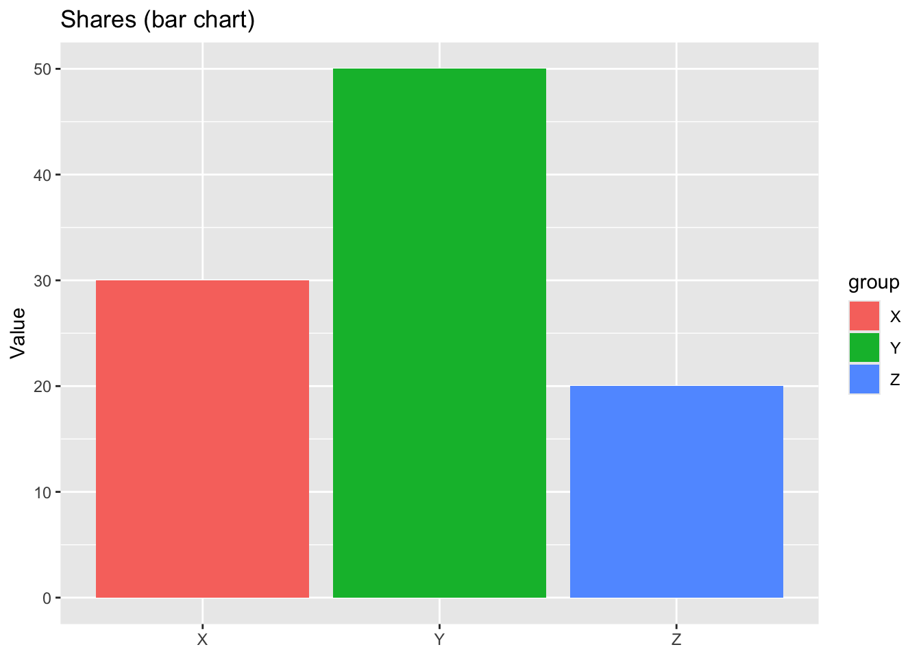
Pie charts (and donut charts, which are essentially pies with a hole in the middle) are widely criticized because humans are not good at accurately comparing angles or areas. Judgments based on angles are much less precise than those based on position or length. This makes pie charts poor at conveying quantitative comparisons, especially when slices are similar in size. Donut charts exacerbate the problem by removing the center, which eliminates a natural visual baseline (the full radius), making angle judgments even harder. For these reasons, most visualization experts recommend bar charts instead, where lengths aligned to a common baseline support more accurate comparisons.
Consider the data of Chetty et al. (2014).
Visualize the relationship between social capital and absolute mobility. Do you see a correlation? Is it what you expected from the Chetty et al. (2014) study executive summary?
Add an aesthetic to your graph to represent whether the CZ is urban or not.
Separate urban and non-urban CZ’s into two separate plots.
Add a smooth fit to each of your plots above. Experiment with adding the option method="lm" in your geom_smooth. What does this option do?
Which variables in the chetty data frame are appropriate x variables for a bar graph?
Make two separate bar graphs for two different x variables.
Make two more bar graphs that display proportions rather than counts of your selected variables.
Make a bar graph that lets you compare the number of urban and rural CZ’s in each of the four regions.
We have explored both base R plotting and the ggplot2 grammar of graphics. Base R offers quick and simple plotting functions, but lacks consistency for more advanced tasks. ggplot2 provides a flexible and layered system, allowing us to build complex visualizations step by step. By studying both good and bad visualizations, we learn not only how to make effective charts but also how to critically evaluate visuals we encounter in practice.