import pandas as pd
import numpy as np
import plotly.express as px
data = pd.read_feather("data/rodent_2022-2023.feather")7 Exploratory Data Analysis
7.1 Descriptive Statistics
Presented by Joshua Lee
When you first begin working with a new dataset, it is important to develop an understanding of the data’s overall behavior. This is important for both understanding numerical and categorical data.
For numeric data, we can develop this understanding through the use of descriptive statistics. The goal of descriptive statistics is to understand three primary elements of a given variable [2]:
- distribution
- central tendency
- variability
7.1.1 Variable Distributions
Every random variable is given by a probability distribution, which is “a mathematical function that describes the probability of different possible values of a variable” [3].
There are a few common types of distributions which appear frequently in real-world data [3]:
- Uniform:
- Poisson:
- Binomial:
- Normal and Standard Normal:
- Gamma:
- Chi-squared:
- Exponential
- Beta
- T-distribution
- F-distribution
Understanding the distribution of different variables in a given dataset can inform how we may decide to transform that data. For example, in the context of the rodent data, we are interested in the patterns which are associated with “rodent” complaints which occur.
Now that we have read in the data, we can examine the distributions of several important variables. Namely, let us examine a numerical variable which is associated with rodent sightings:
data.head(2).T| 0 | 1 | |
|---|---|---|
| unique_key | 59893776 | 59887523 |
| created_date | 2023-12-31 23:05:41 | 2023-12-31 22:19:22 |
| closed_date | 2023-12-31 23:05:41 | 2024-01-03 08:47:02 |
| agency | DOHMH | DOHMH |
| agency_name | Department of Health and Mental Hygiene | Department of Health and Mental Hygiene |
| complaint_type | Rodent | Rodent |
| descriptor | Rat Sighting | Rat Sighting |
| location_type | 3+ Family Apt. Building | Commercial Building |
| incident_zip | 11216 | 10028 |
| incident_address | 265 PUTNAM AVENUE | 1538 THIRD AVENUE |
| street_name | PUTNAM AVENUE | THIRD AVENUE |
| cross_street_1 | BEDFORD AVENUE | EAST 86 STREET |
| cross_street_2 | NOSTRAND AVENUE | EAST 87 STREET |
| intersection_street_1 | BEDFORD AVENUE | EAST 86 STREET |
| intersection_street_2 | NOSTRAND AVENUE | EAST 87 STREET |
| address_type | ADDRESS | ADDRESS |
| city | BROOKLYN | NEW YORK |
| landmark | PUTNAM AVENUE | 3 AVENUE |
| facility_type | NaN | NaN |
| status | Closed | Closed |
| due_date | NaN | NaN |
| resolution_description | The Department of Health and Mental Hygiene fo... | This service request was closed because the De... |
| resolution_action_updated_date | 12/31/2023 11:05:41 PM | 12/31/2023 10:19:22 PM |
| community_board | 03 BROOKLYN | 08 MANHATTAN |
| bbl | 3018220072.0 | 1015157503.0 |
| borough | BROOKLYN | MANHATTAN |
| x_coordinate_(state_plane) | 997661.0 | 997076.0 |
| y_coordinate_(state_plane) | 188427.0 | 223179.0 |
| open_data_channel_type | MOBILE | MOBILE |
| park_facility_name | NaN | NaN |
| park_borough | BROOKLYN | MANHATTAN |
| vehicle_type | NaN | NaN |
| taxi_company_borough | NaN | NaN |
| taxi_pick_up_location | NaN | NaN |
| bridge_highway_name | NaN | NaN |
| bridge_highway_direction | NaN | NaN |
| road_ramp | NaN | NaN |
| bridge_highway_segment | NaN | NaN |
| latitude | 40.683857 | 40.779243 |
| longitude | -73.951645 | -73.95369 |
| location | (40.683855196486164, -73.95164557951071) | (40.77924175816874, -73.95368859796383) |
| zip_codes | 17618.0 | 10099.0 |
| community_districts | 69.0 | 23.0 |
| borough_boundaries | 2.0 | 4.0 |
| city_council_districts | 49.0 | 1.0 |
| police_precincts | 51.0 | 11.0 |
| police_precinct | 51.0 | 11.0 |
In this dataset, the most relevant numerical data to consider is the time between the opening of a rodent complaint and its closing. All of the other relevant variables are either geospatial or categorical:
# convert strings into datetime objects
data["closed_date"] = pd.to_datetime(data["closed_date"],
format="%m/%d/%Y %I:%M:%S %p")
data["created_date"] = pd.to_datetime(data["created_date"],
format="%m/%d/%Y %I:%M:%S %p")
data["time_dif"] = data["closed_date"] - data["created_date"]
# set the time delta as the number of hours difference
data["time_dif"] = data["time_dif"].dt.total_seconds()/3600
data["time_dif"]0 0.000000
1 58.461111
2 0.000000
3 60.344722
4 NaN
...
82864 51.862222
82865 0.000000
82866 57.840278
82867 58.551944
82868 0.000000
Name: time_dif, Length: 82869, dtype: float64Now we have a column describing the time difference between when a complaint is opened and closed. We can plot this distribution with plotly to provide a better visual representation of the distribution:
Note, every value in the data is shifted up 1 for plotting purposes. Fitting an exponential distribution with parameter \(\lambda=0\) exactly is not possible to fit precisely due to divide by \(0\) errors. Additionally, this plot ignores the location parameter provided by output from
stats.expon.fit()since the mean brought up significantly by outliers at the asbolute extremes of the distribution (the higher end).
import plotly.graph_objects as go
from scipy import stats
# add a 1 to avoid weird zero errors
response_dat2 = data["time_dif"].dropna() + 1
hist2 = go.Histogram(x=response_dat2,
nbinsx=2500,
opacity=0.75,
name='response time',
histnorm='probability density')
# Calculate KDE
scale, loc = stats.expon.fit(response_dat2.values)
x_range = np.linspace(min(response_dat2), max(response_dat2), 10000)
fitted_vals = stats.expon.pdf(x_range, loc=0.2, scale=scale)
fitted_dist = go.Scatter(x=x_range, y=fitted_vals, mode="lines",
name="Fitted Exponential Distribution")
# Create a layout
layout = go.Layout(title='Complaint Response Time Histogram and Density',
xaxis=dict(title='Complaint Response Time (hours)', range=[0,100]),
yaxis=dict(title='Density', range=[0,0.2]),
bargap=0.1
)
# Create a figure and add both the histogram and KDE
fig = go.Figure(data=[hist2, fitted_dist], layout=layout)
# Show the figure
fig.show()As you can see, there is a strong right skew (the majority of observations are concentrated at the lower end of the distribution, but there are a few observations at the extreme right end).
Here, we use pandas plotting to generate a density estimation curve.
x_range = np.linspace(response_dat2.min(), response_dat2.max(), 1000)
response_dat2.plot.kde(ind=x_range)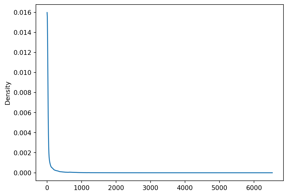
We can compare this density curve to plots of the exponential distribution, and see that this variable (complaint response times) closely match an exponential distribution with a very high \(\lambda\) parameter value. Below is a figure displaying a series of exponential distributions for different values of \(\lambda\):
import matplotlib.pyplot as plt
# Define the lambda parameters
lambdas = [0.5, 1, 2, 4, 8]
# Define the x range
x = np.linspace(0, 2*np.pi, 1000)
# Create the plot
plt.figure(figsize=(10, 6))
# Plot the exponential distribution for each lambda
for lam in lambdas:
y = lam * np.exp(-lam * x)
plt.plot(x, y, label=f'λ = {lam}')
# Set the x-axis labels
plt.xticks([np.pi/2, np.pi, 3*np.pi/2, 2*np.pi], ['π/2', 'π', '3π/2', '2π'])
# Add a legend
plt.legend()
# Show the plot
plt.show()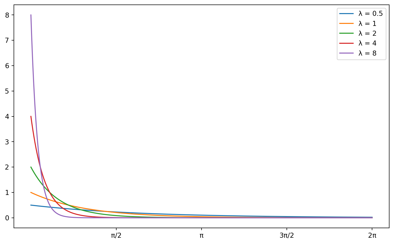
7.1.2 Central Tendency Measures
Now that we have examined the distribution of the response time, it is appropriate to investigate the important measures of central tendency for the data.
There are three main measures of central tendency which are used:
- Mean: The average or expected value of a random variable
- \(\overline{X} = (1/n)\sum_{i=1}^{n} X_{i}\) (where \(X_{i}\text{s}\) are independent random samples from the same distribution)
- Median: exact middle value of a random variable [5]
- For even \(n\), \(\overset{\sim}{X} = (1/2)[X_{(n/2+1)} + X_{(n/2)}]\)
- For odd \(n\), \(\overset{\sim}{X} = X_{([n+1]/2)}\)
- Mode: the most frequently occurring value of a random variable
For the given variable (complaint response time), we can find each of the respective statistics using pandas:
NOTE:
pandas.Series.mode()returns the most commonly occurring value in theSeries, or aSeriesof the most commonly occurring values if there is a tie between multiple values. It does not calculate multiple modes in the case of a multi-modal distribution. Here,Series.mode()returns \(0\) and \(0.000\dots\) so I elected to choose the first element of that series for display.
central_tendency = pd.Series(
{"Mean": response_dat2.mean(),
"Median": response_dat2.median(),
"Mode": response_dat2.mode().iloc[0]}
)
central_tendencyMean 53.346003
Median 1.000000
Mode 1.000000
dtype: float64As you can see, the most commonly occurring value (as is obvious from the density plot) is 0. This means that the time between when a rodent sighting complaint is filed and responded to (or closed) is most likely to be 0. Additionally, it implies that more than half of all data points have a complaint response time of zero since the median is zero as well.
It makes sense that the mean is greater than the median in this case since the distribution is exponential and skewed to the right.
7.1.3 Variability Measures
As with central tendency, there are also several relevant measures of variance [2]. These include:
- range: \(X_{(n)} - X_{(1)}\) - the difference between the greatest observed value and the smallest one.
- standard deviation: \(S = \sqrt{(1/[n-1])\sum_{i=1}^{n}(X_{i} - \overline{X})^{2}}\) - the average difference of values from the observed mean of a sample.
- variance: Square of the standard deviation of a sample \(S^{2} = (1/[n-1])\sum_{i=1}^{n}(X_{i} - \overline{X})^{2}\)
- Interquartile Range: \(X_{[3/4]} - X_{[1/4]}\) where \(X_{[p]}\) is the \(p\text{th}\) sample quantile - A measure of the difference between the 1st and third quantiles of a distribution
We can easily calculate all of these values using pandas in python [6]
quartiles = response_dat2.quantile([0.25, 0.75])
iqr = quartiles[0.75] - quartiles[0.25]
variability = pd.Series(
{"range": response_dat2.max() - response_dat2.min(),
"standard deviation": response_dat2.std(),
"variance": response_dat2.std()**2,
"IQR": iqr}
)
variabilityrange 6530.811944
standard deviation 183.977103
variance 33847.574408
IQR 16.492986
dtype: float64We can also use the interquartile range as a means to obtain a rudimentary measure of outliers in the data. Specifically, any observations which are a distance of \(1.5 * IQR\) beyond the third or first quartiles.
Seeing as the first quartile is also the minimum in this, case we only need to be concerned with outliers at the higher end of the spectrum. We calculate the upper fence for outliers as follows [5]:
\(\text{upper fence } = X_{[0.75]} + 1.5\cdot IQR\)
upper_lim = quartiles[0.75] + 1.5*iqr
outliers = response_dat2[response_dat2 > upper_lim]
outliers1 59.461111
3 61.344722
5 188.193889
10 92.917222
12 206.714722
...
82857 1110.238611
82860 52.264444
82864 52.862222
82866 58.840278
82867 59.551944
Name: time_dif, Length: 15011, dtype: float64Given the exponential nature of the distribution, it would be interesting to examine the patterns which occur in categorical variables to see if there may be any connections between those variables and the response time. It may also be useful to examine relationships between geospatial data and the response time.
7.1.4 Univariate Categorical Descriptive Statistics
Descriptive statistics for categorical data are primarily aimed at understanding the rates of occurrence for different categorical variables. These include the following measures [7]:
- frequencies: number of occurrences
- percentages / relative frequencies: the percentage of observations which have a given value for a categorical variable
These sorts of metrics are often best represented by frequency distribution tables, pie-charts, and bar charts:
For example, let us examine the categorical variable “Borough” from the rodent data:
# create a frequency distribution table
counts = data["borough"].value_counts()
proportions = counts/len(data)
cumulative_proportions = proportions.cumsum()
frequency_table = pd.DataFrame(
{"Counts": counts,
"Proportions": proportions,
"Cumulative Proportion": cumulative_proportions}
)
frequency_table| Counts | Proportions | Cumulative Proportion | |
|---|---|---|---|
| borough | |||
| BROOKLYN | 30796 | 0.371623 | 0.371623 |
| MANHATTAN | 22641 | 0.273214 | 0.644837 |
| QUEENS | 13978 | 0.168676 | 0.813513 |
| BRONX | 12829 | 0.154811 | 0.968323 |
| STATEN ISLAND | 2617 | 0.031580 | 0.999903 |
This table demonstrates that the most significant proportion of rodent sightings occurred in the borough of Brooklyn. Additionally, it indicates that Manhattan and Brooklyn collectively represent more than half of all rodent sightings which occur, while Staten Island in particular represents a relatively small proportion.
We can also use bar chart to represent this data:
# Create a bar chart
fig = go.Figure(data=[go.Bar(x=counts.index, y=counts.values)])
# Show the figure
fig.show()A pie-chart also serves as a good representation of the relative frequencies of categories:
fig = go.Figure(data=[go.Pie(labels=counts.index, values=counts.values, hole=.2)])
# Show the figure
fig.show()7.1.5 Chi-Squared Significance Tests (Contingency Table Testing)
In order to determine whether there exists a dependence between several categorical variables, we can use chi-squared contingency table testing. This is also referred to as the chi-squared test of independence [8]. We will examine this topic by investigating the relationship between the borough and the complaint descriptor variables in the rodents data.
The first step in conducting a Chi-squared significance test is to construct a contingency table.
contingency tables are frequency tables of two variables which are presented simultaneously [8].
This can be accomplished in python by utilizing the pd.crosstab() function
# produce a contingency table for viewing
contingency_table_view = pd.crosstab(data["borough"],
data["descriptor"],
margins=True)
# produce a contingency table for calculations
contingency_table = pd.crosstab(data["borough"],
data["descriptor"],
margins=False)
contingency_table_view| descriptor | Condition Attracting Rodents | Mouse Sighting | Rat Sighting | Rodent Bite - PCS Only | Signs of Rodents | All |
|---|---|---|---|---|---|---|
| borough | ||||||
| BRONX | 2395 | 1381 | 7745 | 8 | 1300 | 12829 |
| BROOKLYN | 5332 | 2075 | 20323 | 12 | 3054 | 30796 |
| MANHATTAN | 2818 | 1758 | 14036 | 2 | 4027 | 22641 |
| QUEENS | 3105 | 1219 | 8449 | 4 | 1201 | 13978 |
| STATEN ISLAND | 795 | 184 | 1391 | 0 | 247 | 2617 |
| All | 14445 | 6617 | 51944 | 26 | 9829 | 82861 |
Now that we have constructed the contingency table, we are ready to begin conducting the signficance tests (for independence of Borough and Descriptor). This requires that we compute the chi-squared statistic.
There are multiple steps to computing the chi-squared statistic for this test, but the general test-statistic is computed as follows:
\[\chi_{rows-1 * cols-1}^{2} = \sum_{cells} \frac{(O - E)^{2}}{E}\]
Here, \(E = \text{row sum} * \text{col sum}/N\) stands for the expected value of each cell, and \(O\) refers to the observed values. Note that \(N\) refers to the total observations (the right and lower-most cell value in the contingency table above)
First, let’s calculate the expected values. This can be accomplished by performing the outer product of row sums and column sums for the contingency table:
\[ \begin{align} \text{row\_margins} = \langle r_{1}, r_{2}, \dots, r_{n}\rangle \\ \text{col\_margins} = \langle c_{1}, c_{2}, \dots, c_{m}\rangle \\ \text{row\_margins} \otimes \text{col\_margins} = \left[\begin{array}{cccc} r_{1}c_{1} & r_{1}c_{2} & \dots & r_{1}c_{m} \\ r_{2}c_{1} & r_{2}c_{2} & \dots & r_{2}c_{m} \\ \vdots & \vdots & \ddots & \vdots \\ r_{n}c_{1} & r_{n}c_{2} & \dots & r_{n}c_{m} \end{array}\right] \end{align} \]
In python this is calculated as:
row_margins = contingency_table_view["All"]
col_margins = contingency_table_view.T["All"]
total = contingency_table_view["All"]["All"]
expected = np.outer(row_margins, col_margins)/total
pd.DataFrame(expected, columns=contingency_table_view.columns).set_index(
contingency_table_view.index
)| descriptor | Condition Attracting Rodents | Mouse Sighting | Rat Sighting | Rodent Bite - PCS Only | Signs of Rodents | All |
|---|---|---|---|---|---|---|
| borough | ||||||
| BRONX | 2236.455087 | 1024.480672 | 8042.258433 | 4.025464 | 1521.780343 | 12829.0 |
| BROOKLYN | 5368.607910 | 2459.264696 | 19305.432278 | 9.663123 | 3653.031993 | 30796.0 |
| MANHATTAN | 3946.962322 | 1808.033900 | 14193.216399 | 7.104259 | 2685.683120 | 22641.0 |
| QUEENS | 2436.758065 | 1116.235937 | 8762.544888 | 4.385996 | 1658.075114 | 13978.0 |
| STATEN ISLAND | 456.216616 | 208.984794 | 1640.548002 | 0.821158 | 310.429430 | 2617.0 |
| All | 14445.000000 | 6617.000000 | 51944.000000 | 26.000000 | 9829.000000 | 82861.0 |
The chi-squared statistic can be calculated directly from the (component-wise) squared difference between the original contingency table and the expected values presented above divided by the total number of observations. However, we can also use the scipy.stats package to perform the contingency test automatically.
Before performing this test, let us also examine the relavent hypotheses to this significance test.
\[ \begin{align} & H_{0}: \text{Rodent complaint type reported and Borough are independent} \\ & H_{1}: H_{0} \text{ is false.} \end{align} \]
We assume a significance level of \(\alpha=0.05\) for this test:
NOTE: the contingency table without row margins is used for calculating the chi-squared test.
from scipy.stats import chi2_contingency
chi2_val, p, dof, expected = chi2_contingency(contingency_table)
pd.Series({
"Chi-Squared Statistic": chi2_val,
"P-value": p,
"degrees of freedom": dof
})Chi-Squared Statistic 2031.14984
P-value 0.00000
degrees of freedom 16.00000
dtype: float64Now we can create a plot to demonstrate the location of the chi-squared statistic with respect to the chi-squared distribution
x = np.arange(0, 45, 0.001)
# x2 = np.arange(59, 60, 0.001)
plt.plot(x, stats.chi2.pdf(x, df=20), label="df: 20", color="red")
# plt.fill_between(x, x**4, color="red", alpha=0.5)
plt.xlabel("x")
plt.ylabel("Density")
plt.show()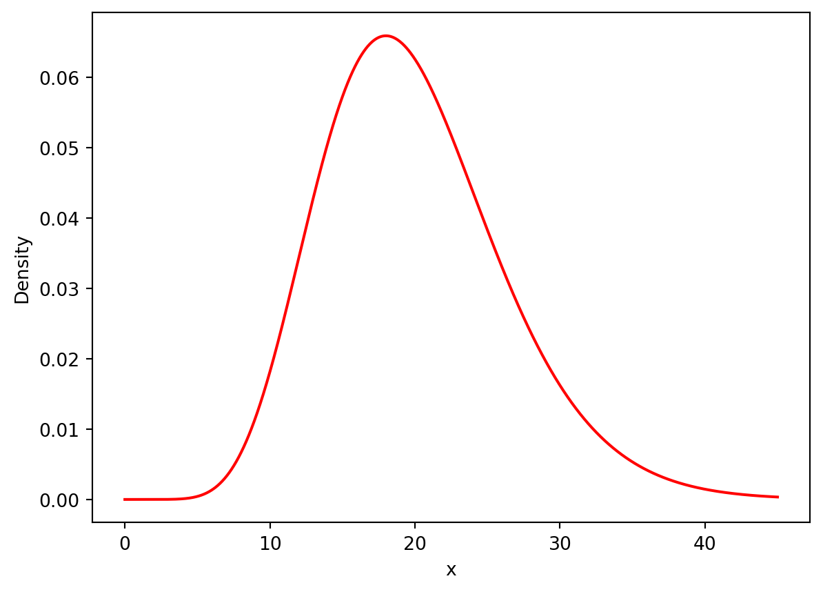
<!–
from scipy.stats import chi2
max_chi_val = 59.0
x_range = np.arange(0, 60, 0.001)
fig = px.histogram(x=x_range,
y=chi2.pdf(x_range, df=dof),
labels={"x":"Chi-Squared Value",
"y":"Density"},
title="Chi-Squared Distribution (df = {})".format(dof))
# create a a scatter plot of values from chi2 to chi2 (a single point)
# and going from 0 to the y value at the critical point - a vertical
# line
fig.add_trace(go.Scatter(x=[max_chi_val, max_chi_val],
y=[0,chi2.pdf(max_chi_val, df=dof)],
mode="lines",
name="Critical Value",
line=dict(color="red", dash="dash")))
fig.update_layout(shapes=[dict(type="rect",
x0=max_chi_val,
x1=20,
y0=0,
y1=chi2.pdf(max_chi_val, df=dof),
fillcolor="rgba(0, 100, 80, 0.2)",
line=dict(width=0))],
annotations=[dict(x=max_chi_val + 0.5,
y=0.02,
text="Area of Interest",
showarrow=False,
font=dict(size=10, color="black"))])
fig.show()As you can see from the figure, the critical value we obtain (2034) is exceptionally far beyond the bounds of the distribution, that there must be a significant dependence relationship between the borough and the rodent incident type which is reported.
Moreover, the p-value returned for this test is 0.00000, meaning that there is virtually 0 probability that such observations would be made given that the borough and rodent incident type reported were independent.
7.1.6 Sources
- towardsdatascience.com - Exploratory data analysis
- scribbr.com - Descriptive statistics
- scribbr.com - Probability Distributions
- mathisfun.com - Median definition
- stats.libretexts - outliers and sample quantiles
- datagy.io - calculating IQR in python
- curtin university - descriptive statistics for categorical data
- dwstockburger.com - hypothesis testing with contingency tables
- askpython.com - chi-squared testing in python
- sphweb - Hypotheses for chi-squared tests
7.2 Hypothesis Testing with scipy.stats
This section was written by Isabelle Perez.
7.2.1 Introduction
Hello! My name is Isabelle Perez and I am a junior Mathematics-Statistics major and Computer Science minor. I am interested in learning about data science topics and have an interest in how statistics can improve sports analytics, specifically in baseball. Today’s topic is the scipy.stats package and the many hypothesis tests that we can perform using it.
7.2.2 Scipy.stats
The package scipy.stats is a subpackage of Scipy and contains many methods useful for statistics such as probability distributions, summary statistics, statistical tests, etc. The focus of this presentation will be on some of the many hypothesis tests that can be easily conducted using scipy.stats and will provide examples of situations in which they may be useful.
Firstly, ensure Scipy is installed by using pip install scipy or
conda install -c anaconda scipy.
To import the package, use the command import scipy.stats.
7.2.3 Basic Statistical Hypothesis Tests
7.2.3.1 Two-sample t-test
H0: \(\mu_1 = \mu_2\)
H1: \(\mu_1 \neq\) or \(>\) or \(<\) \(\mu_2\)
H1: \(\mu_1 \neq\) or \(>\) or \(<\) \(\mu_2\)
Code: scipy.stats.ttest_ind(sample_1, sample_2)
Assumptions: Observations are independent and identically distributed (i.i.d), normally distributed, and the two samples have equal variances.
Optional Parameters:
nan_policycan be set topropagate(returnnan),raise(raiseValueError),
oromit(ignore null values).alternativecan betwo-sided(default),less, orgreater.equal_varis a boolean representing whether the variances of the two samples are equal
(default is True).axisdefines the axis along which the statistic should be computed (default is 0).
Returns: The t-statisic, a corresponding p-value, and the degrees of freedom.
7.2.3.2 Paired t-test
H0: \(\mu_1 = \mu_2\)
H1: \(\mu_1 \neq\) or \(>\) or \(<\) \(\mu_2\)
H1: \(\mu_1 \neq\) or \(>\) or \(<\) \(\mu_2\)
Code: scipy.stats.ttest_rel(sample_1, sample_2)
Assumptions: Observations are i.i.d, normally distributed, and related, and the two samples have equal variances. The input arrays must also be of the same size since the observations are paired.
Optional Parameters: Can use nan_policy or alternative.
Returns: The t-statisic, a corresponding p-value, and the degrees of freedom. Also has a method called confidence_interval with input parameter confidence_level that returns a tuple with the confidence interval around the difference in population means of the two samples.
7.2.3.3 ANOVA
H0: \(\mu_1 = \mu_2 = ... = \mu_n\)
H1: at least two \(\mu_i\) are not equal
H1: at least two \(\mu_i\) are not equal
Code: scipy.stats.f_oneway(sample_1, sample_2, ..., sample_n)
Assumptions: Samples are i.i.d., normally distributed, and the samples have equal variances.
Errors:
- Raises
ConstantInputWarningif all values in each of the inputs are identical. - Raises
DegenerateDataWarningif any input has length \(0\) or all inputs have length \(1\).
Returns: The F-statistic and a corresponding p-value.
7.2.3.4 Example: Comparison of Mean Response Times by Borough
Looking at the 2022-2023 rodent sighting data from the NYC 311 Service Requests,
there are many ways a two-sample t-test may be useful. For example, we can consider samples drawn from different boroughs and perform this hypothesis test to identify whether their mean response times differ. If so, this may suggest that some boroughs are being underserviced.
import pandas as pd
import numpy as np
import scipy.stats
# read in file
df = pd.read_csv('data/rodent_2022-2023.csv')
# data cleaning - change dates to timestamp object
df['Created Date'] = pd.to_datetime(df['Created Date'])
df['Closed Date'] = pd.to_datetime(df['Closed Date'])
# add column Response Time
df['Response Time'] = df['Closed Date'] - df['Created Date']
# convert data to total seconds
df['Response Time'] = df['Response Time'].apply(lambda x: x.total_seconds() / 3600) /var/folders/cq/5ysgnwfn7c3g0h46xyzvpj800000gn/T/ipykernel_21950/2664048187.py:9: UserWarning:
Could not infer format, so each element will be parsed individually, falling back to `dateutil`. To ensure parsing is consistent and as-expected, please specify a format.
/var/folders/cq/5ysgnwfn7c3g0h46xyzvpj800000gn/T/ipykernel_21950/2664048187.py:10: UserWarning:
Could not infer format, so each element will be parsed individually, falling back to `dateutil`. To ensure parsing is consistent and as-expected, please specify a format.
Since the two-sample t-test assumes the data is drawn from a normal distribution,
we need to ensure the samples we are comparing are normally distributed. According to the Central Limit theorem, the distribution of sample means from repeated samples of a population will be roughly normal. Therefore, we can take 100 samples of each borough’s response times, measure the mean of each sample, and perform the hypothesis test on the arrays of sample means.
import matplotlib.pyplot as plt
# select Bronx and Queens boroughs
df_mhtn = df[df['Borough'] == 'MANHATTAN']['Response Time']
df_queens = df[df['Borough'] == 'QUEENS']['Response Time']
mhtn_means = []
queens_means = []
# create samples of sampling means
for i in range(100):
sample1 = df_mhtn.sample(1000, replace = True)
mhtn_means.append(sample1.mean())
sample2 = df_queens.sample(1000, replace = True)
queens_means.append(sample2.mean())
# plot distribution of sample means for Manhattan
plt.hist(mhtn_means)
plt.xlabel('Mean Response Times for Manhattan')
plt.ylabel('Value Counts')
plt.show()
# plot distribution of sample means for Queens
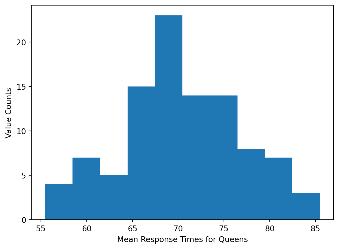
plt.hist(queens_means)
plt.xlabel('Mean Response Times for Queens')
plt.ylabel('Value Counts')
plt.show() 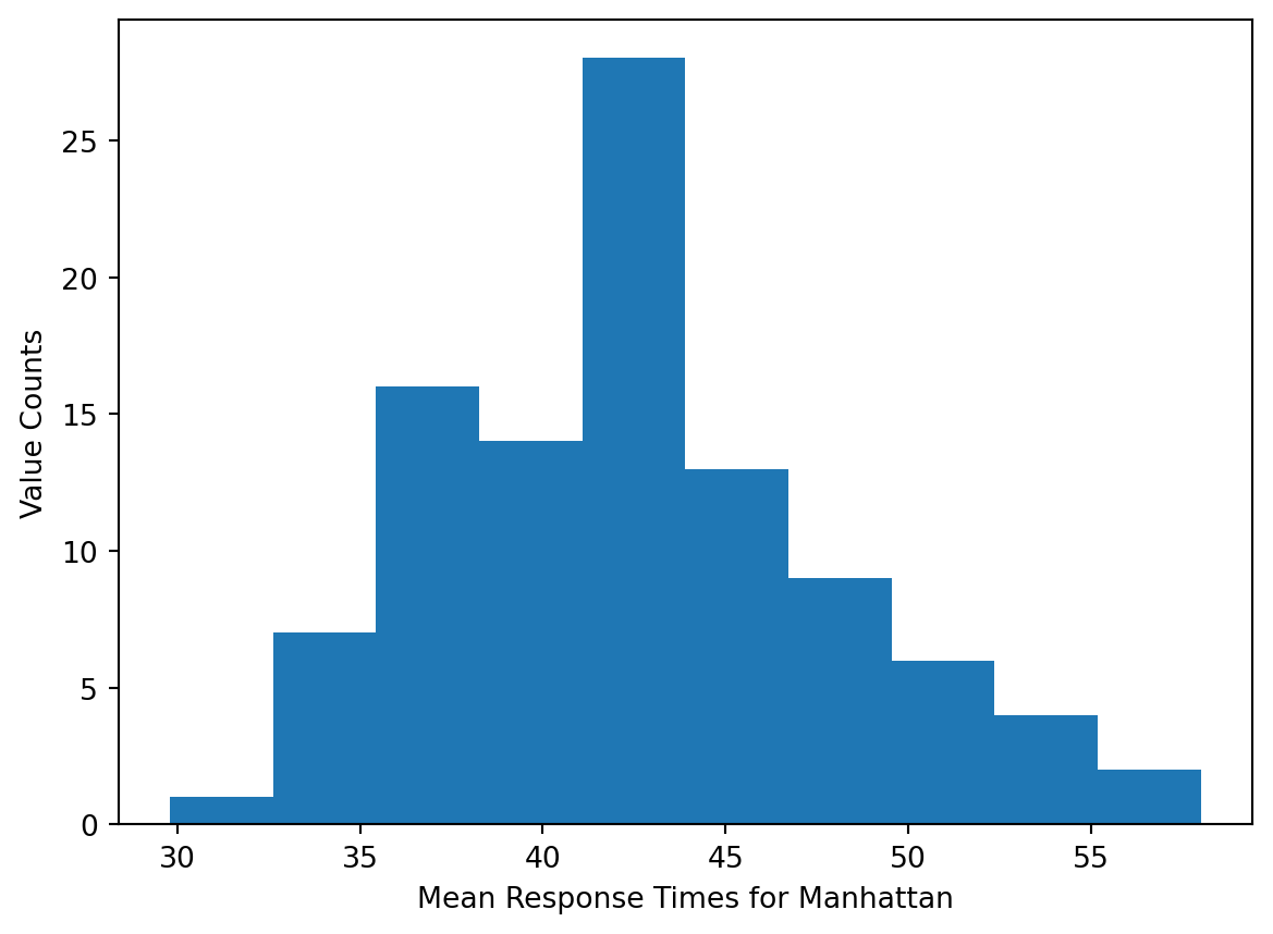
We also need to check if the variances of the two samples are equal.
# convert to numpy array
mhtn_means = np.array(mhtn_means)
queens_means = np.array(queens_means)
print('Mean, variance for Manhattan', (mhtn_means.mean(), mhtn_means.std() ** 2))
print('Mean, variance for Queens:', (queens_means.mean(), queens_means.std() ** 2))Mean, variance for Manhattan (42.51382936447074, 29.263089059077576)
Mean, variance for Queens: (70.31393657103288, 43.576834811630626)Since the ratio of the variances is less than \(2\), it is safe to assume equal variances.
result_ttest = scipy.stats.ttest_ind(mhtn_means, queens_means, equal_var = True)
print('t-statistic:', result_ttest.statistic)
print('p-value:', result_ttest.pvalue)
# print('degrees of freedom:', result_ttest.df) t-statistic: -32.41002204216531
p-value: 4.174970235673649e-81At an alpha level of \(0.05\), the p-value allows us to reject the null hypothesis and conclude that there is a statistically significant difference in the mean of sample means drawn from rodent sighting response times for Manhattan compared to Queens.
result_ttest2 = scipy.stats.ttest_ind(mhtn_means, queens_means, equal_var = True,
alternative = 'less')
print('t-statistic:', result_ttest2.statistic)
print('p-value:', result_ttest2.pvalue)
# print('degrees of freedom:', result_ttest2.df) t-statistic: -32.41002204216531
p-value: 2.0874851178368245e-81We can also set the alternative equal to less to test if the mean of sample means drawn from the Manhattan response times is less than that of sample means drawn from Queens response times. At the alpha level of \(0.05\), we can also reject this null hypothesis and conclude that the mean of sample means is less for Manhattan than it is for Queens.
7.2.4 Normality
7.2.4.1 Shapiro-Wilk Test
H0: data is drawn from a normal distribution
H1: data is not drawn from a normal distribution
H1: data is not drawn from a normal distribution
Code: scipy.stats.shapiro(sample)
Assumptions: Observations are i.i.d.
Returns: The test statistic and corresponding p-value.
- More appropriate for smaller sample sizes (\(<50\)).
- The closer the test statistic is to \(1\), the closer it is to a normal distribution, with \(1\) being a perfect match.
7.2.4.2 NormalTest
H0: data is drawn from a normal distribution
H1: data is not drawn from a normal distribution
H1: data is not drawn from a normal distribution
Code: scipy.stats.normaltest(sample)
Assumptions: Observations are i.i.d.
Optional Parameters: Can use nan_policy.
Returns: The test-statistic \(s^2 + k^2\), where \(s^2\) is from the skewtest and \(k\) is from the kurtosistest, and a corresponding p-value
This test is based on D’Agostino and Pearson’s test which combines skew and kurtosis (heaviness of the tail or how much data resides in the tails). The test compares the skewness and kurtosis of the sample to that of a normal distribution, which are \(0\) and \(3\), respectively.
7.2.4.3 Example: Distribution of Response Times
It can be useful to identify the distribution of a population because it gives us the ability to summarize the data more efficiently. We can identify whether or not the distribution of a sample of response times
from the rodent sighting dataset is normal by conducting a normality test using scipy.stats.
# take a sample from Response Time column
resp_time_samp = df['Response Time'].sample(10000, random_state = 0)
results_norm = scipy.stats.normaltest(resp_time_samp, nan_policy = 'propagate')
print('test statistic:', results_norm.statistic)
print('p-value:', results_norm.pvalue)test statistic: nan
p-value: nanBecause there are null values in the sample data, if we set the nan_policy to propagate, both the test statistic and p-value will return as nan. If we still want to obtain results when there is missing data, we must set the nan_policy to omit.
results_norm2 = scipy.stats.normaltest(resp_time_samp, nan_policy = 'omit')
print('test statistic:', results_norm2.statistic)
print('p-value:', results_norm2.pvalue)test statistic: 12530.153548983568
p-value: 0.0At an alpha level of \(0.05\), the p-value allows us to reject the null hypothesis and conclude that the data is not drawn from a normal distribution. We can further show this by plotting the data in a histogram.
bins = [i for i in range(int(resp_time_samp.min()), int(resp_time_samp.max()), 300)]
plt.hist(resp_time_samp, bins = bins)
plt.xlabel('Response Times')
plt.ylabel('Value Counts')
plt.show()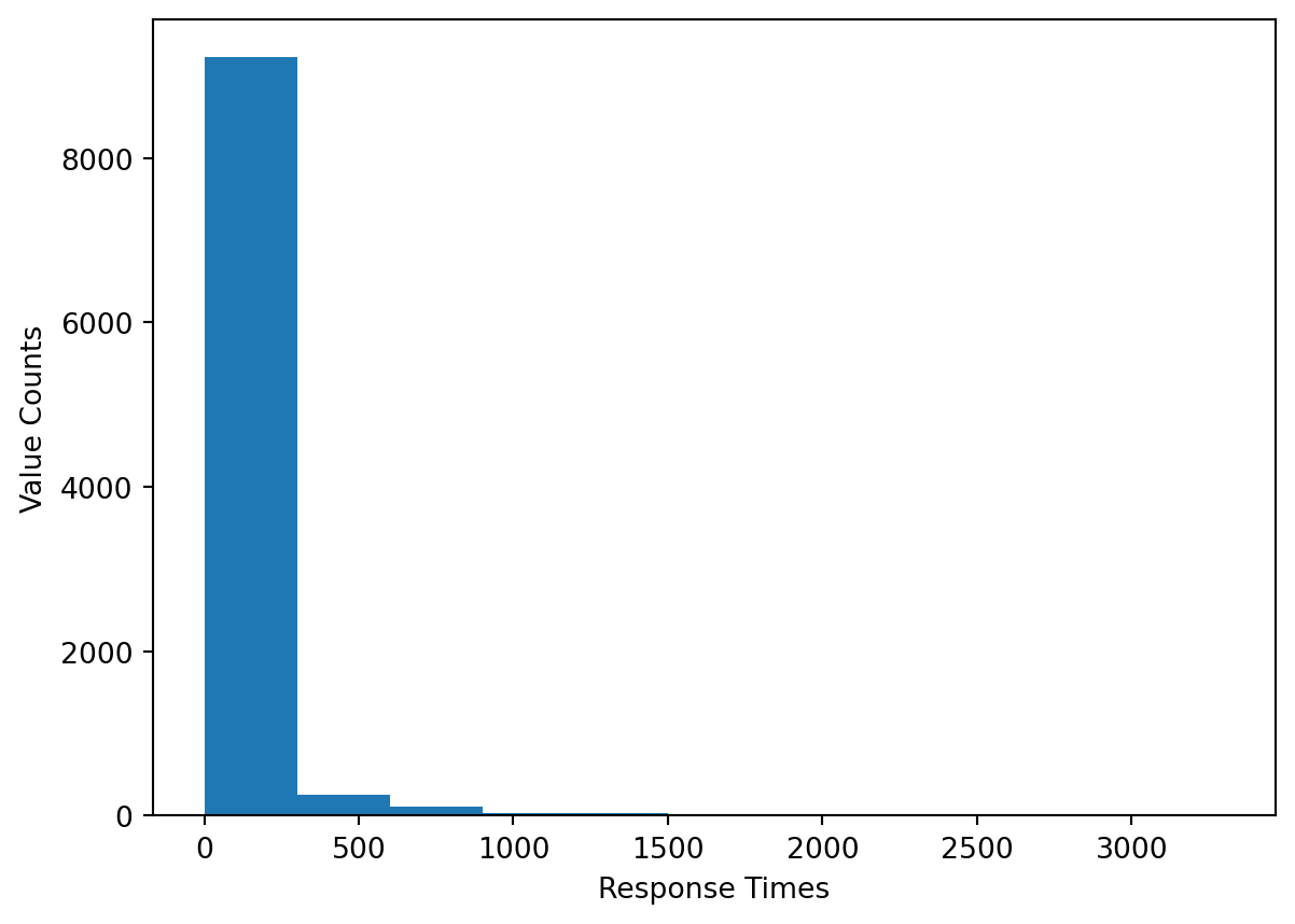
7.2.5 Correlation
7.2.5.1 Pearson’s Correlation
H0: the correlations is \(0\)
H1: the correlations is \(\neq\), \(<\), or \(> 0\)
H1: the correlations is \(\neq\), \(<\), or \(> 0\)
Code: scipy.stats.pearsonr(sample_1, sample_2)
Assumptions: Observations are i.i.d, normally distributed, and the two samples have equal variances.
Optional Parameters: Can use alternative.
Errors:
- Raises
ConstantInputWarningif either input has all constant values. - Raises
NearConstantInputWarningifnp.linalg.norm(x - mean(x)) < 1e-13 * np.abs(mean(x)).
Returns: The correlation coefficient and a corresponding p-value. It also has the confidence_interval method.
7.2.5.2 Chi-Squared Test
H0: the two variables are independent of one another
H1: a dependency exists between the two variables
H1: a dependency exists between the two variables
Code: scipy.stats.chi2_contingency(table)
Assumptions: The cells in the table contain frequencies, the levels of each variable are mutually exclusive, and observations are independent. [2]
Returns: The test statistic, a corresponding p-value, the degrees of freedom, and an array of expected frequencies from the table.
dof = table.size - sum(table.shape) + table.ndim - 1
7.2.5.3 Example: Analyzing the Relationship Between Season and Response Time
One way in which the chi-squared test may prove useful with the 2022-2023 311 Service Request rodent sighting data is by allowing us to identify dependencies between different variables, categorical ones in particular. For example, we can choose a borough and test whether the season in which the request was created is independent of the type of sighting, using the Descriptor column.
# return season based off month of created date
def get_season(month):
if month in [3, 4, 5]:
return 'Spring'
elif month in [6, 7, 8]:
return 'Summer'
elif month in [9, 10, 11]:
return 'Fall'
elif month in [12, 1, 2]:
return 'Winter'
# add column for season
df['Season'] = df['Created Date'].dt.month.apply(get_season)
# create df for Brooklyn
df_brklyn = df[df['Borough'] == 'BROOKLYN']
freq_table_2 = pd.crosstab(df_brklyn.Season, df_brklyn.Descriptor)
freq_table_2| Descriptor | Condition Attracting Rodents | Mouse Sighting | Rat Sighting | Rodent Bite - PCS Only | Signs of Rodents |
|---|---|---|---|---|---|
| Season | |||||
| Fall | 1282 | 464 | 4653 | 0 | 710 |
| Spring | 1395 | 579 | 5396 | 4 | 850 |
| Summer | 1732 | 509 | 6631 | 5 | 881 |
| Winter | 923 | 523 | 3643 | 3 | 613 |
results_chi2 = scipy.stats.chi2_contingency(freq_table_2)
print('test statistic:', results_chi2.statistic)
print('p-value:', results_chi2.pvalue)
print('degrees of freedom:', results_chi2.dof) test statistic: 120.07130925971065
p-value: 5.981181861531126e-20
degrees of freedom: 12At an alpha level of \(0.05\), the p-value allows us to reject the null hypothesis and conclude that the Season and Descriptor columns are indeed dependent for Brooklyn. This can also be confirmed by plotting the descriptor frequencies in a stacked bar chart, where the four seasons represent different colored bars.
x_labels = ['Condition', 'M.Sighting', 'R.Sighting', 'Bite', 'Signs of Rodents']
freq_table_2.rename(columns = {'Condition Attracting Rodents': 'Condition',
'Rat Sighting': 'R.Sighting', 'Mouse Sighting': 'M.Sighting',
'Rodent Bite - PCS Only': 'Bite'},
inplace = True)
freq_table_2.T.plot(kind = 'bar', stacked = True) 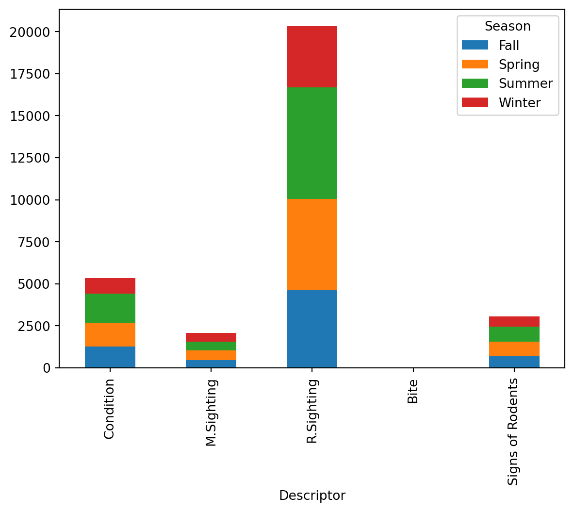
The bar chart above shows that the ranking of each season by number of rodent sightings is consistent across all five types of rodent sightings. This further suggests that there exists dependency between season and rodent sighting in Brooklyn.
7.2.6 Nonparametric Hypothesis Tests
7.2.6.1 Mann-Whitney U (Wilcoxon Rank-Sum) Test
H0: distribution of population 1 \(=\) distribution of population 2
H1: distribution of population 1 \(\neq\) or \(>\) or \(<\) distribution of population 2
H1: distribution of population 1 \(\neq\) or \(>\) or \(<\) distribution of population 2
Code: scipy.stats.mannwhitneyu(sample_1, sample_2)
Assumptions: Observations are independent and ordinal.
Optional Parameters:
alternativecan allow us to test if one sample has a distribution that is stochastically less than or greater than that of the second sample.
- Can use
nan_policy. methodselects how the p-value is calculated and can be set toasymptotic,exact, orauto.asymptoticcorrects for ties and compares the standardized test statistic to the normal distribution.exactdoes not correct for ties and computes the exact p-value.auto(default) choosesexactwhen there are no ties and the size of one sample is \(<=8\),asymptoticotherwise.
Returns: The Mann-Whitney U Statistic corresponding with the first sample and a corresponding p-value.
- The statistic corresponding to the second sample is not returned but can be calculated as
sample_1.shape * sample_2.shape - U1whereU1is the test statistic associated withsample_1. - For large sample sizes, the distribution can be assumed to be approximately normal, so the statisic can be measured as \(z = \frac{U-\mu_{U}}{\sigma_{U}}\).
- To adjust for ties, the standard deviation is calculated as follows:
\(\sigma_{U} = \sqrt{\frac{n_{1}n_{2}}{12}((n + 1) - \frac{\sum_{k = 1}^{K}(t^{3}_{k} - t_{k})}{n(n - 1)})}\), where \(t_{k}\) is the number of ties.
- Non-parametric version of the two-sample t-test.
- If the underlying distributions have similar shapes, the test is essentially a comparison of medians. [5]
7.2.6.2 Wilcoxon Signed-Rank test
H0: distribution of population 1 \(=\) distribution of population 2
H1: distribution of population 1 \(\neq\) or \(>\) or \(<\) distribution of population 2
H1: distribution of population 1 \(\neq\) or \(>\) or \(<\) distribution of population 2
Code: scipy.stats.wilcoxon(sample_1, sample_2) or
scipy.statss.wilcoxon(sample_diff, None)
Assumptions: Observations are independent, ordinal, and the samples are paired.
Optional Parameters:
zero-methodchooses how to handle pairs with the same value.wilcox(default) doesn’t include these pairs.prattdrops ranks of pairs whose difference is \(0\).zsplitincludes pairs and assigns half the ranks into the positive group and the other half in the negative group.
- Can use
alternativeandnan_policy. alternativeallows us to identify whether the distribution of the difference is stochastically greater than or less than a distribution symmetric about \(0\).methodselects how the p-value is calculated.exactcomputes the exact p-value.approxfinds the p-value by standardizing the test statistic.auto(default) choosesexactwhen the sizes of the samples are \(<=50\) andapproxotherwise.
Returns: The test statistic, a corresponding p-value, and the calculated z-score when the method is approx.
- Non-parametric version of the paired t-test.
7.2.6.3 Kruskal-Wallis H-Test
H0: all populations have the same distribution
H1: \(>=2\) populations are distributed differently
H1: \(>=2\) populations are distributed differently
Code: scipy.stats.kruskal(sample_1, ..., sample_n)
Assumptions: Observations are independent, ordinal, and each sample has \(>=5\) observations. [3]
Optional Parameters: Can use nan_policy.
Returns: The Kruskal-Wallis H-statisic (corrected for ties) and a corresponding p-value.
- Non-parametric version of ANOVA.
7.2.6.4 Example: Distribution of Response Times for 2022 vs. 2023
We can use the Mann-Whitney test to compare the distributions of response times from our rodent data. For example, we can split the data into two groups, one for 2022 and the other for 2023, to compare their distributions.
# create dfs for 2022 and 2023
df_2022 = df[df['Created Date'].dt.year == 2022]['Response Time']
df_2023 = df[df['Created Date'].dt.year == 2023]['Response Time']
# perform test with H_0 df_2022 > df_2023
results_mw = scipy.stats.mannwhitneyu(df_2022, df_2023, nan_policy = 'omit',
alternative = 'greater')
# perform test with H_0 df_2022 < df_2023
results_mw2 = scipy.stats.mannwhitneyu(df_2022, df_2023, nan_policy = 'omit',
alternative = 'less')
print('test statistic:', results_mw.statistic)
print('p-value:', results_mw.pvalue)
print()
print('test statistic:', results_mw2.statistic)
print('p-value:', results_mw2.pvalue)test statistic: 744300262.0
p-value: 1.0
test statistic: 744300262.0
p-value: 3.931744717049885e-98At an alpha level of \(0.05\), the p-value of \(1\) is too large to reject the null hypothesis, therefore we cannot conclude that the distribution of response times for 2022 is stochastically greater than that for 2023. But when we set the alternative to less, our p-value is small enough to conclude that the distribution of response times for 2022 is stochastically greater than the distribution of response times for 2023.
bins = [i for i in range(5, 500, 50)]
plt.hist(df_2022, label = 2022, bins = bins, color = 'red')
plt.hist(df_2023, label = 2023, bins = bins, color = 'blue',
alpha = 0.5)
plt.legend()
plt.show() 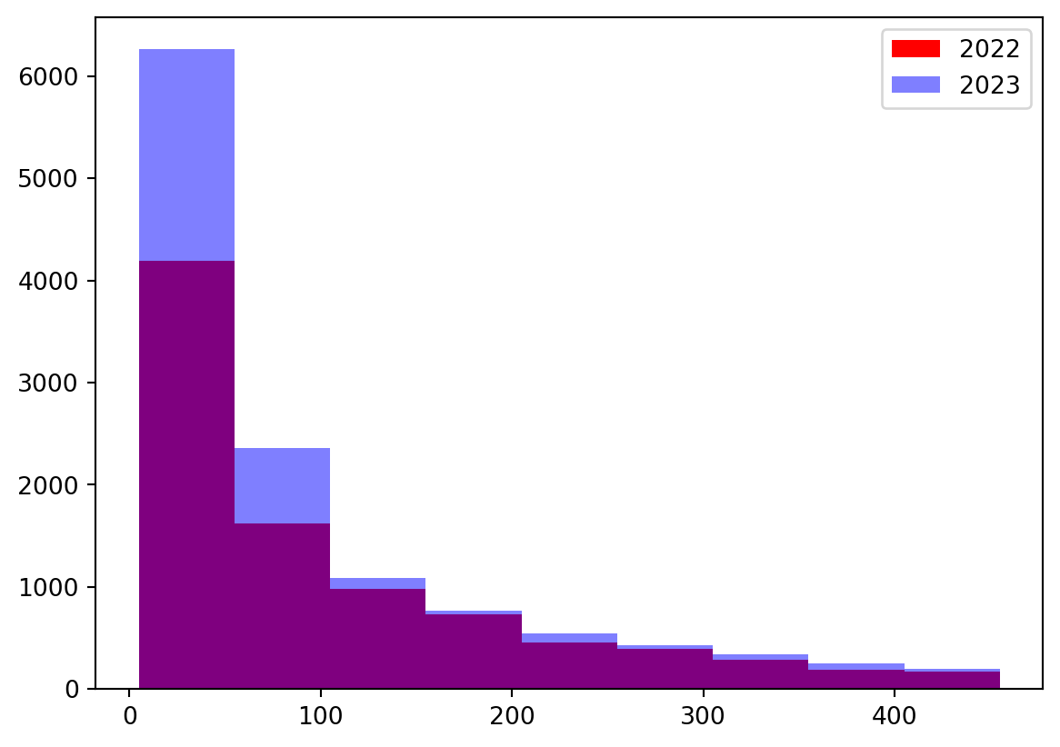
This small subset of data confirms the results of the one-sided hypothesis test, showing that in general, the counts of response times for 2022 are greater than those for 2023, suggesting the distribution for 2022 is stochastically larger than that of 2023 data.
7.2.6.5 Example: Distribution of Response Times by Season
Similar to the previous, example, we can use a non-parametric test to compare the distribution of response times by season. Because in this case we have four samples to compare, we need to use the Kruskal Wallis H-Test.
df_summer = df[df['Season'] == 'Summer']['Response Time']
df_spring = df[df['Season'] == 'Spring']['Response Time']
df_fall = df[df['Season'] == 'Fall']['Response Time']
df_winter = df[df['Season'] == 'Winter']['Response Time']
results_kw = scipy.stats.kruskal(df_summer, df_spring, df_fall, df_winter,
nan_policy = 'omit')
print('test statistic:', results_kw.statistic)
print('p-value:', results_kw.pvalue)test statistic: 7.626073129122622
p-value: 0.05440606295505631At an alpha level of \(0.05\), the p-value of \(0.0496\) is just small enough to reject the null hypothesis, suggesting that the distribution of response times differs by season, but not by much.
7.2.7 References
- https://docs.scipy.org/doc/scipy/reference/stats.html (
scipy.statsdocumentation) - https://libguides.library.kent.edu/SPSS/ChiSquare
- https://library.virginia.edu/data/articles/getting-started-with-the-kruskal-wallis-test
- https://machinelearningmastery.com/statistical-hypothesis-tests-in-python-cheat-sheet/
- https://library.virginia.edu/data/articles/the-wilcoxon-rank-sum-test
7.3 Exploring NYC Rodent Dataset (by Xingye.Zhang)
The main goal of my presentation is to show the process of ‘transforming raw dataset’ into ‘compelling insights’ using various data visualizing examples. And most importantly, I wish to get you guys ‘engaged’ and ‘come up with your insights’ about visualizing NYC dataset throughout the process of exploring.
7.3.1 Personal Introduction
My name is Xingye Zhang, you can call me Austin, which may be easier to pronounce. I’m from China and currently a senior majoring in Statistics and Economics. I plan to graduate next semester, having taken a gap semester previously.
My experience with Python is quite recent. I had my first Python course in ECON prior to this course and I just started to learn how to use Github and Vs code in this semester.
Please feel free to interrupt if you have any questions or notice I made a mistake. I’m glad to answer your questions and learn from you guys!
7.3.2 Dataset Format Selection
Why ‘Feather’?
Speed: Feather files are faster to read and write than CSV files.
Efficiency in Storage: Feather files are often smaller in size than CSV files.
Support for Large Datasets: Feather files can handle large datasets more efficiently.
7.3.3 Dataset Cleaning
# Import basic packages
import pandas as pd
# Pyarrow is better for reading feather file
import pyarrow.feather as pya
# Load the original dataset
rodent_data = pya.read_feather('data/rodent_2022-2023.feather')
# Print columns in order to avoid 'Keyerror'
column_names = rodent_data.columns.tolist()
print(column_names)['unique_key', 'created_date', 'closed_date', 'agency', 'agency_name', 'complaint_type', 'descriptor', 'location_type', 'incident_zip', 'incident_address', 'street_name', 'cross_street_1', 'cross_street_2', 'intersection_street_1', 'intersection_street_2', 'address_type', 'city', 'landmark', 'facility_type', 'status', 'due_date', 'resolution_description', 'resolution_action_updated_date', 'community_board', 'bbl', 'borough', 'x_coordinate_(state_plane)', 'y_coordinate_(state_plane)', 'open_data_channel_type', 'park_facility_name', 'park_borough', 'vehicle_type', 'taxi_company_borough', 'taxi_pick_up_location', 'bridge_highway_name', 'bridge_highway_direction', 'road_ramp', 'bridge_highway_segment', 'latitude', 'longitude', 'location', 'zip_codes', 'community_districts', 'borough_boundaries', 'city_council_districts', 'police_precincts', 'police_precinct']1. Checking Columns
Conclusion:: There are no columns with identical data, but some columns are highly correlated.
Empty Columns: ‘Facility Type’, ‘Due Date’, ‘Vehicle Type’, ‘Taxi Company Borough’,‘Taxi Pick Up Location’, ‘Bridge Highway Name’, ‘Bridge Highway Direction’, ‘Road Ramp’, ‘Bridge Highway Segment’.
Columns we can remove to clean data: ‘Agency Name’, ‘Street Name’, ‘Landmark’, ‘Intersection Street 1’, ‘Intersection Street 2’, ‘Park Facility Name’, ‘Park Borough’, ‘Police Precinct’, ‘Facility Type’, ‘Due Date’, ‘Vehicle Type’, ‘Taxi Company Borough’, ‘Taxi Pick Up Location’, ‘Bridge Highway Name’, ‘Bridge Highway Direction’, ‘Road Ramp’, ‘Bridge Highway Segment’.
2. Using reverse geocoding to fill the missing zip code
# Find the missing zip code
missing_zip = rodent_data['zip_codes'].isnull()
missing_borough = rodent_data['borough'].isnull()
missing_zip_borough_correlation = (missing_zip == missing_borough).all()
# Use reverse geocoding to fill the missing zip code
geocode_available = not (rodent_data['latitude'].isnull().any()
or rodent_data['longitude'].isnull().any())
missing_zip_borough_correlation, geocode_available(False, False)3. Clean the Original Data
# Removing redundant columns
columns_to_remove = ['agency_name', 'street_name', 'landmark',
'intersection_street_1', 'intersection_street_2',
'park_facility_name', 'park_borough',
'police_precinct', 'facility_type', 'due_date',
'vehicle_type', 'taxi_company_borough',
'taxi_pick_up_location', 'police_precinct',
'bridge_highway_name', 'bridge_highway_direction',
'road_ramp','bridge_highway_segment']
cleaned_data = rodent_data.drop(columns=columns_to_remove)
#Create the file_path
file_path = 'data/cleaned_rodent_data.feather'
# Feather Export (removing non-supported types like datetime)
cleaned_data['created_date'] = cleaned_data['created_date'].astype(str)
cleaned_data['closed_date'] = cleaned_data['closed_date'].astype(str)
cleaned_data.to_feather(file_path)
# Check the cleaned columns
print(cleaned_data.columns)Index(['unique_key', 'created_date', 'closed_date', 'agency', 'complaint_type',
'descriptor', 'location_type', 'incident_zip', 'incident_address',
'cross_street_1', 'cross_street_2', 'address_type', 'city', 'status',
'resolution_description', 'resolution_action_updated_date',
'community_board', 'bbl', 'borough', 'x_coordinate_(state_plane)',
'y_coordinate_(state_plane)', 'open_data_channel_type', 'latitude',
'longitude', 'location', 'zip_codes', 'community_districts',
'borough_boundaries', 'city_council_districts', 'police_precincts'],
dtype='object')7.3.4 Categorizing the Columns
Highly suggest to use ‘Chatgpt’ first and then revise it yourself.
Identification Information: ‘Unique Key’.
Temporal Information: ‘Created Date’, ‘Closed Date’.
Agency Information: ‘Agency’.
Complaint Details: ‘Complaint Type’, ‘Descriptor’, ‘Resolution Description’, ‘Resolution Action Updated Date’.
Location and Administrative Information: ‘Location Type’, ‘Incident Zip’, ‘Incident Address’, ‘Cross Street 1’, ‘Cross Street 2’, ‘City’,‘Borough’, ‘Community Board’, ‘Community Districts’, ‘Borough Boundaries’, ‘BBL’. ‘City Council Districts’, ‘Police Precincts’.
Geographical Coordinates: ‘X Coordinate (State Plane)’, ‘Y Coordinate (State Plane)’, ‘Location’.
Communication Channels: ‘Open Data Channel Type’.
7.3.5 Question based on Dataset
Agency: 1. Temporal Trends in Rodent Complaints 2. Relationship between Rodent Complaints Location Types 3. Spatial Analysis of Rodent Complaints
Complainer: 1. Agency Resolution Time 2. Impact of Rodent Complaints on City Services:
7.3.6 Temporal Trends in Rodent Complaints
# Import basic packages
import matplotlib.pyplot as plt
import seaborn as sns
# Ensure 'created_date' is in datetime format and extract 'Year' and 'Month'
cleaned_data['created_date'] = pd.to_datetime(cleaned_data['created_date'],
errors='coerce')
cleaned_data['Year'] = cleaned_data['created_date'].dt.year
cleaned_data['Month'] = cleaned_data['created_date'].dt.month
# Use data from year 2023 as example
data_2023 = cleaned_data[cleaned_data['Year'] == 2023]
# Group by Month to get the count of complaints
mon_complaints_23= data_2023.groupby('Month').size().reset_index(name='Counts')
# Plotting
plt.figure(figsize=(7, 3))
sns.barplot(data=mon_complaints_23, x='Month', y='Counts')
plt.title('Monthly Rodent Complaints in 2023')
plt.xlabel('Month')
plt.ylabel('Number of Complaints')
plt.xticks(range(12), ['Jan', 'Feb', 'Mar', 'Apr', 'May', 'Jun', 'Jul', 'Aug',
'Sep', 'Oct', 'Nov', 'Dec'])
plt.tight_layout()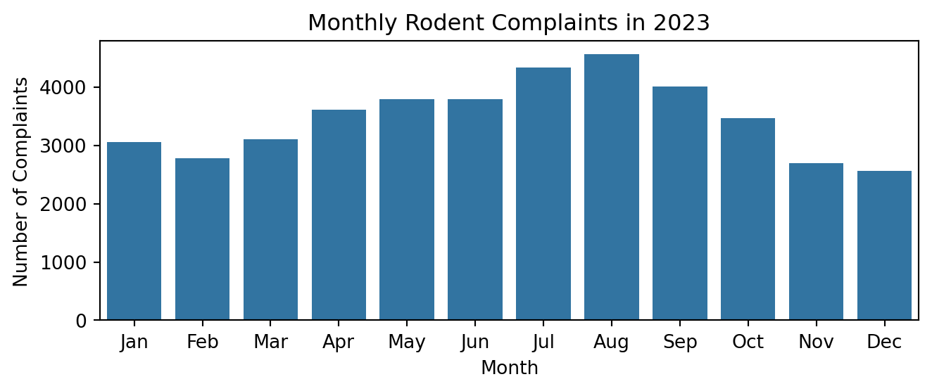
Seasonal Trend
# Categorize month into seasons
def categorize_season(month):
if month in [3, 4, 5]:
return 'Spring'
elif month in [6, 7, 8]:
return 'Summer'
elif month in [9, 10, 11]:
return 'Fall'
else: # Months 12, 1, 2
return 'Winter'
# Applying the function to create a 'Season' column
data_2023 = cleaned_data[cleaned_data['Year'] == 2023].copy()
data_2023['Season'] = data_2023['Month'].apply(categorize_season)
# Grouping by Season to get the count of complaints
season_com_2023 = data_2023.groupby('Season').size().reset_index(name='Counts')
# Ordering the seasons for the plot
season_order = ['Spring', 'Summer', 'Fall', 'Winter']
season_com_2023['Season'] = pd.Categorical(season_com_2023['Season'],
categories=season_order, ordered=True)
season_com_2023 = season_com_2023.sort_values('Season')
# Plotting
plt.figure(figsize=(7, 3))
sns.barplot(data=season_com_2023, x='Season', y='Counts')
plt.title('Seasonal Rodent Complaints in 2023')
plt.xlabel('Season')
plt.ylabel('Number of Complaints')
plt.tight_layout()
plt.show()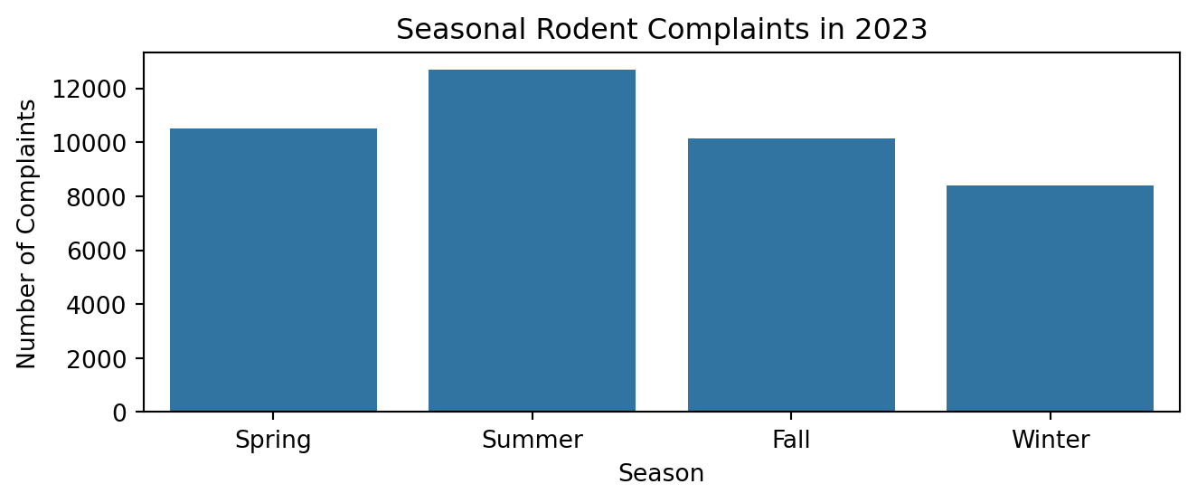
Comparing 2022 and 2023 Seasonal Trend
# Filter data for two specific years, e.g., 2022 and 2023
data_filtered = cleaned_data[cleaned_data['Year'].isin([2022, 2023])]
# Group by Year and Month to get the count of complaints
mon_counts = data_filtered.groupby(['Year',
'Month']).size().reset_index(name='Counts')
# Pivot the data for easy plotting
mon_counts_pivot = mon_counts.pivot(index='Month', columns='Year',
values='Counts')
# Plotting
plt.figure(figsize=(7, 3))
sns.lineplot(data=mon_counts_pivot)
plt.title('Comparison of Monthly Rodent Complaints between 2022 and 2023')
plt.xlabel('Month')
plt.ylabel('Number of Complaints')
plt.xticks(range(1, 13), ['Jan', 'Feb', 'Mar', 'Apr', 'May', 'Jun', 'Jul',
'Aug', 'Sep', 'Oct', 'Nov', 'Dec'])
plt.legend(title='Year', labels=mon_counts_pivot.columns)
plt.tight_layout()
plt.show()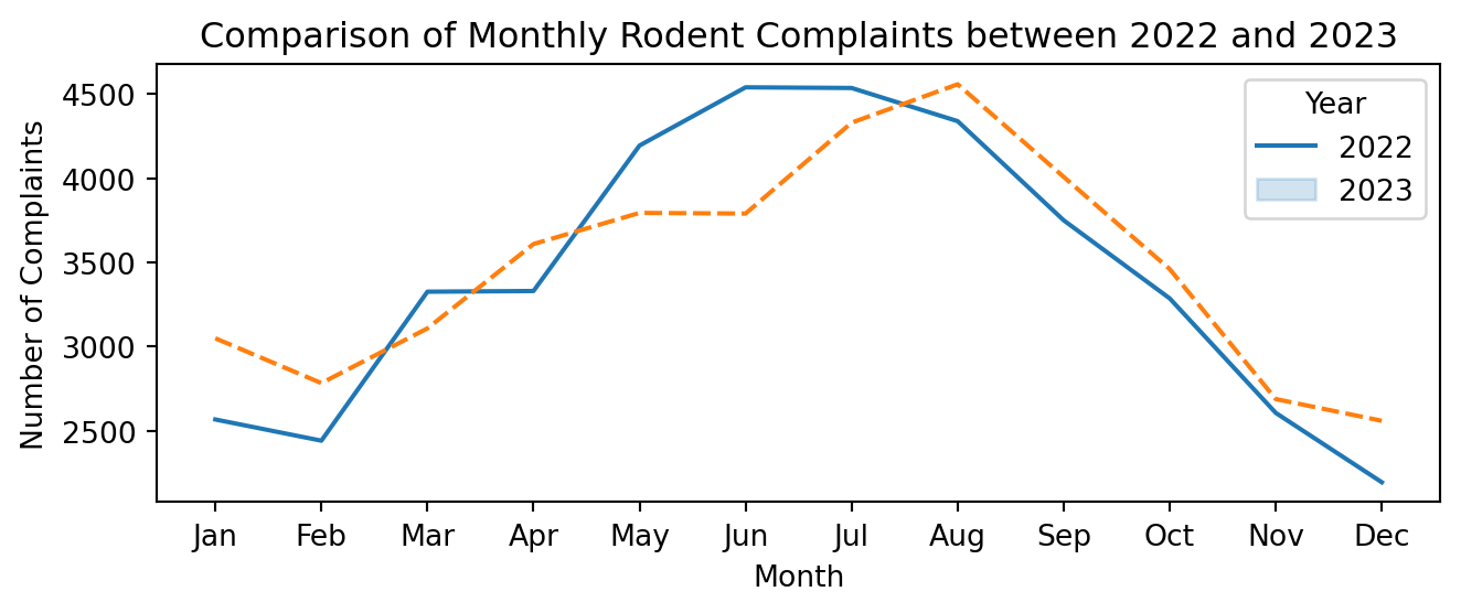
Comparing Temporal Trends from Boroughs in 2023
data_2023 = cleaned_data[cleaned_data['Year'] == 2023]
# Group by Month and Borough to get the count of complaints
mon_borough_counts = data_2023.groupby(['Month',
'borough']).size().reset_index(name='Counts')
# Pivot the data for easy plotting
mon_borough_counts_pivot = mon_borough_counts.pivot(index='Month',
columns='borough', values='Counts')
# Plotting
plt.figure(figsize=(7, 3))
sns.lineplot(data=mon_borough_counts_pivot)
plt.title('Monthly Trend of Rodent Complaints by Borough in 2023')
plt.xlabel('Month')
plt.ylabel('Number of Complaints')
plt.xticks(range(1, 13), ['Jan', 'Feb', 'Mar', 'Apr', 'May', 'Jun', 'Jul',
'Aug', 'Sep', 'Oct', 'Nov', 'Dec'])
plt.legend(title='Borough')
plt.tight_layout()
plt.show()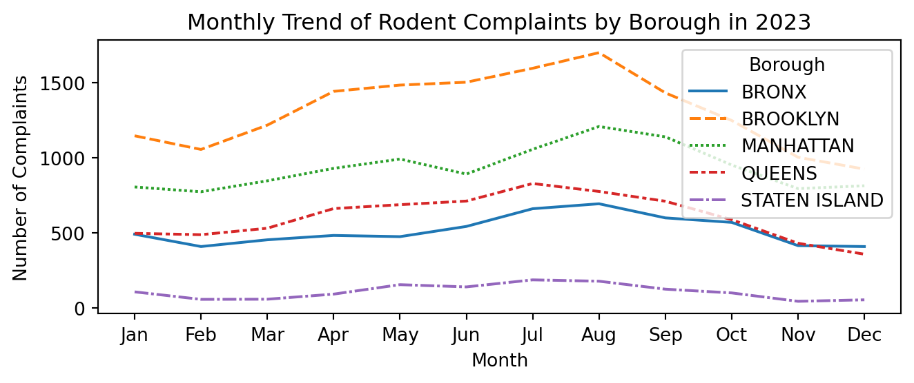
Adding the Location Types
import warnings
from plotnine.exceptions import PlotnineWarning
from plotnine import (
ggplot, aes, geom_line, geom_point, facet_wrap,
labs, theme, element_text, scale_x_continuous
)
# Suppress specific Plotnine warnings
warnings.filterwarnings('ignore', category=PlotnineWarning)
# get the count of complaints per month per location type and borough
monthly_data = (data_2023.groupby(['borough', 'location_type', 'Month'])
.size()
.reset_index(name='Counts'))
# Create the plot with adjusted figure size and legend properties
plot = (ggplot(monthly_data, aes(x='Month', y='Counts', color='location_type')) +
geom_line() +
geom_point() +
facet_wrap('~borough', scales='free_y', ncol=3) +
labs(x='Month', y='Number of Complaints', color='Location Type',
title='Monthly Rodent Complaints by Location Type and Borough') +
scale_x_continuous(breaks=range(2, 13, 2)) +
theme(
figure_size=(20, 10), # Adjusted figure size
text=element_text(size=10),
legend_position='right',
axis_text_x=element_text(rotation=0, hjust=0.5)
# Removed subplots_adjust
)
)
# Save the plot to a file with high resolution
plot.save('rodent_complaints_plot.jpeg', width=20, height=10, dpi=300)
# Corrected way to show the plot
plot.show()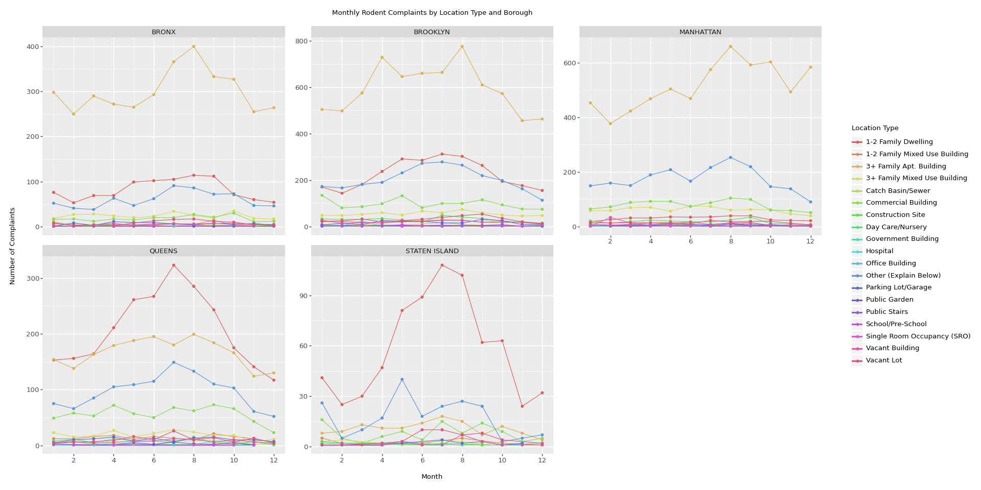
7.3.7 Interactive Graph
Plotly Example of Monthly Rodents Complaints in Bronx
import plotly.express as px
import pandas as pd
# Load your dataset
# Replace with the path to your dataset
data = pya.read_feather('data/cleaned_rodent_data.feather')
# Convert 'Created Date' to datetime and extract 'Year' and 'Month'
data['created_date'] = pd.to_datetime(data['created_date'], errors='coerce')
data['Year'] = data['created_date'].dt.year.astype(int)
data['Month'] = data['created_date'].dt.month
# Filter the dataset for the years 2022 and 2023
data_filtered = data[(data['Year'] == 2022) | (data['Year'] == 2023)]
# Further filter to only include the Bronx borough
data_bronx = data_filtered[data_filtered['borough'] == 'BRONX'].copy()
# Combine 'Year' and 'Month' to a 'Year-Month' format for more granular plotting
data_bronx['Year-Month'] = (data_bronx['Year'].astype(str)
+ '-' + data_bronx['Month'].astype(str).str.pad(2,
fillchar='0'))
# Group data by 'Year-Month' and 'Location Type' and count the complaints.
monthly_data_bronx = (data_bronx.groupby(['Year-Month', 'location_type'],
as_index=False)
.size()
.rename(columns={'size': 'Counts'}))
# Create an interactive plot with Plotly Express
fig = px.scatter(monthly_data_bronx, x='Year-Month', y='Counts',
color='location_type',
size='Counts', hover_data=['location_type'],
title='Monthly Rodent Complaints by Location Type in Bronx')
# Adjust layout for better readability
fig.update_layout(
height=400, width=750,
legend_title='Location Type',
xaxis_title='Year-Month',
yaxis_title='Number of Complaints',
# Rotate the labels on the x-axis for better readability
xaxis=dict(tickangle=45)
)
# Show the interactive plot
fig.show()7.3.8 Interactive Map using Google
# Shapely for converting latitude/longtitude to geometry
from shapely.geometry import Point
# To create GeodataFrame
import geopandas as gpd
# cutting the length of dataset to avoid over-capacity
sub_data = data.iloc[:len(data)//20] # Shorten dataset for illustration.
# Drop rows with missing latitude or longitude to match the lengths
sub_data_cleaned = sub_data.dropna(subset=['latitude', 'longitude'])
# creating geometry using shapely (removing empty points)
geometry = [Point(xy) for xy in zip(sub_data_cleaned["longitude"], \
sub_data_cleaned["latitude"]) if not Point(xy).is_empty]
# creating geometry column to be used by geopandas
geometry2 = gpd.points_from_xy(sub_data_cleaned["longitude"],
sub_data_cleaned["latitude"])
# coordinate reference system.
crs = "EPSG:4326"
# Create GeoDataFrame directly using geopandas points_from_xy utility
rodent_geo = gpd.GeoDataFrame(sub_data_cleaned,
crs=crs,
geometry=gpd.points_from_xy(
sub_data_cleaned['longitude'],
sub_data_cleaned['latitude']))
rodent_geo.plot(column='borough', legend=True)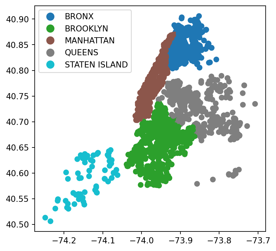
# Converts timestamps into strings for JSON serialization
rodent_geo['created_date'] = rodent_geo['created_date'].astype(str)
rodent_geo['closed_date'] = rodent_geo['closed_date'].astype(str)
map = rodent_geo.explore(column='borough', legend=True)
mapMake this Notebook Trusted to load map: File -> Trust Notebook
Tips in using this map - Due to the length of information shown in ‘resolution_description’, and the amount of total columns, the information are hard to be shown fully and clearly.
Please drag the google map to keep the coordinates at the left side of the google map, so that the information could be shown on the right side.
In this case, the information shown could be more readable and organized.
7.3.9 References
For more information see the following:
- Plotly Basic Charts
- Plotnine Tutorial
- GeoPandas Documentation
- NYC Borough Data
- NYC Zip Code Data