import numpy as np
import pandas as pd
from sklearn.datasets import fetch_california_housing
from sklearn.ensemble import GradientBoostingRegressor
from sklearn.model_selection import train_test_split
from sklearn.metrics import mean_squared_error

# Load data
housing = fetch_california_housing(as_frame=True)
X, y = housing.data, housing.target9 Supervised Learning
9.1 Decision Trees: Foundation
Decision trees are widely used supervised learning models that predict the value of a target variable by iteratively splitting the dataset based on decision rules derived from input features. The model functions as a piecewise constant approximation of the target function, producing clear, interpretable rules that are easily visualized and analyzed (Breiman et al., 1984). Decision trees are fundamental in both classification and regression tasks, serving as the building blocks for more advanced ensemble models such as Random Forests and Gradient Boosting Machines.
9.1.1 Algorithm Formulation
The core mechanism of a decision tree algorithm is the identification of optimal splits that partition the data into subsets that are increasingly homogeneous with respect to the target variable. At any node \(m\), the data subset is denoted as \(Q_m\) with a sample size of \(n_m\). The objective is to find a candidate split \(\theta\), defined as a threshold for a given feature, that minimizes an impurity or loss measure \(H\).
When a split is made at node \(m\), the data is divided into two subsets: \(Q_{m,l}\) (left node) with sample size \(n_{m,l}\), and \(Q_{m,r}\) (right node) with sample size \(n_{m,r}\). The split quality, measured by \(G(Q_m, \theta)\), is given by:
\[ G(Q_m, \theta) = \frac{n_{m,l}}{n_m} H(Q_{m,l}(\theta)) + \frac{n_{m,r}}{n_m} H(Q_{m,r}(\theta)). \]
The algorithm aims to identify the split that minimizes the impurity:
\[ \theta^* = \arg\min_{\theta} G(Q_m, \theta). \]
This process is applied recursively at each child node until a stopping condition is met.
- Stopping Criteria: The algorithm stops when the maximum tree depth is reached or when the node sample size falls below a preset threshold.
- Pruning: Reduce the complexity of the final tree by removing branches that add little predictive value. This reduces overfitting and improves the generalization accuracy of the model.
9.1.2 Search Space for Possible Splits
At each node in the decision tree, the search space for possible splits comprises all features in the dataset and potential thresholds derived from the values of each feature. For a given feature, the algorithm considers each unique value in the current node’s subset as a possible split point. The potential thresholds are typically set as midpoints between consecutive unique values, ensuring the data is partitioned effectively.
Formally, let the feature set be \(\{X_1, X_2, \ldots, X_p\}\), where \(p\) is the total number of features, and let the unique values of feature \(X_j\) at node \(m\) be denoted by \(\{v_{j,1}, v_{j,2}, \ldots, v_{j,k_j}\}\). The search space at node \(m\) includes:
- Feature candidates: \(\{X_1, X_2, \ldots, X_p\}\).
- Threshold candidates for \(X_j\): \[ \left\{ \frac{v_{j,i} + v_{j,i+1}}{2} \mid 1 \leq i < k_j \right\}. \]
The search space therefore encompasses all combinations of features and their respective thresholds. While the complexity of this search can be substantial, particularly for high-dimensional data or features with numerous unique values, efficient algorithms use sorting and single-pass scanning techniques to mitigate the computational cost.
9.1.3 Metrics
9.1.3.1 Classification
In decision tree classification, several criteria can be used to measure the quality of a split at each node. These criteria are based on how “pure” the resulting nodes are after the split. A pure node contains samples that predominantly belong to a single class. The goal is to minimize impurity, leading to nodes that are as homogeneous as possible.
Gini Index: The Gini index measures the impurity of a node by calculating the probability of randomly choosing two different classes. A perfect split (all instances belong to one class) has a Gini index of 0. At node \(m\), the Gini index is \[ H(Q_m) = \sum_{k=1}^{K} p_{mk} (1 - p_{mk}), \] where \(p_{mk}\) is the proportion of samples of class \(k\) at node \(m\); and\(K\) is the total number of classes The Gini index is often preferred for its speed and simplicity, and it’s used by default in many implementations of decision trees, including
sklearn.Entropy (Information Gain): Entropy is another measure of impurity, derived from information theory. It quantifies the “disorder” of the data at a node. Lower entropy means higher purity. At node \(m\), it is defined as \[ H(Q_m) = - \sum_{k=1}^{K} p_{mk} \log p_{mk} \] Entropy is commonly used in decision tree algorithms like ID3 and C4.5. The choice between Gini and entropy often depends on specific use cases, but both perform similarly in practice.
Misclassification Error: Misclassification error focuses solely on the most frequent class in the node. It measures the proportion of samples that do not belong to the majority class. Although less sensitive than Gini and entropy, it can be useful for classification when simplicity is preferred. At node \(m\), it is defined as \[ H(Q_m) = 1 - \max_k p_{mk}, \] where \(\max_k p_{mk}\) is the largest proportion of samples belonging to any class \(k\).
9.1.3.2 Regression Criteria
In decision tree regression, different criteria are used to assess the quality of a split. The goal is to minimize the spread or variance of the target variable within each node.
Mean Squared Error (MSE): Mean squared error is the most common criterion used in regression trees. It measures the average squared difference between the actual values and the predicted values (mean of the target in the node). The smaller the MSE, the better the fit. At node \(m\), it is \[ H(Q_m) = \frac{1}{n_m} \sum_{i=1}^{n_m} (y_i - \bar{y}_m)^2, \] where
- \(y_i\) is the actual value for sample \(i\);
- \(\bar{y}_m\) is the mean value of the target at node \(m\);
- \(n_m\) is the number of samples at node \(m\).
MSE works well when the target is continuous and normally distributed.
Half Poisson Deviance (for count targets): When dealing with count data, the Poisson deviance is used to model the variance in the number of occurrences of an event. It is well-suited for target variables representing counts (e.g., number of occurrences of an event). At node \(m\), it is \[ H(Q_m) = \sum_{i=1}^{n_m} \left( y_i \log\left(\frac{y_i}{\hat{y}_i}\right) - (y_i - \hat{y}_i) \right), \] where \(\hat{y}_i\) is the predicted count. This criterion is especially useful when the target variable represents discrete counts, such as predicting the number of occurrences of an event.
Mean Absolute Error (MAE): Mean absolute error is another criterion that minimizes the absolute differences between actual and predicted values. While it is more robust to outliers than MSE, it is slower computationally due to the lack of a closed-form solution for minimization. At node \(m\), it is \[ H(Q_m) = \frac{1}{n_m} \sum_{i=1}^{n_m} |y_i - \bar{y}_m|. \] MAE is useful when you want to minimize large deviations and can be more robust in cases where outliers are present in the data.
9.1.3.3 Summary
In decision trees, the choice of splitting criterion depends on the type of task (classification or regression) and the nature of the data. For classification tasks, the Gini index and entropy are the most commonly used, with Gini offering simplicity and speed, and entropy providing a more theoretically grounded approach. Misclassification error can be used for simpler cases. For regression tasks, MSE is the most popular choice, but Poisson deviance and MAE are useful for specific use cases such as count data and robust models, respectively.
9.2 Gradient-Boosted Models
Gradient boosting is a powerful ensemble technique in machine learning that combines multiple weak learners into a strong predictive model. Unlike bagging methods, which train models independently, gradient boosting fits models sequentially, with each new model correcting errors made by the previous ensemble (Friedman, 2001). While decision trees are commonly used as weak learners, gradient boosting can be generalized to other base models. This iterative method optimizes a specified loss function by repeatedly adding models designed to reduce residual errors.
9.2.1 Introduction
Gradient boosting builds on the general concept of boosting, aiming to construct a strong predictor from an ensemble of sequentially trained weak learners. The weak learners are often shallow decision trees (stumps), linear models, or generalized additive models (Hastie et al., 2009). Each iteration adds a new learner focusing primarily on the data points poorly predicted by the existing ensemble, thereby progressively enhancing predictive accuracy.
Gradient boosting’s effectiveness stems from:
- Error Correction: Each iteration specifically targets previous errors, refining predictive accuracy.
- Weighted Learning: Iteratively focuses more heavily on difficult-to-predict data points.
- Flexibility: Capable of handling diverse loss functions and various types of predictive tasks.
The effectiveness of gradient-boosted models has made them popular across diverse tasks, including classification, regression, and ranking. Gradient boosting forms the foundation for algorithms such as XGBoost (Chen & Guestrin, 2016), LightGBM (Ke et al., 2017), and CatBoost (Prokhorenkova et al., 2018), known for their high performance and scalability.
9.2.2 Gradient Boosting Process
Gradient boosting builds an ensemble by iteratively minimizing the residual errors from previous models. This iterative approach optimizes a loss function, \(L(y, F(x))\), where \(y\) represents the observed target variable and \(F(x)\) the model’s prediction for a given feature vector \(x\).
Key concepts:
- Loss Function: Guides model optimization, such as squared error for regression or logistic loss for classification.
- Learning Rate: Controls incremental updates, balancing training speed and generalization.
- Regularization: Reduces overfitting through tree depth limitation, subsampling, and L1/L2 penalties.
9.2.2.1 Model Iteration
The gradient boosting algorithm proceeds as follows:
Initialization: Define a base model \(F_0(x)\), typically the mean of the target variable for regression or the log-odds for classification.
Iterative Boosting: At each iteration \(m\):
Compute pseudo-residuals representing the negative gradient of the loss function at the current predictions. For each observation \(i\): \[ r_i^{(m)} = -\left.\frac{\partial L(y_i, F(x_i))}{\partial F(x_i)}\right|_{F(x)=F_{m-1}(x)}, \] where \(x_i\) and \(y_i\) denote the feature vector and observed value for the \(i\)-th observation, respectively.
Fit a new weak learner \(h_m(x)\) to these residuals.
Update the model: \[ F_m(x) = F_{m-1}(x) + \eta \, h_m(x), \] where \(\eta\) is a small positive learning rate (e.g., 0.01–0.1), controlling incremental improvement and reducing overfitting.
Final Model: After \(M\) iterations, the ensemble model is: \[ F_M(x) = F_0(x) + \sum_{m=1}^M \eta \, h_m(x). \]
Stochastic gradient boosting is a variant that enhances gradient boosting by introducing randomness through subsampling at each iteration, selecting a random fraction of data points (typically 50%–80%) to fit the model (Friedman, 2002). This randomness helps reduce correlation among trees, improve model robustness, and reduce the risk of overfitting.
9.2.3 Demonstration
Here’s a practical example using scikit-learn to demonstrate gradient boosting on the California housing dataset. First, import necessary libraries and load the data:
Next, split the dataset into training and testing sets:
# Train-test split
X_train, X_test, y_train, y_test = train_test_split(
    X, y, test_size=0.2, random_state=20250407
)
Then, set up and train a stochastic gradient boosting model:
# Gradient Boosting Model with stochastic subsampling
gbm = GradientBoostingRegressor(
    n_estimators=200,
    learning_rate=0.1,
    max_depth=3,
    subsample=0.7,  # stochastic gradient boosting
    random_state=20250408
)

gbm.fit(X_train, y_train)
GradientBoostingRegressor(n_estimators=200, random_state=20250408,
subsample=0.7)In a Jupyter environment, please rerun this cell to show the HTML representation or trust the notebook. On GitHub, the HTML representation is unable to render, please try loading this page with nbviewer.org.
GradientBoostingRegressor(n_estimators=200, random_state=20250408,
subsample=0.7)Finally, make predictions and evaluate the model performance:
# Predictions
y_pred = gbm.predict(X_test)

# Evaluate
mse = mean_squared_error(y_test, y_pred)
print(f"Test MSE: {mse:.4f}")
Test MSE: 0.26979.2.4 XGBoost: Extreme Gradient Boosting
XGBoost is a scalable and efficient implementation of gradient-boosted decision trees (Chen & Guestrin, 2016). It has become one of the most widely used machine learning methods for structured data due to its high predictive performance, regularization capabilities, and speed. XGBoost builds an ensemble of decision trees in a stage-wise fashion, minimizing a regularized objective that balances training loss and model complexity.
The core idea of XGBoost is to fit each new tree to the gradient of the loss function with respect to the model’s predictions. Unlike traditional boosting algorithms like AdaBoost, which use only first-order gradients, XGBoost optionally uses second-order derivatives (Hessians), enabling better convergence and stability (Friedman, 2001).
XGBoost is widely used in data science competitions and real-world applications. It supports regularization (L1 and L2), handles missing values internally, and is designed for distributed computing.
XGBoost builds upon the same foundational idea as gradient boosted machines—sequentially adding trees to improve the predictive model— but introduces a number of enhancements:
| Aspect | Traditional GBM | XGBoost |
|---|---|---|
| Implementation | Basic gradient boosting | Optimized, regularized boosting |
| Regularization | Shrinkage only | L1 and L2 regularization |
| Loss Optimization | First-order gradients | First- and second-order |
| Missing Data | Requires manual imputation | Handled automatically |
| Tree Construction | Depth-wise | Level-wise (faster) |
| Parallelization | Limited | Built-in |
| Sparsity Handling | No | Yes |
| Objective Functions | Few options | Custom supported |
| Cross-validation | External via GridSearchCV |
Built-in xgb.cv |
XGBoost is therefore more suitable for large-scale problems and provides better generalization performance in many practical tasks.
9.3 Variable Importance Metrics in Supervised Learning
This section was written by Xavier Febles, a junior majoring in Statistical Data Science at the University of Connecticut.
This section explores different methods for interpreting machine learning models in Python. We’ll use scikit-learn to train models and calculate feature importances through Gini importance from Random Forests, Permutation importance for evaluating the effect of shuffling features, and Lasso regression to observe how regularization impacts feature coefficients. We’ll also use pandas for data handling and SHAP for visualizing global and local model explanations, helping us better understand feature contributions and interactions in our models.
9.3.1 Introduction
Variable importance metrics help measure the contribution of each feature in predicting the target variable. These metrics improve model interpretability, assist in feature selection, and enhance performance.
9.3.1.1 Topics Covered:
- Gini Importance (Tree-based models)
- Permutation Importance (Model-agnostic)
- Regularization (Lasso)
- SHAP (Shapley Additive Explanations)
9.3.1.2 What are Variable Importance Metrics?
Variable importance metrics assess how much each feature contributes to the prediction outcome in supervised learning tasks.
9.3.1.3 Types of Variable Importance Metrics
- Tree-based methods: e.g., Gini Importance
- Ensemble models: e.g., Random Forest
- Linear models: e.g., Regularization (Lasso, Ridge)
- Model-agnostic methods: e.g., Permutation Importance, SHAP
9.3.2 Gini Importance
Gini Importance measures the mean decrease in impurity from splits using a feature. Higher values indicate greater influence on predictions. It is calculated based on how much a feature contributes to reducing uncertainty at each split in the decision trees.
from sklearn.ensemble import RandomForestClassifier
import pandas as pd
import numpy as np
from sklearn.model_selection import train_test_split
from sklearn.datasets import make_classification

# Simulate dataset
X, y = make_classification(n_samples=1000, n_features=10, n_informative=5, random_state=42)
X = pd.DataFrame(X, columns=[f'feature_{i}' for i in range(1, 11)])

# Split dataset
X_train, X_test, y_train, y_test = train_test_split(X, y, test_size=0.2, random_state=42)

# Train model
rf = RandomForestClassifier(random_state=42)
rf.fit(X_train, y_train)

# Gini importance
df_gini = pd.DataFrame({
    'feature': X_train.columns,
    'gini_importance': rf.feature_importances_
}).sort_values(by='gini_importance', ascending=False)

print(df_gini)
feature gini_importance
4 feature_5 0.206109
9 feature_10 0.167711
0 feature_1 0.159516
5 feature_6 0.143680
3 feature_4 0.120340
6 feature_7 0.069936
1 feature_2 0.065147
8 feature_9 0.025048
2 feature_3 0.021608
7 feature_8 0.020905A classification dataset was simulated with 1,000 samples and 10 features. The data was split into training and testing sets, using an 80/20 split. A Random Forest Classifier was trained on the training data to build the model. Gini importance was then calculated for each feature to understand their contribution to the model’s decisions.
The output ranks the features by their importance scores, showing that feature_5, feature_10, and feature_1 are the top three most influential features. Feature_5 has the highest importance, indicating it plays the largest role in predicting the target variable in this simulated dataset.
9.3.3 Permutation Importance
Permutation Importance measures the drop in model performance after shuffling a feature. Positive values suggest that these features contribute positively to the model, while negative values indicate they may harm performance.
The standard deviation of Permutation Importance shows the variability in each feature’s importance score.
import pandas as pd
import numpy as np
from sklearn.ensemble import RandomForestClassifier
from sklearn.model_selection import train_test_split
from sklearn.datasets import make_classification
from sklearn.inspection import permutation_importance

# Simulate a dataset
X, y = make_classification(n_samples=1000, n_features=10, n_informative=5, random_state=42)

# Convert to a DataFrame for easier handling
X = pd.DataFrame(X, columns=[f'feature_{i}' for i in range(1, 11)])

# Split the dataset into training and testing sets
X_train, X_test, y_train, y_test = train_test_split(X, y, test_size=0.2, random_state=42)

# Fit a RandomForest model
rf = RandomForestClassifier(random_state=42)
rf.fit(X_train, y_train)

# Get Permutation Importance
perm_importance = permutation_importance(rf, X_test, y_test, random_state=42)

# Create a DataFrame to display the results
df_perm = pd.DataFrame({
    'feature': X_test.columns,
    'permutation_importance_mean': perm_importance.importances_mean,
    'permutation_importance_std': perm_importance.importances_std
}).sort_values(by='permutation_importance_mean', ascending=False)

# Display the feature importances
print(df_perm)
feature permutation_importance_mean permutation_importance_std
4 feature_5 0.185 0.028810
5 feature_6 0.110 0.019748
0 feature_1 0.096 0.028531
9 feature_10 0.035 0.013038
3 feature_4 0.025 0.011402
1 feature_2 0.007 0.002449
6 feature_7 -0.002 0.006782
8 feature_9 -0.003 0.002449
7 feature_8 -0.007 0.006000
2 feature_3 -0.008 0.004000This code demonstrates how to compute Permutation Importance using a RandomForest model. It starts by generating a synthetic dataset with 1,000 samples and 10 features, of which 5 are informative. The dataset is split into training and testing sets. A RandomForestClassifier is trained on the training data, and then the permutation importance is calculated on the test set. The permutation importance measures how much the model’s accuracy drops when the values of each feature are randomly shuffled, thus breaking the relationship between the feature and the target. Finally, the results are stored in a DataFrame and sorted by importance.
The output is a table listing each feature along with its mean and standard deviation of permutation importance. Higher mean values indicate that shuffling the feature leads to a larger drop in model performance, meaning the feature is important for predictions. For example, feature_5 has the highest importance, while features with negative values like feature_3 and feature_8 may contribute noise or have little predictive power.
9.3.4 Regularization (Lasso)
Regularization techniques shrink the coefficients to reduce overfitting. Lasso, in particular, drives some coefficients to zero, promoting feature selection. By doing so, it simplifies the model and helps improve interpretability, especially when dealing with high-dimensional data.
import pandas as pd
import numpy as np
from sklearn.linear_model import Lasso
from sklearn.model_selection import train_test_split
from sklearn.datasets import make_regression

# Simulate a dataset
X, y = make_regression(n_samples=1000, n_features=10, n_informative=5, noise=0.1, random_state=42)

# Convert to a DataFrame for easier handling
X = pd.DataFrame(X, columns=[f'feature_{i}' for i in range(1, 11)])

# Split the dataset into training and testing sets
X_train, X_test, y_train, y_test = train_test_split(X, y, test_size=0.2, random_state=42)

# Fit a Lasso model
lasso = Lasso(alpha=0.05, random_state=42)
lasso.fit(X_train, y_train)

# Get Lasso coefficients
coefficients = lasso.coef_

# Create a DataFrame to display the results
df_lasso = pd.DataFrame({
    'feature': X_train.columns,
    'lasso_coefficient': coefficients
}).sort_values(by='lasso_coefficient', ascending=False)

# Display the coefficients
print(df_lasso)
feature lasso_coefficient
0 feature_1 58.243886
3 feature_4 32.080140
6 feature_7 10.253066
9 feature_10 9.377729
4 feature_5 7.121199
1 feature_2 -0.000000
5 feature_6 0.000000
2 feature_3 -0.000000
7 feature_8 -0.000000
8 feature_9 -0.000000This code uses Lasso regression for feature selection. It starts by creating a simulated dataset with 1,000 samples and 10 features, where 5 features are informative. The features are stored in a pandas DataFrame, and the data is split into training and testing sets. A Lasso model is set up with alpha 0.05, which controls how strongly the model penalizes large coefficients. The model is trained on the training data, and the resulting coefficients for each feature are extracted. These coefficients are then stored in a DataFrame and sorted to show which features have the most impact on the predictions.
The output lists each feature and its Lasso coefficient. Features with non-zero coefficients, like feature_1 and feature_4, are identified as important for the model. Features with coefficients of zero, such as feature_3 and feature_6, are excluded from the model. This shows how Lasso helps simplify the model by shrinking unimportant feature coefficients to zero, making it easier to interpret and reducing overfitting.
9.3.5 SHAP: Introduction
9.3.5.1 What is SHAP (SHAPley Additive Explanations)?
SHAP is based on Shapley values from game theory. The goal is to fairly distribute the contribution of each feature to a prediction. SHAP is model agnostic, so it works with Linear models, Tree-based models, Deep learning models
9.3.5.2 Why SHAP?
- Consistency – If a feature increases model performance, SHAP assigns it a higher value.
- Local accuracy – SHAP values sum to the exact model prediction.
- Handles feature interactions better than other methods.
9.3.6 SHAP: Mathematics Behind It
The Shapley value equation is:
φᵢ = the sum over all subsets S of N excluding i of (|S|! × (|N| − |S| − 1)! ÷ |N|!) times [f(S ∪ {i}) − f(S)].
Where:
S = subset of features N = total number of features f(S) = model output for subset ϕᵢ = contribution of feature i
Essentially SHAP values compute the marginal contribution of a feature averaged over all possible feature combinations. The sum of all SHAP values equals the model’s total prediction.
9.3.7 Installing SHAP
To install SHAP, run:
pip install shap
Make sure your NumPy version is 2.1 or lower for compatibility.
You also need to have Microsoft C++ Build Tools installed.
9.3.8 SHAP Visualizations
The shap package allows for for 3 main types of plots.
shap.summary_plot(shap_values, X_test) This creates a global summary plot of feature importance. shap_values contains the SHAP values for all predictions, showing how features impact the model output. X_test provides the feature data. Each dot in the plot represents a feature’s impact for one instance, with color showing feature value. This helps identify the most influential features overall.
shap.dependence_plot('variable_name', shap_values, X_test, interaction_index) This shows the relationship between a single feature and its SHAP value. The string 'variable_name' selects the feature to plot. shap_values provides the SHAP values, while X_test supplies feature data. The interaction_index controls which feature’s value is used for coloring, highlighting potential feature interactions.
shap.plots.force(shap_values[index]) This creates a force plot to explain an individual prediction. shap_values[index] selects the SHAP values for one specific instance. The plot visualizes how each feature contributes to pushing the prediction higher or lower, providing an intuitive breakdown of that decision.
Important note: This will not be included in the code as it requires being saved separately in html or Jupyter Notebook format.
9.3.8.1 Example of SHAP
For this example we will be using the built in sklearn diabetes dataset.
A quick summary of each varaible:
- age — Age of the patient
- sex — Sex of the patient
- bmi — Body Mass Index
- bp — Blood pressure
- s1 — T-cell count
- s2 — LDL cholesterol
- s3 — HDL cholesterol
- s4 — Total cholesterol
- s5 — Serum triglycerides (blood sugar proxy)
- s6 — Blood sugar level
9.3.8.2 SHAP Code using Linear Model
import shap
import sklearn
from sklearn.datasets import load_diabetes
from sklearn.linear_model import LinearRegression
from sklearn.model_selection import train_test_split
import matplotlib.pyplot as plt

# Load dataset
X, y = load_diabetes(return_X_y=True, as_frame=True)

# Split data
X_train, X_test, y_train, y_test = train_test_split(X, y, test_size=0.2, random_state=42)

# Fit linear regression model
model = LinearRegression()
model.fit(X_train, y_train)

# Create the SHAP explainer with the masker
explainer = shap.Explainer(model, X_train)
shap_values = explainer(X_test)

# SHAP Summary Plot
shap.summary_plot(shap_values.values, X_test)

# SHAP Dependence Plot (example with 'bmi')
shap.dependence_plot('bmi', shap_values.values, X_test, interaction_index='bp')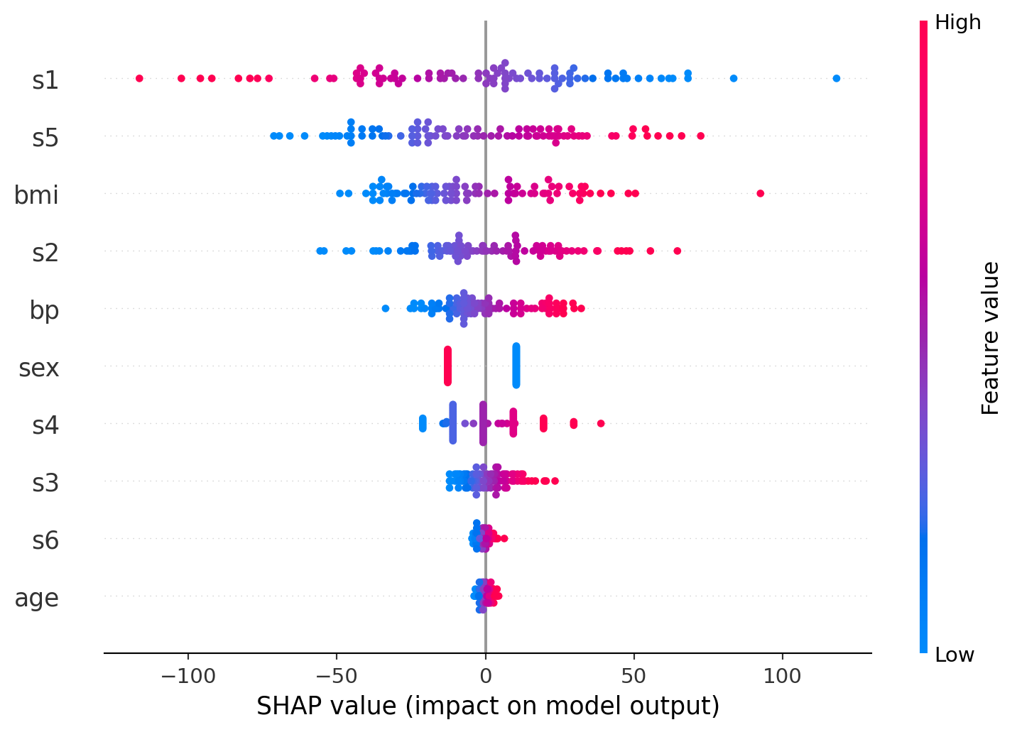
9.3.8.3 Explaining the code and output
explainer = shap.Explainer(model, X_train):
This initializes a SHAP explainer using the trained model and the training data (X_train). The explainer learns how the model makes predictions by seeing how it behaves on this data.X_trainacts as the masker, which helps SHAP understand the feature distribution when simulating the absence of a feature.shap_values = explainer(X_test):
This computes the SHAP values for the test data (X_test). The SHAP values show the contribution of each feature to every individual prediction in the test set.
The first plot is a SHAP summary plot that ranks the features by their overall importance to the model’s predictions. Features like s1, s5, and bmi show the greatest impact, meaning changes in these values most strongly influence the output. Each dot represents an individual data point, with color indicating the value of the feature (high in pink, low in blue). This helps show not only which features matter most but also how their value ranges affect the predictions.
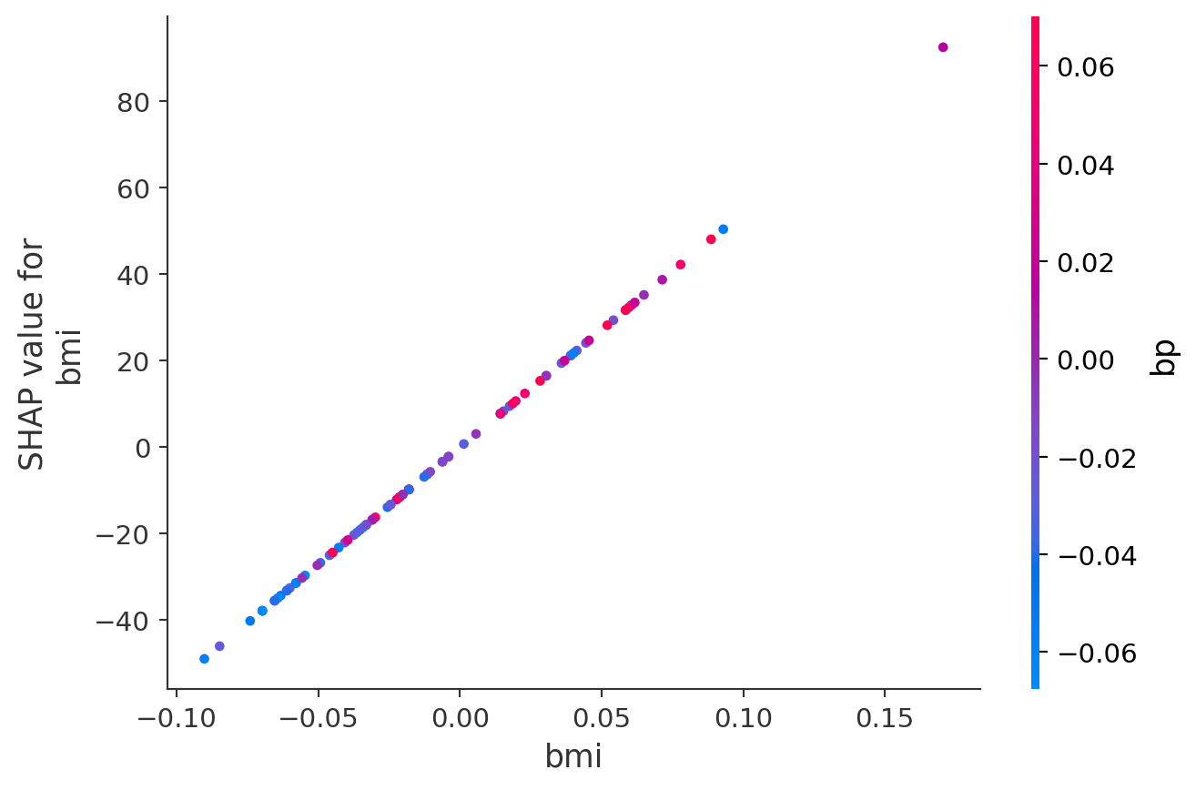
The second plot is a SHAP dependence plot focusing on bmi. It shows a clear positive relationship: as bmi increases, its contribution to the model prediction rises sharply. The color gradient represents blood pressure (bp), helping to illustrate how bmi interacts with bp in shaping the outcome. Higher bp values (pink) tend to cluster with higher bmi and higher SHAP values, suggesting a compounding effect.
9.3.8.4 Other SHAP functions
shap.TreeExplainer(model): Explains tree based modelsshap.DeepExplainer(model): Explains deep learning based models (works well with packages like tensorflow)
9.3.8.5 SHAP: Advantages and Challenges
Advantages: - Handles feature interactions. - Provides consistent and reliable explanations. - Works across different model types.
Challenges: - Computationally expensive for large datasets.This could mean that it will require approximation for complex models.
9.3.8.6 Pros and Cons of Each Method:
| Method | Pros | Cons |
|---|---|---|
| Gini Importance | Fast, easy to compute | Biased toward high- |
| cardinality features | ||
| Lasso | Performs feature selection | Sensitive to correlated |
| fast | features, assumes | |
| linearity | ||
| Permutation | Simple to compute | Affected by correlated |
| features | ||
| SHAP | Handles interactions, | Computationally expensive |
| consistent |
9.3.8.7 How Each Method Handles Feature Interactions:
| Method | Handles Interactions | Notes |
|---|---|---|
| Gini Importance | Indirectly | Captures splits based on |
| feature combinations | ||
| Permutation | Yes | Measures impact after |
| Importance | shuffling all features | |
| Lasso | No | Treats features |
| independently, assumes | ||
| linearity | ||
| SHAP | Yes | Captures interaction |
| effects explicitly |
9.3.8.8 When to Use Which Method
- Tree-based models: Use SHAP or permutation importance for better accuracy.
- Linear models: Coefficients and regularization for interpretability.
- Complex models: SHAP handles feature interactions better.
9.3.8.9 Recommended Strategy
- Start with permutation importance or Gini importance for quick insights.
- Use SHAP for deeper understanding and interaction effects.
- For linear models, regularization helps with feature selection.
9.3.9 Conclusion:
- Variable importance helps in understanding and improving models.
- SHAP provides the most consistent and interpretable results.
- Different methods work better depending on model type and complexity.
9.4 Explaining XGBoost Predictions with SHAP
This section is prepared by Yifei Chen. I am a junior student double majoring in Statistical Data Science and Economics.
9.4.1 Introduction
In this section, we explore how to interpret predictions made by XGBoost models using SHAP (SHapley Additive exPlanations). XGBoost is a powerful gradient boosting framework widely used for structured data tasks, but its predictions are often difficult to explain directly. SHAP offers a principled, game-theoretic approach to decompose each prediction into contributions from individual features.
9.4.2 What is SHAP?
SHAP is a model-agnostic method for interpreting machine learning models by quantifying the contribution of each feature to individual predictions.
- Based on game theory: Shapley values from cooperative games.
- Assigns each feature a “contribution” to the prediction.
- Works well with tree-based models (like XGBoost) using Tree SHAP algorithm.
- Local interpretability: Explaining a single prediction. (Why did the model predict this value for this instance?)
- Global interpretability: Understanding the model’s behavior across all predictions. (Which features are most important across the whole dataset?)
9.4.3 Simulated Airbnb Data
We start by simulating Airbnb listing data with four predictors: room type, borough, number of reviews, and availability. The target variable is price, which is a function of these inputs with added noise. This setup helps us evaluate SHAP against known relationships.
9.4.3.1 Importing Libraries
First, we import the necessary Python libraries: NumPy and Pandas.
import numpy as np
import pandas as pd
np.random.seed(1)
9.4.3.2 Creating the Base Dataset
We generate a dataset with 200 observations, randomly assigning values to room type, borough, number of reviews, and availability.
n = 200
df = pd.DataFrame({
    "room_type": np.random.choice(["Entire home", "Private room"], n),
    "borough": np.random.choice(["Manhattan", "Brooklyn", "Queens"], n),
    "number_of_reviews": np.random.poisson(20, n),
    "availability": np.random.randint(10, 365, n),
})
9.4.3.3 Defining Base Price Logic
We define the price based on room type, borough, and the number of reviews using a basic linear relationship.
df["price"] = (
    80
    + (df["room_type"] == "Entire home") * 60
    + (df["borough"] == "Manhattan") * 50
    + np.log1p(df["number_of_reviews"]) * 3
)
This formula increases the base price if the listing is an entire home or located in Manhattan, and slightly adjusts it based on the number of reviews.
9.4.3.4 Adding Nonlinear Effect of Availability
We introduce a nonlinear relationship between availability and price to reflect that listings available more days tend to be priced higher.
df["price"] += 0.02 * df["availability"] ** 1.59.4.3.5 Adding Interaction Effects
We add an interaction term that further boosts the price if a listing is both an entire home and located in Manhattan.
df["price"] += (
    ((df["room_type"] == "Entire home") &
     (df["borough"] == "Manhattan"))
    * 25
)
9.4.3.6 Adding Random Noise
Finally, we add normally distributed noise to simulate real-world variation in prices.
df["price"] += np.random.normal(0, 10, n)9.4.3.7 Viewing the First Few Rows
We display the first few rows of the simulated dataset
df.head()| room_type | borough | number_of_reviews | availability | price | |
|---|---|---|---|---|---|
| 0 | Private room | Manhattan | 20 | 95 | 150.343046 |
| 1 | Private room | Queens | 19 | 44 | 94.628590 |
| 2 | Entire home | Manhattan | 21 | 244 | 296.406151 |
| 3 | Entire home | Queens | 24 | 230 | 222.006869 |
| 4 | Private room | Brooklyn | 10 | 220 | 160.837083 |
9.4.4 Encode and Train XGBoost Model
We one-hot encode categorical variables and split the data into training and test sets. Then, we train an XGBoost regressor model.
9.4.4.1 Importing Libraries
First, we import the required libraries for modeling and evaluation.
from xgboost import XGBRegressor
import xgboost as xgb
from sklearn.model_selection import train_test_split, cross_val_score
from sklearn.metrics import mean_squared_error, r2_score
9.4.4.2 Preparing the Feature Matrix and Target Variable
We separate the predictors (X) and the outcome variable (y).
Categorical variables are one-hot encoded using pd.get_dummies, which transforms them into binary indicators.
X = pd.get_dummies(df.drop("price", axis=1), drop_first=True)
y = df["price"]
9.4.4.3 Splitting the Data
We split the dataset into a training set (80%) and a test set (20%) to evaluate model performance.
X_train, X_test, y_train, y_test = train_test_split(
    X, y, test_size=0.2, random_state=42
)
9.4.4.4 Training the XGBoost Regressor
We fit an XGBoost regressor with 100 trees (n_estimators=100), a learning rate of 0.1, and a maximum tree depth of 3 (max_depth=3).
These hyperparameters help balance model complexity and generalization.
model = XGBRegressor(n_estimators=100, learning_rate=0.1, max_depth=3)
model.fit(X_train, y_train)
XGBRegressor(base_score=None, booster=None, callbacks=None,
colsample_bylevel=None, colsample_bynode=None,
colsample_bytree=None, device=None, early_stopping_rounds=None,
enable_categorical=False, eval_metric=None, feature_types=None,
feature_weights=None, gamma=None, grow_policy=None,
importance_type=None, interaction_constraints=None,
learning_rate=0.1, max_bin=None, max_cat_threshold=None,
max_cat_to_onehot=None, max_delta_step=None, max_depth=3,
max_leaves=None, min_child_weight=None, missing=nan,
monotone_constraints=None, multi_strategy=None, n_estimators=100,
n_jobs=None, num_parallel_tree=None, ...)In a Jupyter environment, please rerun this cell to show the HTML representation or trust the notebook. On GitHub, the HTML representation is unable to render, please try loading this page with nbviewer.org.
XGBRegressor(base_score=None, booster=None, callbacks=None,
             colsample_bylevel=None, colsample_bynode=None,
             colsample_bytree=None, device=None, early_stopping_rounds=None,
             enable_categorical=False, eval_metric=None, feature_types=None,
             feature_weights=None, gamma=None, grow_policy=None,
             importance_type=None, interaction_constraints=None,
             learning_rate=0.1, max_bin=None, max_cat_threshold=None,
             max_cat_to_onehot=None, max_delta_step=None, max_depth=3,
             max_leaves=None, min_child_weight=None, missing=nan,
             monotone_constraints=None, multi_strategy=None, n_estimators=100,
n_jobs=None, num_parallel_tree=None, ...)9.4.4.5 Evaluating the Model
We predict on the test set and calculate evaluation metrics:
Root Mean Squared Error (RMSE) measures the typical size of prediction errors.
R-squared (R²) indicates the proportion of variance in the target variable that the model can explain.
preds = model.predict(X_test)
print("RMSE:", np.sqrt(mean_squared_error(y_test, preds)))
print("R^2:", r2_score(y_test, preds))
RMSE: 12.634626845730063
R^2: 0.9593441283227434After training XGBoost on our enhanced dataset with nonlinear and interaction terms, we achieved a Root Mean Squared Error (RMSE) of about $12.63, meaning on average, our model’s predictions are off by around $12.63 from the actual listing price.
And the model explains over 95.9% of the variation in prices (R² = 0.959), which indicates a very strong fit. This shows that XGBoost effectively captures the complex relationships we embedded in our simulated data — including the nonlinear availability effect and the interaction between room type and borough.
9.4.5 Compare XGBoost Feature Importance vs. SHAP
XGBoost has a built-in feature importance plot. It shows how often each feature is used for splitting, but doesn’t reflect how much a feature contributes to prediction outcomes. It’s useful, but not always reliable—so we turn to SHAP for deeper insight.
import matplotlib.pyplot as plt
xgb.plot_importance(model)
plt.title("XGBoost Feature Importance")
plt.show()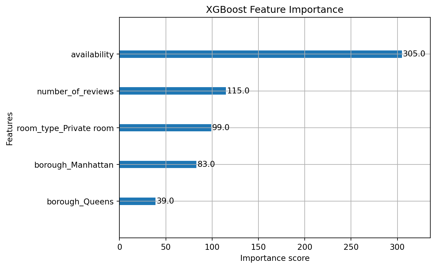
Interpretation:
This bar chart shows the built-in feature importance from XGBoost. It measures how frequently each feature is used to split nodes across all trees in the ensemble:
- Availability is the most frequently used feature, with over 300 splits, suggesting it plays a dominant role in decision making.
- Number of reviews and room_type_Private room are also influential.
- Borough variables (especially
borough_Manhattanandborough_Queens) are used less frequently.
But frequency ≠ influence
This method doesn’t tell us how much a feature contributes to raising or lowering predictions — just how often it’s used in splits.
9.4.6 SHAP: Global Feature Importance
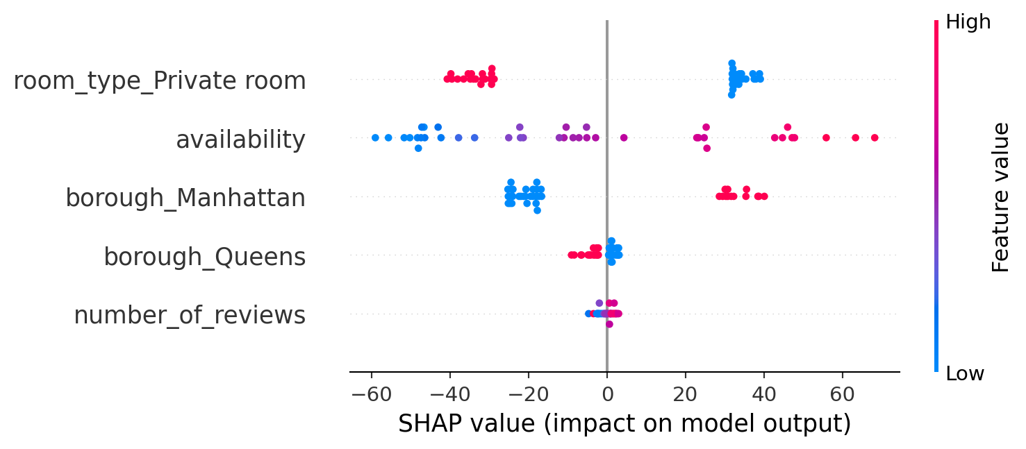
SHAP’s summary plot shows global feature importance. Each point represents a feature’s effect on a single prediction. Red indicates high feature values; blue is low. Here, ‘room_type_Entire home’ and ‘borough_Manhattan’ consistently drive price increases.
import shap
shap.initjs()
explainer = shap.Explainer(model)
shap_values = explainer(X_test)
shap.summary_plot(shap_values, X_test)
/var/folders/cq/5ysgnwfn7c3g0h46xyzvpj800000gn/T/ipykernel_3054/3575566828.py:5: FutureWarning:

The NumPy global RNG was seeded by calling `np.random.seed`. In a future version this function will no longer use the global RNG. Pass `rng` explicitly to opt-in to the new behaviour and silence this warning.
Interpretation:
This SHAP summary plot shows the impact of each feature on the model’s predictions, based on SHAP values:
- Each point represents a SHAP value for one observation.
- The position along the x-axis shows whether that feature pushed the prediction higher (right) or lower (left).
- The color represents the actual feature value:
- Red = high values
- Blue = low values
- Purple medium feature values
Listings associated with high values of room_type_Private room consistently lead to lower predicted prices. Higher availability, as indicated by red points, tends to raise the predicted price, whereas lower availability, shown in blue, typically decreases it. Being located in Manhattan, observed through the blue points on borough_Manhattan, significantly increases the predicted price. Similarly, a greater number of reviews generally results in slightly higher predicted prices, as reflected by the right-shifted red dots on number_of_reviews. Unlike XGBoost’s traditional frequency-based feature importance, SHAP provides a direct quantification of each feature’s contribution to individual predictions, offering a more nuanced and interpretable understanding of the model’s behavior.
9.4.7 SHAP Dependence Plot
This plot isolates the relationship between number of reviews and its contribution to predicted price. We observe diminishing returns—more reviews increase price up to a point, after which the effect stabilizes.
shap.dependence_plot("number_of_reviews", shap_values.values, X_test)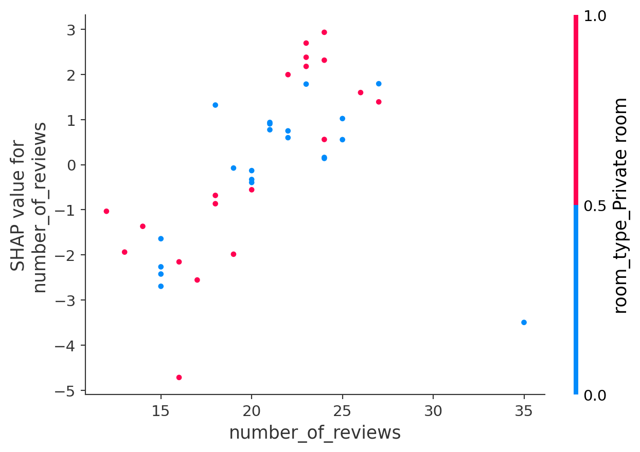
This SHAP dependence plot shows how the feature number_of_reviews affects the model’s predictions:
- The x-axis shows the actual number of reviews.
- The y-axis shows the SHAP value — the effect of that feature on the predicted price.
- Each point is a listing, and the color represents the value of another feature:
room_type_Private room(0 = blue, 1 = red).
As the number of reviews increases, the SHAP values generally rise, indicating that a greater number of reviews tends to lead to higher predicted prices. Listings with fewer reviews, concentrated on the left side of the plot, exhibit negative SHAP values, thereby lowering the price predictions. The color pattern suggests an interaction effect: while both room types can exhibit positive or negative influences, the distribution of SHAP values shifts slightly depending on the room type. Purple points represent medium feature values, illustrating how mid-range values influence predictions relative to more extreme values. Since room_type_Private room is a binary feature (0 or 1), most points are either red or blue. Overall, this dependence plot reveals an interaction between number_of_reviews and room_type_Private room, providing insight into how these two features jointly affect the model’s predictions.
9.4.8 SHAP Waterfall Plot
The waterfall plot explains one individual prediction by breaking it into base value + feature contributions. You can see which features pushed the price up or down—this is the kind of transparency stakeholders appreciate.
shap.plots.waterfall(shap_values[0])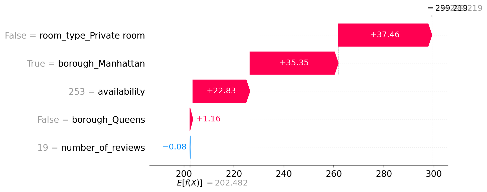
This SHAP waterfall plot explains a single prediction by showing how each feature contributed to moving the prediction away from the average.
- The model’s baseline prediction (expected value
E[f(X)]) is about 202.48, which is the average prediction across all data. - The final prediction for this listing is ~299.22.
- Each bar shows how a feature pushes the prediction up or down:
- Positive contributions (in red) increase the predicted price.
- Negative contributions (in blue) decrease it.
Feature impacts for this listing:
room_type_Private room = False(i.e., Entire home) adds +37.46borough_Manhattan = Trueadds +35.35availability = 253adds +22.83borough_Queens = Falseadds +1.16number_of_reviews = 19has a negligible negative effect (−0.08)
Together, these factors raise the predicted price from the baseline (~202) to about 299. This plot makes the model’s reasoning fully transparent for this specific example.
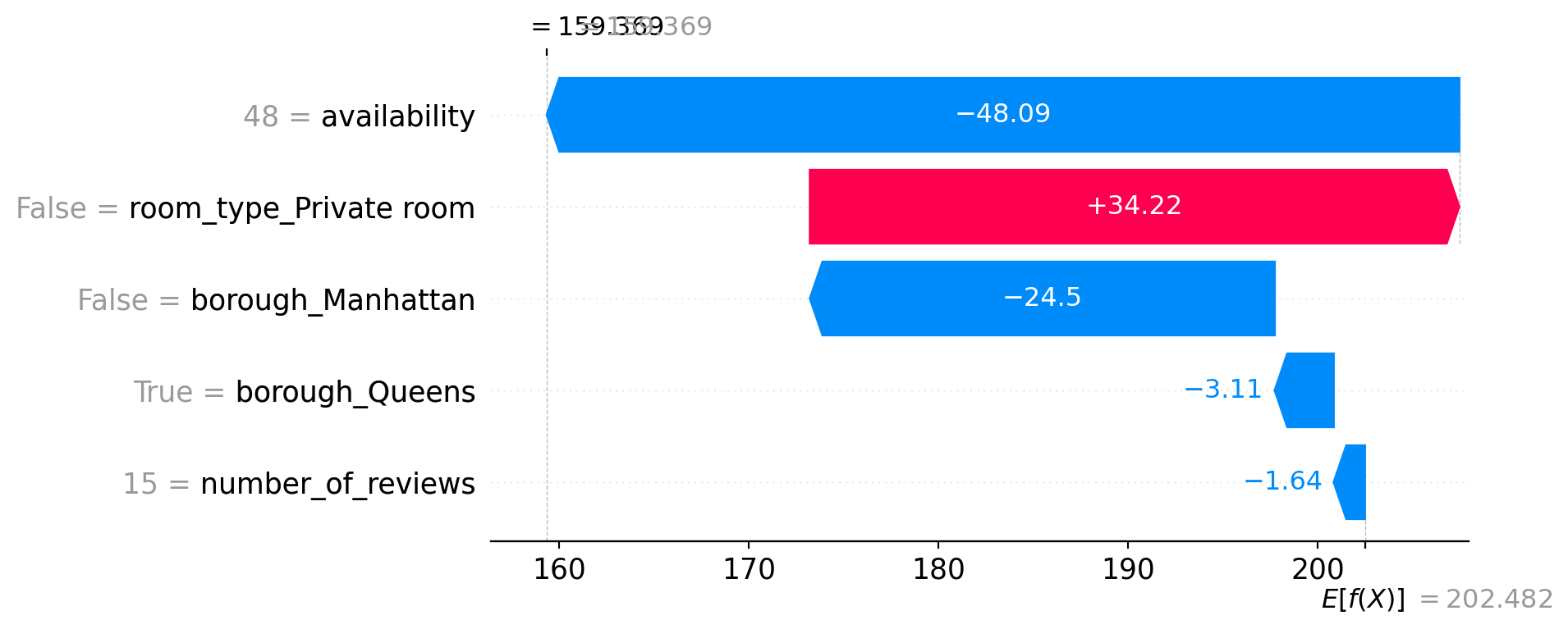
9.4.9 SHAP Waterfall Plots for Multiple Examples
We look at a few different listings to see how explanations change. For instance, this one might have a lower price due to being in Queens, while another might be higher due to being an entire home in Manhattan. SHAP helps compare these directly.
shap.plots.waterfall(shap_values[1])
shap.plots.waterfall(shap_values[2])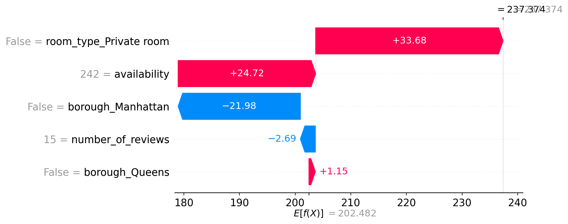
9.4.9.1 Example 1 – Final Prediction: 237.37
- The listing is not a private room (entire home), which increases the prediction by +33.68.
- High availability (242) contributes +24.72.
- It’s not in Manhattan, which reduces the price by −21.98.
- Fewer reviews (15) slightly reduce the prediction (−2.69).
- Not in Queens adds a small positive effect (+1.15).
Overall, the price is pulled up due to availability and room type, even though being outside Manhattan and having few reviews lowers it.
9.4.9.2 Example 2 – Final Prediction: 159.37
- This listing has low availability (48), which strongly reduces the price by −48.09.
- It’s not a private room (entire home), which adds +34.22.
- It’s not in Manhattan (−24.5) but is in Queens, which also slightly decreases the price (−3.11).
- The number of reviews is again low (15), slightly pulling the price down (−1.64).
Despite being an entire home, the extremely low availability and location drag the prediction far below average.
These examples highlight how SHAP provides transparent, instance-level reasoning for model predictions, allowing us to understand and trust the model’s decisions.
9.4.10 Real-World Use: Exporting SHAP Values
Here, we export SHAP values for each listing alongside the model’s predictions and true prices. These can feed into dashboards or reports—turning raw model output into business insights or decisions.
shap_df = pd.DataFrame(shap_values.values, columns=X_test.columns)
shap_df["prediction"] = model.predict(X_test)
shap_df["true_price"] = y_test.reset_index(drop=True)
shap_df.head()| number_of_reviews | availability | room_type_Private room | borough_Manhattan | borough_Queens | prediction | true_price | |
|---|---|---|---|---|---|---|---|
| 0 | -0.075032 | 22.834732 | 37.460049 | 35.352047 | 1.164263 | 299.218506 | 303.381871 |
| 1 | -2.692971 | 24.723129 | 33.684650 | -21.976707 | 1.153586 | 237.374176 | 217.884045 |
| 2 | -1.639472 | -48.089657 | 34.221230 | -24.496450 | -3.109193 | 159.368958 | 139.684180 |
| 3 | 1.993280 | -46.662403 | -31.141033 | -17.910049 | -6.507442 | 102.254799 | 103.821194 |
| 4 | 0.748187 | 63.279129 | 33.034374 | -18.868820 | -6.664352 | 274.011047 | 279.036104 |
This table shows exported SHAP values for each Airbnb listing, along with the model’s predicted price and the actual price. Each feature’s SHAP value represents how much it contributed to shifting the prediction up or down from the baseline. For example, in row 0, features like high availability, Manhattan location, and the fact that it’s not a private room all contributed to increasing the predicted price to $299.22, closely matching the true price of $303.38. This kind of output makes it easy to understand and explain individual predictions, which is especially useful for reports, dashboards, or stakeholder communication.
9.4.11 Limitations
- SHAP can be slow with very large datasets. SHAP calculations, especially for kernel-based models, require estimating the contribution of each feature across many possible coalitions of other features (like in cooperative game theory). This is computationally expensive for tree-based models, Tree SHAP is faster, but still non-trivial on large data.
- SHAP explanations may still require domain expertise. Even though SHAP provides clear numeric contributions, interpreting their meaning often depends on context. For example, a +20 SHAP value for availability means it increased the price prediction — but whether that’s reasonable or expected depends on domain knowledge (e.g., tourism demand, market saturation, etc.).
- SHAP explanations depend on model quality. SHAP values faithfully reflect the model’s internal logic — not the truth. If the model is biased, underfit, or overfit, the SHAP values will simply explain a flawed decision. Statistically, SHAP does not correct for omitted variable bias, endogeneity, or poor model specification — it merely reveals the mechanics of the trained model.
9.5 Random Forest
This section was prepared by Gaofei Zhang, a second year PhD student in Health Promotion Science. This section will primarily focus on what Random Forest is, why it matters, and how to apply it to real-world data. This section will cover the basic concepts and practical steps for using a Random Forest regressor. In our example, we predict the number of persons injured in NYC crashes by using accident attributes.
9.5.1 Introduction
9.5.1.1 What is Random Forest?
- Random Forest is a supervised ensemble learning method that builds multiple decision trees and combines their outputs to improve predictive performance and control overfitting.
- It is widely used for both classification and regression tasks due to its robustness and interpretability.
9.5.1.2 Conceptual Foundations
- Bootstrap Aggregating (Bagging)
- For each tree, sample the training set with replacement (bootstrapping).
- This creates diverse datasets so trees are uncorrelated.
- Random Feature Selection
- At each node, select a random subset of features when splitting.
- This further decorrelates trees, reducing variance.
- Aggregation of Predictions
- Classification: each tree votes; the majority class wins.
- Regression: average the outputs of all trees.
- Advantages
- Reduces overfitting compared to single trees.
- Provides feature importance metrics.
- Handles both numerical and categorical data well.
- Reduces overfitting compared to single trees.
- Limitations
- Computationally intensive for large forests.
- Model size can be large, affecting memory usage.
- Computationally intensive for large forests.
9.5.1.3 Random Forest Principles
- Ensemble Method
- Combines many decision trees.
- Randomness
- Bootstrap Sampling means each tree is trained on a random sample (with replacement) of the dataset.
- Random Feature Selection means at each split, only a subset of features is considered.
- Voting/Averaging means for classification, predictions are made by majority vote.
9.5.1.4 Parameter Tuning
- Key Parameters
n_estimators: Number of trees in the forest.max_depth: Maximum depth of each tree.max_features: Number of features to consider when looking for the best split.
- Tuning Process
- Using methods like GridSearchCV, one can search for the optimal combination of these parameters to improve performance.
- Justification
- Tuning these parameters can further reduce overfitting, improve generalization, and provide better insight into feature contributions.
9.5.2 Example: Demo Pipeline
- The first block reads the raw CSV into a DataFrame, converts the ‘CRASH TIME’ strings into datetime hours (coercing invalid formats to NaT), fills any missing hours with the median, and prints the resulting DataFrame shape.
import warnings
import pandas as pd
import numpy as np
from pathlib import Path
from sklearn.model_selection import train_test_split, GridSearchCV
from sklearn.ensemble import RandomForestRegressor
from sklearn.metrics import r2_score, mean_squared_error

# Define the path to the dataset dynamically so it works on any machine
BASE_DIR = Path.cwd()
DATA_FILE = BASE_DIR / "data" / \
    "nyccrashes_2024w0630_by20250212.csv"

df = pd.read_csv(DATA_FILE)
df["CRASH HOUR"] = pd.to_datetime(
    df["CRASH TIME"], format="%H:%M",
    errors="coerce"
).dt.hour
df["CRASH HOUR"] = df["CRASH HOUR"].fillna(df["CRASH HOUR"].median())
print("Loaded data shape:", df.shape)
Loaded data shape: (1876, 30)In this result, we can see the datashape.
The second block sample a smaller fraction for quick demo. To reduce runtime while illustrating the pipeline, we randomly sample 10% of rows. This keeps the demo fast but still representative.
df = df.sample(frac=0.1, random_state=42)
print("Sampled data shape:", df.shape)
Sampled data shape: (188, 30)In this result, we can see the datashape of the smaller fraction for quick demo.
The third block is about feature engineering. Here we drop any records missing BOROUGH or ZIP CODE, standardize those columns as uppercase strings, one-hot encode them, then combine with numeric features (LATITUDE, LONGITUDE, CRASH HOUR) into X, and extract y.
df = df.dropna(subset=["BOROUGH", "ZIP CODE"]).copy()
df["BOROUGH"] = df["BOROUGH"].str.upper()
df["ZIP CODE"] = df["ZIP CODE"].astype(int).astype(str)

cats = pd.get_dummies(
    df[["BOROUGH", "ZIP CODE"]], drop_first=True
)
nums = df[["LATITUDE", "LONGITUDE", "CRASH HOUR"]]
X = pd.concat([cats, nums], axis=1)
y = pd.to_numeric(
    df["NUMBER OF PERSONS INJURED"],
    errors="coerce"
).fillna(0)
print("Features shape:", X.shape)
Features shape: (131, 83)In this result, we can see that the feature shape.
The fourth block is about train/test split. We split X and y into training (70%) and testing (30%) subsets. This allows us to train on one portion and evaluate generalization on the held-out test set.
X_train, X_test, y_train, y_test = train_test_split(
    X, y, test_size=0.3, random_state=42
)
print("Train set shape:", X_train.shape)
print("Test set shape: ", X_test.shape)
Train set shape: (91, 83)
Test set shape: (40, 83)In this results, we can see the train set shape and the test set shape.
The final block is about hyperparameter tuning and training. We define a tiny hyperparameter grid, run a 3-fold GridSearchCV for R², print the best params and CV score, then evaluate on the test set (R² and MSE).
param_grid = {
    "n_estimators": [100],
    "max_depth": [10],
    "max_features": ["sqrt"]
}
rf = RandomForestRegressor(random_state=42)
gs = GridSearchCV(
    rf, param_grid, cv=3, n_jobs=1, scoring="r2"
)
gs.fit(X_train, y_train)
print("Best params:", gs.best_params_)
print("CV R²:     ", gs.best_score_)

y_pred = gs.best_estimator_.predict(X_test)
print("Test R²:   ", r2_score(y_test, y_pred))
print("Test MSE:  ", mean_squared_error(y_test, y_pred))
Best params: {'max_depth': 10, 'max_features': 'sqrt', 'n_estimators': 100}
CV R²: -0.19362463563938928
Test R²: -0.02201729816294029
Test MSE: 3.2474599649127427- In this results, we can see the best parameters, CV R sqaure, test R sqaure and test MSE.
9.5.3 Key Takeaways
Random Forest is an intuitive yet powerful ensemble learning method that builds many decision trees and combines their predictions to achieve more accurate and stable results than any single tree. By training each tree on a different random subset of the data (bootstrapping) and considering only a random subset of features when splitting (feature bagging), Random Forest reduces overfitting and variance, making it robust to noisy data. It handles both numerical and categorical inputs without extensive preprocessing, automatically ranks feature importance to help you understand which variables matter most, and can be applied to both regression and classification tasks. Even with minimal tuning, a Random Forest often delivers strong out-of-the-box performance, and its results are easy to interpret: you can inspect how changing parameters like the number of trees (n_estimators), tree depth (max_depth), and features per split (max_features) affects model bias and variance. As a result, Random Forest provides a reliable, user-friendly “black-box” that offers transparent insights into complex datasets—ideal for newcomers and experts alike looking for a balance between predictive power and interpretability.
9.5.4 Further Readings
9.6 Support Vector Machine(SVM)
This section has been prepared by Shubhan Tamhane, a sophmore majoring in Statistical Data Science and minoring in Financial Analysis at the University of Connecticut. This section will primarily focus on the ins and outs of the popular supervised machine learning algorithim, Support Vector Machine. There will also be a brief demonstration using the MNIST dataset for image classification.
9.6.1 Introduction
What is SVM?
- SVM is a supervised machine learning algorhithm that is used mainly for classification tasks
- It works well in high dimensional spaces and makes a clear decision boundry between groups
Core Idea
- SVM works by finding the best boundry (Hyperplane) that seperates the data into classes
- It chooses a hyperplane with the maximum margin, the widest gap between the classes
- The closest points to the boundry are called support vectors
9.6.2 Example 1
Code to set up original
import numpy as np
import matplotlib.pyplot as plt
X_class0 = np.array([-4, -3, -2])
X_class1 = np.array([2, 3, 4])
support_vectors = np.array([-1.5, 2])
X_all = np.concatenate([X_class0, X_class1, support_vectors])

y_all = np.array([0]*3 + [1]*3 + [0, 1])

plt.figure(figsize=(10, 2))
plt.scatter(X_class0, np.zeros_like(X_class0), color='blue', s=100,
label='Class 0')
plt.scatter(X_class1, np.zeros_like(X_class1), color='red', s=100,
label='Class 1')
plt.scatter(support_vectors, np.zeros_like(support_vectors),
            facecolors='none', edgecolors='green', s=200,
            linewidths=2, label='Support Vectors')

plt.axvline(0, color='black', linestyle='--', linewidth=2, label='Hyperplane')

plt.axvspan(-1.5, 2, color='yellow', alpha=0.3, label='Maximum Margin')

plt.title("1D SVM: Hyperplane, Support Vectors, and Correct Maximum Margin")
plt.xlabel("Feature Value (1D)")
plt.yticks([])
plt.legend(loc='upper left')
plt.xlim(-4.5, 4.5)
plt.grid(axis='x', linestyle=':', alpha=0.5)

plt.tight_layout()
plt.show()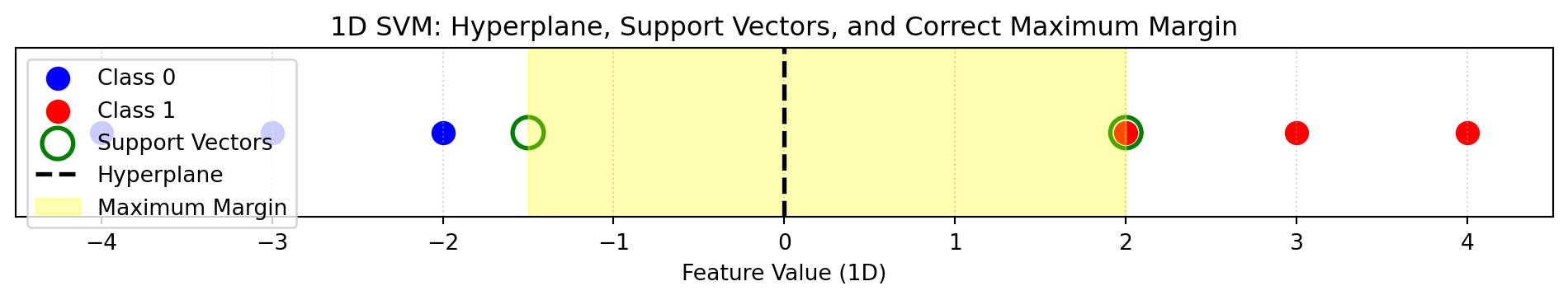
- Suppose we have a dataset of Class 0 and Class 1
- Data is easily seperable
- We can see the hyperplane, maximum margin, and the support vectors
9.6.3 Key Concepts
Margin
- Distance between decision boundry and nearest data points
- SVM tries to maximize this margin
Support Vectors
- Critical data points that determine the position of the decision boundry
- Only the support vectors are used to make the decision boundry, unlike most ML algorithms
Linear vs Non-Linear
- Linear: A straight line can seperate the classes (Example 1)
- Non-linear data: Use kernels to transform the space (Next Example)
9.6.4 More Realistic Example
X = np.array([-3, -2, -1, 0, 1, 2, 3])
y = np.array([1, 1, 0, 0, 0, 1, 1])

plt.figure(figsize=(10, 2))
for xi, yi in zip(X, y):
    plt.scatter(xi, 0, color='blue' if yi == 0 else 'red', s=100)

# Making legend
plt.scatter([], [], color='blue', label='Class 0')
plt.scatter([], [], color='red', label='Class 1')
plt.legend(loc='upper left')

plt.title("1D Data: Not Linearly Separable")
plt.xlabel("Feature Value (1D)")
plt.yticks([])
plt.grid(axis='x', linestyle=':', alpha=0.5)
plt.xlim(-4, 4)
plt.tight_layout()
plt.show()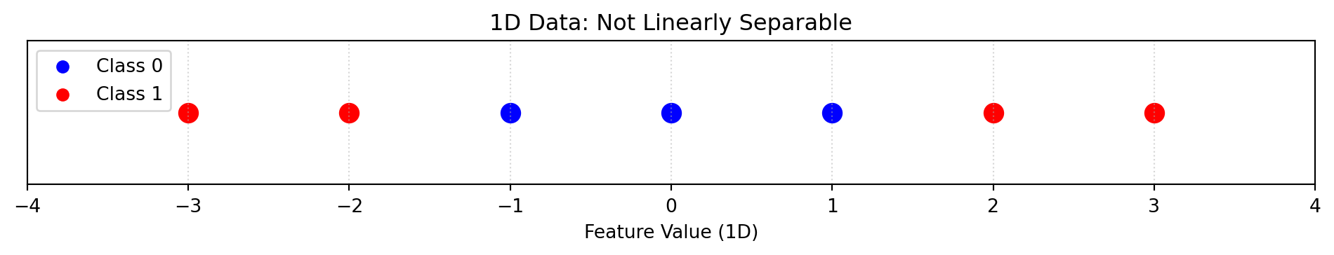
In this example, we can see that the data is impossible to set a hyperplane without having many misclassifications due to high overlap
To fix this problem, we can plot this data in a 2-dimensional space
- Keep the X-axis as the original data points
- Set the Y-axis as the square of the original data points
X = np.array([-3, -2, -1, 0, 1, 2, 3])
y = np.array([1, 1, 0, 0, 0, 1, 1])

X_squared = X**2

support_idx = [0, 2, 4, 6]

plt.figure(figsize=(6, 6))
for xi, x2i, yi in zip(X, X_squared, y):
    plt.scatter(xi, x2i, color='blue' if yi == 0 else 'red', s=100)

plt.scatter(X[support_idx], X_squared[support_idx],
            facecolors='none', edgecolors='black', s=200,
            linewidths=2, label='Support Vectors')

plt.axhline(2.5, color='black',
linestyle='--',
linewidth=2, label='Hyperplane')

plt.axhspan(1, 4, color='yellow', alpha=0.3, label='Maximum Margin')
plt.axhline(1, color='black', linestyle=':', linewidth=1)
plt.axhline(4, color='black', linestyle=':', linewidth=1)

plt.scatter([], [], color='blue', label='Class 0')
plt.scatter([], [], color='red', label='Class 1')
plt.legend(loc='upper left')

plt.title("SVM in 2D: Hyperplane, Margin, and Support Vectors")
plt.xlabel("Original Feature (x)")
plt.ylabel("Transformed Feature (x²)")
plt.grid(True)
plt.tight_layout()
plt.show()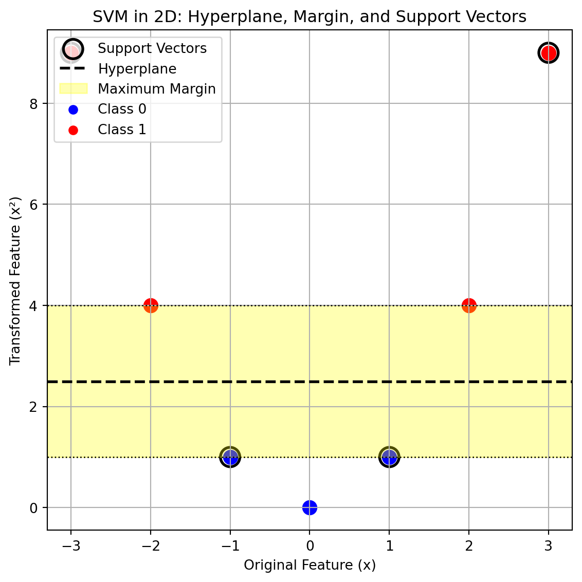
- In the 2d transformation, we can clearly see a clear maximum margin without any misclassifications
- The transformed data is now linearly seperable
9.6.5 The Kernel Trick
- When data is not linearily seperable we can use kernels to implicitly transform them to a higher dimension where it can be more seperable
- This happens without computing the transformation directly, saving computational space
- Using the Kernel Trick allows SVM to draw a straight boundry in the transformed space
| Kernel | Use Case |
|---|---|
| Linear | Data that’s already separable with a straight line (Example 1) |
| Polynomial | When the decision boundary is curved (Example 2) |
| RBF (Radial Basis Function) | For complex, non-linear boundaries |
Radial Basis Function Kernel
- RBF kernel flexibly bends the boundary to fit the shape
- Measures similarity between two points based on distance
- Maps data points in an infinite-dimensional feature space
- Flexible and powerful
9.6.6 Parameters
| Parameter | Description | Example |
|---|---|---|
kernel |
Defines the shape of the decision boundary | 'linear', 'rbf', 'poly' |
C |
Controls trade-off between margin size and misclassification | C = 0.1 (wide margin), C = 100 (strict) |
gamma |
Defines how far the influence of a point reaches | 'scale', 0.1, 1 |
9.6.7 Demonstration with MNIST data
Below is Python code showcasing a demonstration of Support Vector Machine on the MNIST dataset, classifying digits as either a 4 or a 9.
Loading in neccesary libraries and data
import numpy as np
from sklearn.model_selection import train_test_split
from sklearn.svm import SVC
from sklearn.metrics import classification_report, accuracy_score
from sklearn.metrics import precision_score, confusion_matrix, f1_score
import matplotlib.pyplot as plt
from sklearn import datasets
import ssl
import certifi

ssl._create_default_https_context = lambda: ssl.create_default_context(
    cafile=certifi.where())

from sklearn.datasets import fetch_openml
mnist = fetch_openml('mnist_784', version=1, as_frame=False)
Seperate data into X and Y and into training and testing data
X, y = mnist['data'], mnist['target'].astype(int)

mask = np.isin(y, [4,9])
X, y = X[mask], y[mask]

X_train, X_test, y_train, y_test = train_test_split(X, y,
random_state=3255, test_size=0.2)
Fit a Support Vector Classifier model on data, using a Radius Basis Function Kernel, gamma set to scale, and C set to 1.
m1 = SVC(kernel = 'rbf', gamma='scale', C =1)
m1.fit(X_test, y_test)
y_pred = m1.predict(X_test)
Model evaluation.
print("Accuracy Score:", accuracy_score(y_test, y_pred))
print("Precision Score:", precision_score(y_test, y_pred, pos_label=9))
print("F1 Score:", f1_score(y_test, y_pred, pos_label=9))
print("Confusion Matrix:", confusion_matrix(y_test, y_pred))
Accuracy Score: 0.9916575988393181
Precision Score: 0.9921033740129217
F1 Score: 0.9917473986365267
Confusion Matrix: [[1352 11]
[ 12 1382]]From the above output we can see that the SVM model has a high accuracy, precision, and F1 score. Furthermore, we can see from the confusion matrix that there are few misclassifications.
9.6.8 Further Readings
9.7 Naive Bayes
This section was written by Yuxiao Lin, a junior majoring in Statistical Data Science at the University of Connecticut.
This section will focuses on Bayes’ theorem, the types of Naive Bayes classifiers, and provides an example application.
9.7.1 Introduction
Naive Bayes is a probabilistic classification algorithm based on Bayes’ theorem. It assumes that all features are conditionally independent given the class label. Using this assumption, the model calculates the probability of each class given the observed features, and then selects the class with the highest probability as the prediction.
Since it has a simple structure and fast computation, Naive Bayes is widely used in tasks such as text classification, sentiment analysis, and spam detection.
9.7.2 Bayes’ Theorem
Bayes’ Theorem is a mathematical formula used to update a posterior probability based on a prior probability and new evidence. Its basic form is:
\[P(Y|X) = \frac{P(Y)P(X|Y)}{P(X)},\]
where,
- \(P(Y|X)\): Probability of class \(Y\) given features \(X\) - posterior probability.
- \(P(X|Y)\): Probability of features given class \(Y\) - the likelihood.
- \(P(Y)\): Probability of class \(Y\) - prior probability.
- \(P(X)\): Total probability of features \(X\) (marginal probability of features) - the evidence.
9.7.3 Naive Bayes Classifier
The Naive Bayes classifier is a model based on Bayes’ theorem and the assumption of conditional independence among features. Although it applies Bayes’ theorem in its decision rule, it is not necessarily a “Bayesian model” in the statistical sense. In practice, Naive Bayes is usually trained using:
- a frequentist approach via Maximum Likelihood Estimation (MLE), or
- a Bayesian approach using prior and posterior distributions.
9.7.4 Parameter Estimation and Prediction
Naive Bayes does not optimize a loss function like logistic regression.
It “learns” by counting label–feature co-occurrences, using MLE to directly compute class and conditional probabilities — making it fast and simple to fit.
Prior probability of class \(y\): \[P(Y = y) = \frac{\text{count}(Y = y)}{N}.\]
Conditional probability of feature \(X_i\) given class \(y\): \[P(X_i = x_i \mid Y = y) = \frac{\text{count}(X_i = x_i, Y = y)}{\text{count}(Y = y)}.\]
Once the probabilities are estimated, the model predicts the label of a new observation \(X = (x_1, x_2, \dots, x_n)\), then select the one with the highest value: \[ \hat{y} = \arg\max_{y} P(Y = y) \prod_{i=1}^n P(X_i = x_i \mid Y = y). \]
9.7.5 Types of Naive Bayes
To handle different types of input data, 5 types of the Naive Bayes classifier have been developed. Each type is suited to a specific type of data. These types include:
Gaussian Naive Bayes: Used when the dataset contains continuous features. It assumes that for each class, the values of every feature follow a Gaussian (normal) distribution. The model estimates the mean and variance of each feature within each class, and uses those to compute the likelihood of a sample belonging to that class.
Bernoulli Naive Bayes: Designed for binary features (0 or 1). Commonly used for text classification. It can also be used with engineered binary features like
is_weekend,is_borough.Multinomial Naive Bayes: A classification algorithm that models feature counts using a multinomial distribution, commonly applied in text classification tasks.
Categorical Naive Bayes: Used for classification tasks with categorical features. Each feature is assumed to follow a categorical distribution, where the likelihood of each category is estimated independently within each class.
Complement Naive Bayes: This classifier was designed to address some of the strong assumptions and limitations of the standard Multinomial Naive Bayes model. It is particularly well-suited for imbalanced datasets, especially in text classification tasks.
9.7.6 Advantages and Limitations
Advantages:
Simple and fast to train and predict, even with large datasets.
It is not sensitive to missing features because each feature is treated independently.
Performs well on high-dimensional data, such as in text classification.
Limitations:
Suffers when features are strongly correlated.
Assumes conditional independence, which rarely holds in the real world.
9.7.7 Example for NYC Flood Data
Since the original dataset is in CSV format, we first perform data cleaning to filter records from 2024, remove empty columns and extract time-related features.
import pandas as pd

df = pd.read_csv('data/nycflood2024.csv',
                 dtype={"Incident Zip": str}, parse_dates=["Created Date"])
df.columns = df.columns.str.lower().str.replace(' ', '_')

# Drop empty columns
df = df.drop(columns=['location_type', 'vehicle_type', 'taxi_company_borough',
    'bridge_highway_name', 'bridge_highway_segment', 'road_ramp', 'landmark',
    'due_date', 'facility_type', 'bridge_highway_direction',
    'taxi_pick_up_location'])

# Make sure the date is in 2024
df_2024 = df[(df["created_date"] >= "2023-12-31") &
             (df["created_date"] <= "2024-12-31")].copy()

# Make sure the 'closed_date' has same range as 'created_date'
match_date = df_2024[df_2024["closed_date"] == df_2024["created_date"]]

# Set those dates to NaT for further cleaning
df_2024.loc[match_date.index, ["created_date", "closed_date"]] = pd.NaT
/var/folders/cq/5ysgnwfn7c3g0h46xyzvpj800000gn/T/ipykernel_3054/1959091983.py:3: UserWarning:
Could not infer format, so each element will be parsed individually, falling back to `dateutil`. To ensure parsing is consistent and as-expected, please specify a format.
9.7.7.1 Prepare Features and Target Variable
To extract the hour and weekday from the request creation time for use as model features, and create a binary variable over3d to indicate that a service request took three days or longer to close as the target variable.
# Convert date columns to datetime format for feature extraction
df_2024['created_date'] = pd.to_datetime(df_2024['created_date'])
df_2024['closed_date'] = pd.to_datetime(df_2024['closed_date'])

# Extract just the time component
df_2024["created_date"] = pd.to_datetime(df_2024["created_date"], \
    format="%Y-%m-%d %H:%M:%S")
df_2024["closed_date"] = pd.to_datetime(df_2024["closed_date"], \
    format="%Y-%m-%d %H:%M:%S")

# Split 'created_date' to hour and weekday
df_2024["hour"] = df_2024["created_date"].dt.hour
df_2024["weekday"] = df_2024["created_date"].dt.dayofweek

# Compute response time in hours
df_2024["response_time"] = (df_2024["closed_date"] - df_2024["created_date"])
df_2024["response_time"] = df_2024["response_time"].dt.total_seconds() / 3600

# Categorize complaint types into three groups
df_2024["complaint_type"] = df_2024["descriptor"].apply(
    lambda x: "Street Flooding" if "Street Flooding" in str(x) else
              "Catch Basin Clogged" if "Catch Basin Clogged" in str(x) \
                else "Other"
)

# Create a binary variable
df_2024['over3d'] = (df_2024['response_time'] >= 72).astype(int)
9.7.7.2 Feature Selection and Encoding
The features used in this example are hour, incident_zip, complaint_type, and weekday.
To prepare the data, we apply LabelEncoder to convert string-based features into integer codes.
from sklearn.naive_bayes import CategoricalNB
from sklearn.preprocessing import LabelEncoder
import numpy as np
from sklearn.model_selection import train_test_split
from sklearn.metrics import (
    accuracy_score, precision_score, recall_score, confusion_matrix,
    f1_score, roc_curve, auc
)
import matplotlib.pyplot as plt
from sklearn.datasets import make_classification

# Select features
X = df_2024[["hour", "incident_zip", "complaint_type", "weekday"]]

#Encode string-based categorical features into numeric
for col in ["incident_zip", "complaint_type"]:
    le = LabelEncoder()
    X.loc[:, col] = le.fit_transform(X[col].astype(str))
y = df_2024['over3d']
9.7.7.3 Model Fitting and Evaluation with CategoricalNB
Since all the features are categorical variables, we use Categorical Naive Bayes, which is designed for features with discrete categories. Then we split the data into the training and test sets, using the scikit-learn “CategoricalNB” classifier to fit the model. Evaluate this model using accuracy, precision, and recall rate.
# Drop missing values and align X and y
X = X.dropna()
y = y.loc[X.index]

# Split data
X_train, X_test, y_train, y_test = train_test_split(X, y, test_size=0.2, \
    random_state=42)

# Fit the model
cnb = CategoricalNB()
cnb.fit(X_train, y_train)
y_pred = cnb.predict(X_test)

# Evaluate model performance
cm = confusion_matrix(y_test, y_pred)
accuracy = accuracy_score(y_test, y_pred)
precision = precision_score(y_test, y_pred)
recall = recall_score(y_test, y_pred)

print("Confusion Matrix:\n", cm)
print(f"Accuracy: {accuracy:.2f}")
print(f"Precision: {precision:.2f}")
print(f"Recall: {recall:.2f}")
Confusion Matrix:
[[1383 59]
[ 354 65]]
Accuracy: 0.78
Precision: 0.52
Recall: 0.16To further evaluate the classifier’s performance, we use the ROC curve and AUC score to assess how well the model distinguishes between the two classes across different threshold values.
from sklearn.metrics import roc_curve, auc
import matplotlib.pyplot as plt

# Calculate the probability
y_prob = cnb.predict_proba(X_test)[:, 1]

# Calculate fpr, tpr, thresholds
fpr, tpr, thresholds = roc_curve(y_test, y_prob)
roc_auc = auc(fpr, tpr)

# Draw ROC curve
plt.figure(figsize=(6, 5))
plt.plot(fpr, tpr, color='darkorange', lw=2, label=f'ROC curve \
    (AUC = {roc_auc:.2f})')
plt.plot([0, 1], [0, 1], color='gray', linestyle='--')
plt.xlim([0.0, 1.0])
plt.ylim([0.0, 1.05])
plt.xlabel('False Positive Rate')
plt.ylabel('True Positive Rate')
plt.title('ROC Curve for Categorical Naive Bayes')
plt.legend(loc="lower right")
plt.grid(True)
plt.show()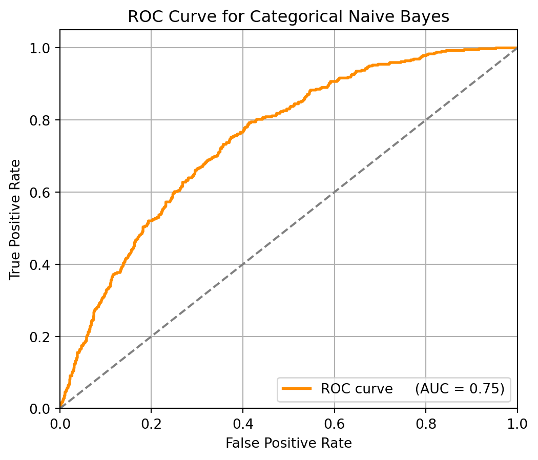
9.7.7.4 Interpretation of Results
From these results, the accuracy is 0.78, which means the model correctly predicts 78% of all cases. In the precision is 0.52, meaning that when it predicts a request that will take over 3 days and it is correct 52%. However, recall is only 0.16, indicating that it fails to detect most of the actual delayed cases.
Although the recall is low, the ROC curve shows that adjusting the threshold can increase the recall rate. AUC = 0.75 indicates that the model has a good overall discrimination ability, and there is a 75% chance that a delayed request (over 3 days) is ranked higher than a non-delayed one. ROC curve lies above the diagonal line, which suggests the model performs better than random guessing.
The Categorical Naive Bayes model performs well overall, but it is difficult to catch delayed requests. We still need some additional adjustments or model comparisons to better handle class imbalances and improve the recall rate.
9.7.8 Further Readings
9.8 Synthetic Minority Over-Sampling Technique (SMOTE)
This section was prepared by Ethan Long, a junior Statistics major.
9.8.1 Introduction
This section covers SMOTE, or Synthetic Minority Over-Sampling Technique. SMOTE (Synthetic Minority Over-Sampling Technique) is a data preprocessing method that is designed to address class imbalance in supervised learning tasks. Instead of duplicating existing minority class instances, SMOTE generates synthetic examples by interpolating between existing minority samples using \(K\)-nearest neighbors (KNN). Class imbalance can significantly distort model performance, often leading to poor recall for the minority class and misleadingly high accuracy, as models tend to favor the majority class. By generating new, diverse samples in feature space, SMOTE creates a more balanced and learnable distribution that helps classifiers detect minority class instances more effectively.
9.8.2 Algorithm Formulation
The SMOTE algorithm operates by linearly interpolating between a random minority instances \(x_i\) and one of it’s \(k\) nearest neighbors \(x_{zi}\) in the minority class. For a given synthetic instance \(x_{\text{new}}\), the generation process is defined as:
\[ \mathbf{x}_{\text{new}} = \mathbf{x}_i + \delta (\mathbf{x}_{zi} - \mathbf{x}_i) \]
where \(\delta \sim U(0, 1)\) is a random number sampled from a uniform distribution. This process is repeated until the desired over-sampling ratio is achieved. By generating synthetic samples that are not exact duplicates, the chance of overlapping data points and overfitting is reduced. It also provides a smoother decision boundary for the classifier.
- Parameters:
- \(k\): Number of nearest neighbors (commonly \(k=5\))
- Over-sample rate: Desired proportion of synthetic samples
9.8.3 Demonstration
For a simple demonstration, lets generate a random dataset using sklearn. It will feature a severe class imbalance. We will compare the SMOTE enhanced model’s performance to a baseline model and see the improvements.
# Import necessary packages
from sklearn.datasets import make_classification
from collections import Counter
from sklearn.model_selection import train_test_split
from sklearn.linear_model import LogisticRegression
from sklearn.metrics import classification_report

# Generate random dataset for classification with class imbalance
X, y = make_classification(
    n_samples=1000,
    n_features=10,
    n_informative=3,
    n_redundant=1,
    n_classes=2,
    weights=[0.95, 0.05],
    flip_y=0,
    random_state=1234
)

# Show total instances of every class
print(f'Class distribution: {Counter(y)}')
Class distribution: Counter({np.int64(0): 950, np.int64(1): 50})Now with a dataset featuring a severe class imbalance having been created, lets split the data into train and test datasets and build an initial classification model.
# Split the data into 20:80 test train
X_train, X_test, y_train, y_test = train_test_split(X, y, stratify=y, random_state=1234)

# Build first classification model
model = LogisticRegression()
model.fit(X_train, y_train)
y_pred = model.predict(X_test)
print(classification_report(y_test, y_pred))
precision recall f1-score support
0 0.98 1.00 0.99 237
1 0.89 0.62 0.73 13
accuracy 0.98 250
macro avg 0.93 0.81 0.86 250
weighted avg 0.97 0.98 0.97 250
Now lets initialize and leverage SMOTE to resample our train data and rectify our dataset’s class imbalance.
# Import package for ignoring warnings
import warnings
warnings.filterwarnings("ignore", category=FutureWarning)

# Now implement SMOTE
from imblearn.over_sampling import SMOTE
smote = SMOTE(random_state=1234)

# Use SMOTE to enhance the generated dataset
# Never apply SMOTE to testing splits only to train
X_resampled, y_resampled = smote.fit_resample(X_train, y_train)

# Second classification model enhanced with SMOTE
smote_enhanced_model = LogisticRegression()
smote_enhanced_model.fit(X_resampled, y_resampled)
smote_y_pred = smote_enhanced_model.predict(X_test)
print(classification_report(y_test, smote_y_pred))
precision recall f1-score support
0 0.99 0.97 0.98 237
1 0.65 0.85 0.73 13
accuracy 0.97 250
macro avg 0.82 0.91 0.86 250
weighted avg 0.97 0.97 0.97 250
9.8.4 Conclusion
From this randomly generated dataset we can see the inherent advantages and drawbacks SMOTE creates when applied to datasets with class imbalances. To begin we can see a sharp decrease in precision when the model attempts to classify class 1 instances. But the model in turn sharply increases the recall value for class 1 instances. This is a common trade-off seen when using SMOTE. This happens because the model becomes more sensitive to the minority class, meaning it’s more likely to predict a sample as the minority class. As a result the recall should increase, capturing more true positives, while producing more false positives.