6.1 Handling Spatial Data with GeoPandas and gmplot
The following section was written by Thomas Schittina, a senior majoring in statistics and minoring in mathematics at the University of Connecticut.
This section focuses on how to manipulate and visualize spatial data in Python, with a particular focus on the packages GeoPandas and gmplot. We’ll start with GeoPandas and do the following:
Cover the core concepts and functionalities
Walkthrough an example using NYC shape data
For gmplot we will:
Talk about why you’ll need a Google Maps API key
See some of the different plotting functionalities
Walkthrough an example using NYC shape data
6.1.1 GeoPandas
6.1.1.1 Introducing GeoPandas
Founded in 2013, GeoPandas is an open-source extension of Pandas that adds support for geospatial data. GeoPandas is built around the GeoSeries and GeoDataFrame objects. Both are subclasses of the corresponding Pandas objects, so they should feel familiar to those who have used Pandas before.
6.1.1.2 A Remark about Shapely
The package Shapely is a core dependency of GeoPandas that handles geometric operations. Each geometry (point, polygon, etc.) stored in a GeoDataFrame is a Shapely object, and GeoPandas internally calls Shapely methods to perform spatial analysis. You won’t often need to interact directly with Shapely when using GeoPandas. Still, you may want to familiarize yourself with its basic concepts.
Similar to Series, but should exclusively contain geometries
GeoSeries.crs stores the Coordinate Reference System information
GeoDataFrame:
May consist of both Series and GeoSeries
May contain several GeoSeries, but only one active geometry column
Geometric operations will only apply to the active column
Accessed and manipulated with GeoDataFrame.geometry
Otherwise similar to a normal DataFrame
6.1.2 Example with NYC MODZCTA Shapefile
Given a file containing geospatial data, geopandas.read_file() will detect the filetype and create a GeoDataFrame.
import geopandas as gpdimport os# get .shp from MODZCTA_Shapefile foldershapefile_path =Noneforfilein os.listdir('MODZCTA_Shapefile'):iffile.endswith(".shp"): shapefile_path = os.path.join('MODZCTA_Shapefile', file)break# Use the first .shp file found# read in datagdf = gpd.read_file(shapefile_path)gdf.drop(columns=['label', 'zcta'], inplace=True)gdf.head()
modzcta
pop_est
geometry
0
10001
23072.0
POLYGON ((-73.98774 40.74407, -73.98819 40.743...
1
10002
74993.0
POLYGON ((-73.9975 40.71407, -73.99709 40.7146...
2
10003
54682.0
POLYGON ((-73.98864 40.72293, -73.98876 40.722...
3
10026
39363.0
MULTIPOLYGON (((-73.96201 40.80551, -73.96007 ...
4
10004
3028.0
MULTIPOLYGON (((-74.00827 40.70772, -74.00937 ...
It’s very important to know which CRS your geospatial data is in. Operations involving distance or area require a projected CRS (using feet, meters, etc.). If a geographic CRS is used (degrees), the calculations will likely be wrong.
print(gdf.crs)# convert to projected CRSgdf = gdf.to_crs(epsg=3857)print(gdf.crs)
EPSG:4326
EPSG:3857
Originally, the geometries were in EPSG 4326, which is measured by latitude and longitude. In order to work with the shape data, the CRS was converted to EPSG 3857, which uses meters.
Now we can start working with the spatial data. First, let’s compute the area of each zip code and store it as a new column.
# create column of areasgdf['area'] = gdf.areagdf.head(3)
modzcta
pop_est
geometry
area
0
10001
23072.0
POLYGON ((-8236278.03 4974664.364, -8236327.85...
2.987592e+06
1
10002
74993.0
POLYGON ((-8237364.444 4970258.308, -8237318.6...
3.974361e+06
2
10003
54682.0
POLYGON ((-8236377.258 4971559.548, -8236390.9...
2.611531e+06
Our active geometry column is the shape data for each zip code, so gdf.area() only acts on that column and ignores the others.
Let’s also find the boundary of each zip code, as well as its geographic center.
# create columns for boundary and centorid infogdf['boundary'] = gdf.boundarygdf['centroid'] = gdf.centroidgdf[['modzcta', 'boundary', 'centroid']].head(3)
modzcta
boundary
centroid
0
10001
LINESTRING (-8236278.03 4974664.364, -8236327....
POINT (-8237323.727 4975637.524)
1
10002
LINESTRING (-8237364.444 4970258.308, -8237318...
POINT (-8236103.249 4970509.323)
2
10003
LINESTRING (-8236377.258 4971559.548, -8236390...
POINT (-8236435.551 4972866.281)
Suppose we want to find the distance between two centroids. The current active geometry column is the shape data. Run gdf.geometry = gdf['centroid'] to switch the active geometry.
# switch active geometry to centroid infogdf.geometry = gdf['centroid']
Then we can calculate the distance between the first two centroids with distance().
# find distance between first two centroidsgdf.geometry[0].distance(gdf.geometry[1])
5271.432980923517
6.1.2.1 Plotting with GeoPandas
GeoPandas also includes some basic plotting functionality. Similar to Pandas, plot() will generate visuals using matplotlib.
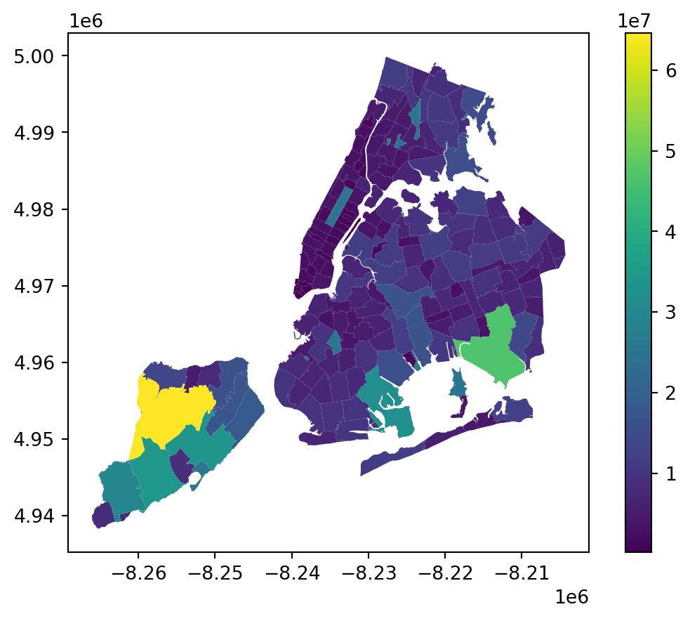
# plot NYC zip codes with color mapping by areagdf.geometry = gdf['geometry'] # must switch active geometry back firstgdf.plot('area', legend=True)
Interactive maps can also be generated using explore, but you will need to install optional dependencies. An alternative approach is the package gmplot, which we’ll discuss next. First though, here is a list of common GeoPandas methods we’ve not yet covered.
to_file(): save GeoDataFrame to a geospatial file (.shp, .GEOjson, etc.)
length(): calculate the length of a geometry, useful for linestrings
instersects(): check if one geometry intersects with another
contains(): check if one geometry contains another
buffer(): create a buffer of specified size around a geometry
equals(): check if the CRS of two objects is the same
is_valid(): check for invalid geometries
6.1.3 gmplot
6.1.3.1 Google Maps API
An API key is not necessary to create visuals with gmplot, but it is highly recommended. Without a key, any generated output will be dimmed and have a watermark.
Example with no API key
The process to create an API key is very simple. Go here and click on Get Started. It requires some credit card information, but you start on a free trial with $300 of credit. You will not be charged unless you select activate full account.
There are some configuration options you can set for your key. Google has many different APIs, but gmplot only requires the Maps Javascript API.
6.1.3.2 Creating Plots with gmplot
gmplot is designed to mimic matplotlib, so the syntax should feel similar. The class GoogleMapPlotter provides the core functionality of the package.
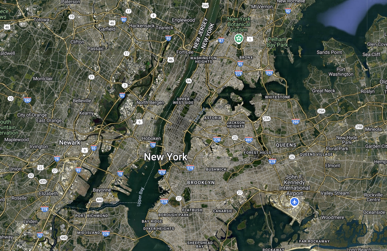
import gmplotapikey =open('gmapKey.txt').read().strip() # read in API key# plot map centered at NYC with zoom = 11gmap = gmplot.GoogleMapPlotter(40.5665, -74.1697, 11, apikey=apikey)
Note: To render the classnotes on your computer, you will need to create the text file gmapKey.txt and store your Google Maps API key there.
The arguments include:
The latitude and longitude of NYC
The level of zoom
API key (even if it’s not used directly)
more optional arguments for further customization
6.1.4 Making Maps with NYC Zip Code Data
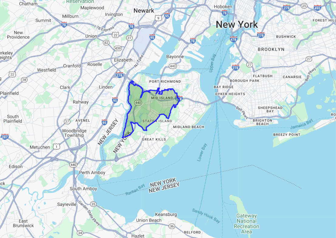
Let’s display the largest zip code by area in NYC.
gdf = gdf.to_crs(epsg=4326) # convert CRS to plot by latitude and longitudelargest_zip = gdf['geometry'][gdf['area'].idxmax()] # returns Shapely POLYGONcoords =list(largest_zip.exterior.coords) # unpack boundary coordinateslats = [lat for lon, lat in coords]lons = [lon for lon, lat in coords]# plot shape of zip codegmap.polygon(lats, lons, face_color='green', edge_color='blue', edge_width=3)# gmap.draw('largest_zip.html')
After creating the plot, gmap.draw('filename') saves it as an HTML file in the current working directory, unless another location is specified. In the classnotes, all outputs will be shown as a PNG image.
Largest NYC Zip Code by area
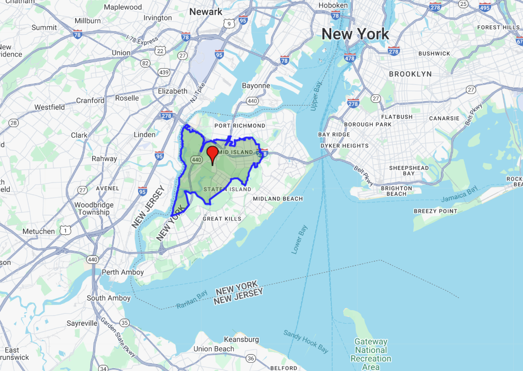
Let’s also plot the centriod of this zip code, and include a link to gmplot’s documentation (in the classnotes this link won’t work because the PNG is used).
gdf.geometry = gdf['centroid'] # now working with new geometry columngdf = gdf.to_crs(epsg=4326) # convert CRS to plot by latitude and longitudecentroid = gdf['centroid'][gdf['area'].idxmax()] # returns Shapely POINT# plot the point with info windowgmap.marker(centroid.y, centroid.x, title='Center of Zip Code', info_window="<a href='https://github.com/gmplot/gmplot/wiki'>gmplot docs</a>")# plot the polygongmap.polygon(lats, lons, face_color='green', edge_color='blue', edge_width=3)# gmap.draw('zip_w_marker.html')
Here’s the output:
Center of largest NYC Zip Code
6.1.4.1 Other Features of gmplot
directions(): draw directions from one point to another
scatter(): plot a collection of points
heatmap(): plot a heatmap
enable_marker_dropping(): click on map to create/remove markers
from_geocode(): use name of location instead of coordinates
see docs for more
You can also change the map type when you create an instance of GoogleMapPlotter.
Geopandas is a powerful tool for handling spatial data and operations. It builds on regular Pandas by introducing two new data structures, the GeoSeries and GeoDataFrame. Under the hood, Shapely handles geometric operations.
The package gmplot is a simple yet dynamic tool that overlays spatial data onto interactive Google maps. It does so through the class GoogleMapPlotter, which offers an alternative to Geopandas’ built in graphing methods for simple plots.
6.2 Google Maps visualizations with Folium
This section was created by Vlad Lagutin. I am a sophomore majoring in Statistical Data Science at the University of Connecticut.
Here I introduce one more library for geospatial visualizations, in addition to GeoPandas and gmplot libraries described in the previous section.
6.2.1 Folium and its features
Folium is a Python library used to create interactive maps
It is built on top of Leaflet.js, an open-source JavaScript library for interactive maps
Manipulate your data in Python, visualize it in a Leaflet map with Folium
Easily compatible with Pandas and Geopandas in Python
Supports interactive features such as popups, zoom and tooltips
Able to export maps to HTML
6.2.2 Initializing Maps and Tile Layers
This is how simple map is created. It is often useful to provide arguments like location and zoom_start for convenience:
Make this Notebook Trusted to load map: File -> Trust Notebook
We can add various Tile Layers to modify how our base map looks like: built-in folium styles, as well as many other tiles provided by Leaflet can be found here.
m = folium.Map(location=[50, -100], zoom_start=4)# not built-in layer; add the link herefolium.TileLayer('https://{s}.tile.opentopomap.org/{z}/{x}/{y}.png', name='OpenTopoMap', attr='OpenTopoMap').add_to(m)# built-in layersfolium.TileLayer('CartoDB Positron', name='Positron', attr='cartodb positron').add_to(m)folium.TileLayer('CartoDB Voyager', name='Voyager', attr='Voyager').add_to(m)# to be able to use them, add Layer Controlfolium.LayerControl().add_to(m)m
Make this Notebook Trusted to load map: File -> Trust Notebook
After adding LayerControl, we can switch these layers using control in the top right corner of the produced map.
6.2.2.1 Geojson files
With Geojson files, we can visualize the borders of counties or states inside of them. These GeoJson files can be found online.
m = folium.Map(location=[50, -100], zoom_start=4)folium.GeoJson('data/us_states.json', name="USA").add_to(m)folium.GeoJson('data/canada_provinces.json', name="Canada").add_to(m)folium.LayerControl().add_to(m)m
Make this Notebook Trusted to load map: File -> Trust Notebook
6.2.2.2 Styling
We can style these geojson objects. Useful parameters:
color - color of line stroke
weight - line stroke width
opacity - opacity of line strokes
fillcolor - filling color of regions
fillOpacity - opacity of regions
# initialize styling dictionarystyle = {'color': 'black', 'weight': 1,'fillColor': 'purple'} m = folium.Map(location=[50, -100], zoom_start=4)# pass styling dictinary to a special argument "style_function"folium.GeoJson('data/us_states.json', name="USA", style_function=lambda x: style).add_to(m)folium.GeoJson('data/canada_provinces.json', name="Canada", style_function=lambda x: style).add_to(m)folium.LayerControl().add_to(m)m
Make this Notebook Trusted to load map: File -> Trust Notebook
6.2.3 Markers
It is possible for user to label certain locations on the map with various types of markers. Folium provides several types of them.
6.2.3.1 Circle Markers
As one can understand from the title, these are just circles.
There are two types of circle markers:
folium.Circle - has radius in meters
folium.CircleMarker - has radius in pixels
m = folium.Map(location=[38.8974579,-77.0376094], zoom_start=13.7)# Radius in metersfolium.Circle(location=[38.89766472658641, -77.03654034831065],radius=100).add_to(m)# Circle marker has radius in pixelsfolium.CircleMarker(location=[38.88946075081255, -77.03528690318743],radius=50).add_to(m)m
Make this Notebook Trusted to load map: File -> Trust Notebook
As you can see, the marker around the Washington monument increases while zooming out, and the marker around White House remains the same.
6.2.3.2 Styling for Circles
We can style circles as well, here are some important parameters:
stroke - set to True to enable line stroke, default is True
weight - line stroke width in pixels, default is 5
color - line stroke color
opacity - line stroke opacity
fill - set to True to enable filling with color, default is False
fill_color - fill Color
fill_opacity - ranges between 0 to 1. 0 means transparent, 1 means opaque
Moreover, we can also add
tooltip - a label that appears when you put your cursor over an element
popup - a box with info that appears when you click on element
m = folium.Map(location=[38.8974579,-77.0376094], zoom_start=13.7)# Radius in metersfolium.Circle(radius=100, location=[38.89766472658641, -77.03654034831065], color='black', fill=True, fill_opacity=0.7, tooltip="White House",# can also just write string popup; use html popup=folium.Popup("""<h2>The White House</h2><br/> <img src="https://cdn.britannica.com/43/93843-050-A1F1B668/White-House-Washington-DC.jpg" alt="Trulli" style="max-width:100%;max-height:100%">""", max_width=500) ).add_to(m)# Circle marker has radius in pixelsfolium.CircleMarker(radius=50, location=[38.88946075081255, -77.03528690318743], color='purple', fill=True, tooltip="Washington monument", popup=folium.Popup("""<h2>The Washington monument</h2><br/> <img src="https://www.trolleytours.com/wp-content/uploads/2016/06/washington-monument.jpg" alt="Trulli" style="max-width:100%;max-height:100%">""", max_width=500) ).add_to(m)m
Make this Notebook Trusted to load map: File -> Trust Notebook
6.2.3.3 Markers
In addition to circles, we can add just Markers:
m = folium.Map(location=[39.8584824090568, -99.63735509074904], zoom_start=4)folium.Marker(location=[43.88284841471961, -85.43121849839345] ).add_to(m)folium.Marker(location=[42.97269745752499, -98.88739407603738] ).add_to(m)m
Make this Notebook Trusted to load map: File -> Trust Notebook
6.2.3.4 Styling for Markers
Here we can use icon parameter to change the icon of a marker.
Icon names for glyphicons by bootstrapcan be found here
Icon names by fontawesome can be found here, need to add prefix='fa'
Make this Notebook Trusted to load map: File -> Trust Notebook
6.2.4 Grouping
We can create groups of Markers, choosing whether we want to show them or not
m = folium.Map(location=[39.8584824090568, -99.63735509074904], zoom_start=4)# adding group 1group_1 = folium.FeatureGroup("first group").add_to(m)folium.Marker(location=(37.17403654771468, -96.90854476924225), icon=folium.Icon("red") ).add_to(group_1)folium.Marker(location=[43.88284841471961, -85.43121849839345] ).add_to(m)# adding group 2group_2 = folium.FeatureGroup("second group").add_to(m)folium.Marker(location=(42.53679960949629, -110.16683522968691), icon=folium.Icon("green") ).add_to(group_2)folium.Marker(location=[42.97269745752499, -98.88739407603738] ).add_to(m)folium.LayerControl().add_to(m)m
Make this Notebook Trusted to load map: File -> Trust Notebook
Using Layer Control on the top right, we can turn on and off these groups of Markers.
However, two blue markers were not added to any of the groups but to the map directly, so we cannot hide them.
6.2.5 Drawing different shapes on a map
We can draw different shapes like rectangles, lines, and polygons. Styling works the same as it does for circles
6.2.5.1 Rectangle
For a rectangle, we just need two diagonal points.
We can draw it, for example, around a Wyoming state, since it has a rectangular form:
m = folium.Map(location=[39.8584824090568, -99.63735509074904], zoom_start=4)# for rectangle, we need only 2 diagonal pointsfolium.Rectangle([(45.0378, -111.0328), (41.0734, -104.0689)], color='purple', fill=True, tooltip='see the name', popup="Wyoming state", fill_color='blue').add_to(m)m
Make this Notebook Trusted to load map: File -> Trust Notebook
6.2.5.2 Polygon
However, for states like Nevada, which are not of a rectangular form, we can use Polygon:
Make this Notebook Trusted to load map: File -> Trust Notebook
6.2.5.3 PolyLine
It is also possible to just create lines;
The only diffence between Polygon and PolyLine is that Polygon connects the first point to the last and PolyLine does not
Make this Notebook Trusted to load map: File -> Trust Notebook
6.2.5.4 Draw it yourself
Is it possible to draw these shapes ourselves, we just need to import Draw plugin:
from folium.plugins import Draw# add export button, allowing to save as geojson fileDraw(export=True).add_to(m)m
Make this Notebook Trusted to load map: File -> Trust Notebook
To draw, use tools on a panel on the left.
6.2.6 Heatmap
We can also create simple HeatMaps:
Arguments:
data (list of points of the form [lat, lng] or [lat, lng, weight]) – The points you want to plot. You can also provide a numpy.array of shape (n,2) or (n,3). Ideally, the weight should be between 0 and 1.
name (default None) – The name of the Layer, as it will appear in LayerControls
min_opacity (default 1.) – The minimum opacity the heat will start at
radius (default 25) – Radius of each “point” of the heatmap
/var/folders/cq/5ysgnwfn7c3g0h46xyzvpj800000gn/T/ipykernel_10379/2407777587.py:3: UserWarning:
Could not infer format, so each element will be parsed individually, falling back to `dateutil`. To ensure parsing is consistent and as-expected, please specify a format.
Make this Notebook Trusted to load map: File -> Trust Notebook
This section was contributed by Mohammad Mundiwala. I am a first year graduate student in Mechanical Engineering. My research interests are in sustainable design and machine learning. I enjoy to make short videos on youtube which is partly why I chose this topic.
One of my favorite youtubers is actually the creator of the manim package that we are going to explore. He is one of the largest STEM educators on the internet and at the time of writing this has amassed 650 million views on YouTube alone. What sets his videos apart are his captivating, precise, and dynamic animations. Because there were no available tools that could help visualize the abstract concepts he wanted to share, he specifically curated manim to be able to do just that.
6.3.3manim vs matplotlib.animation
A first choice for many animation tasks is and very well should be matplotlib as it is familiar and powerful. It is useful then to clarify when an even more powerful package such as manim should be used.
Scene-direction approach vs Frame-by-frame approach
Precise control of objects vs Quick iterative plotting
Elegant mathematical animations vs Straightforward integration
When using manim, you become the director of a movie. You have control of every single detail in the frame which is exciting and daunting. If your goal is as simple as making many static plots (frames) and stitching them together to create a GIF or animation, then manim is overkill. Even the creator of manim would reccommend you use Desmos or GeoGebra instead. I love these options for their clean UI and speed. If you cannot get it done with these tools, then you may be in manim territory.
In manim, everything you see in a rendered output video is called an object. In my simple example video above, the circle, square, triangle, etc are objects with properties like color, size, position, etc. The camera itself is also an object which you can control preciseley.
To make the elegant animations with manim on your computer, simply follow the Manim Setup Guide. There are a few steps that may take some time to download but it is otherwise a pretty simple process - especially since we are all very familiar with the command line interface.
6.3.4 Manim Workflow
Each animation that I made using manim can be boiled down to the following five simple steps.
Define a scene class (e.g., Scene, ThreeDScene, ZoomedScene)
Create shapes or objects (circles, squares, axis)
Apply transformations or animations (.animate, MoveTo)
Customize text, labels, colors, to clarify whats going on
Render the scene with “manim -plq script.py Scene_Name”
Manim is great example of Object Oriented Programming (OOP) because almost everything you might want to do is done by calling a method on some object that you made an instance of. A “scene” is just a class that you write in python where you can specify the type of scene in the argument. The way you interact with the different scene options (presented above: Scene or ThreeDScene) will be the same. There are different methods (actions) that you might want to do in a 3D scene vs a 2D scene. For example, in 3D, you can control the angle of the lighting, the angle and position of the camera, and the orientation of objects in 3D space. It would not make sense to do this in 2D, for example.
Every basic shape or symbol you want to use in your animation in likely an existing object you can simply call. If you want to animate your own symbol, or custom icon then you can simply read it in as an image, and treat it like an object (where applicable). Note that all objects are automatically placed at the center of the screen (the origin). If you want to place a circle, for instance, to the left or right of the page, you can use circle.move_to(LEFT). Similarly, if you want to go up, down, or right, use UP, DOWN, and RIGHT, respectively. These act kind of like unit vectors in their directions. Multiply a number by them to move further in that direction.
Next is the fun part. You can apply the movements and transformations that you would like to which ever object you want. If you want to transform a square to a cirlce, then use Transform(square, circle). To make the transformation actually happen within your scene, you have to call the scene object that you defined. That is as simple as writing self.play(<insert animation here>). One useful argument to the .play() method which you use for every single animation is run_time which helps you define exactly how long, in seconds, the animation you defined will last. The default is 1 second which may be too quick for some ideas.
You can add labels, text, Latex math, etc. to make your animations more complete. Each text block you write, with MathTex() for the latex fans, is also treated like an object within the scene. You can control its font, font size, color, position; you may also link its position relative to another object.
Finally you will use the command line or terminal of your choice to render your animation. I must admit that there is some upfront effort required to make your system and virtual environment ready to run a manim script. Again, there is nothing else you should need between the Manim Community Documentation and ChatGPT, but still, it took me many hours to get all of the dependencies and packages to be installed correctly. If you already have a latex rendering package and video rendering package installed that is added to your PATH, then it may take less time. I want to simply clarify that manim is NOT a single pip install command away, but that is not to discourage anyone. I did it and feel it is worth the extra effort.
6.3.5 Code for intro
The code for the intro animation is presented below. It is simple and aims at just getting the primary functionality and commands of manim across. It follows the manim workflow described in the previous section.
from manim import*import numpy as npclass TransformCycle(Scene):def construct(self):# circle -> square -> triangle -> star -> circle circle1 = Circle() square = Square() triangle = Triangle() star = Star() circle2 = Circle() shapes = [circle1, square, triangle, star, circle2] current = shapes[0]self.add(current)for shape in shapes[1:]:self.play(Transform(current, shape), run_time=1.25)
6.3.6 Using \(\LaTeX\)
Part of what makes manim so useful for math is its natural use of Latex when writing text. Other animation softwares do not support precise math notation using Latex which often used by experts. In the following example, I show a very simple demonstration on how text using Latex and related objects (ellipse) can be positioned in the frame. First notice the different animations that are happening; then we can explore the code!
The code used to generate the video is presented below. It should be easy(ish) to follow since we use the same format as the previous animation. This time I included more arguements to the objects (position, color, width, height, etc).
Using the defined objects from above, below are the commands that actually animate. This is where you can be creative! The animation occur sequentially. When multiple animations are listed in the self.play() method, they begin at the same time.
How cool. Try and edit this animation I made slightly to see how different parameters effect the final result. I found that it was the best way to learn.
6.3.7 Visualizing Support Vector Machine
Some data is distributed in a 2 dimensional plane. Some samples are blue and some are white. When trying to seperate the white samples from blue (called binary classification), we see it is not possible when they are shown in 2D. We can draw a linear boundary where blue is on one side and white is on the other. My animation shows the utility of the Kernel Trick used by SVM. We apply a nonlinear transformation to increase the dimensionality of the feature space. Then, in the higher dimension, we search for a hyperplane that can split the two classes. Once that hyper plane is found, we can map that plane back into the feature space using the inverse of the non-linear transformation. For this animation, I used a parabaloid transformation to keep it simple and clear. The hyper plane intersects the parabaloid as a conic section - ellipse in 2D. The camera pans to top down view to show the feature space now segmented using the kernel trick. SVM is a highly abstract mathemtical tool that can be hard to imagine. I feel that in this low dimensional case (2D and 3D), we can convey the most important ideas without getting into the math.
I split the movie shown above into sections or scenes below. Every single animation or motion presented above is written in these relatively short blocks of code.
The primary animation that shows the points in 2D being ‘transformed’ into 3D is a simple Replacement Transform in manim. The samples, represented by spheres, were given a starting position and ending position. Manim, automatically smoothly interpolates the transition from start to end, which renders as the points slowly rising upward. Pretty cool!
base_pts, lifted_pts = VGroup(), VGroup()for (x, y), cls inzip(X, y): p = axes.c2p(x, y, 0) base_pts.add(Dot3D(p, radius=dot_rad, color=colors[int(cls)])) z = (x -2)**2+ (y -2)**2+1 p = axes.c2p(x, y, z) # or axes.coords_to_point lifted_pts.add(Dot3D(p, radius=dot_rad, color=colors[int(cls)]))self.play(FadeIn(base_pts), run_time=1)self.wait(1) step2_tex = MarkupText("2nd: Kernal trick with nonlinear mapping", color=WHITE, font_size=24).move_to(UP*2+ RIGHT*2)self.play(ReplacementTransform(base_pts, lifted_pts), run_time=3)self.wait()
6.3.7.3 Hyper-plane
The hyperplane “searching” for the optimum boundary is performed by creating a square in 3D space. I then set its color and position. The show the rotation, I determined the final orienation of the plane in terms of its normal vector. I sweep a small range of nearby normal vectors to ultimately ‘animate’ the search or convergance of an SVM model. Note that there are many different ways I could have gone about accomplishing this. This was one way where I did the math by hand.
plane_size =0.6 plane_mobj = Square(side_length=plane_size) plane_mobj.set_fill(BLUE_A, opacity=0.5) plane_mobj.set_stroke(width=0) plane_mobj.move_to(axes.c2p(2, 2, 1.3))# default Square is parallel to XYself.add(plane_mobj)self.wait(1)# final orientation: normal = np.array([A, B, C], dtype=float) z_anchor =-(A*2+ B*2+ D) / C anchor_pt = np.array([2, 2, z_anchor]) anchor_3d = axes.c2p(*anchor_pt) z_hat = np.array([0, 0, 1]) n_hat = normal / np.linalg.norm(normal) final_angle = angle_between_vectors(z_hat, n_hat)# Rotation axis is their cross product: rot_axis = np.cross(z_hat, n_hat)if np.allclose(rot_axis, 0): rot_axis = OUT self.play( plane_mobj.animate.rotate(30*DEGREES, axis=RIGHT, about_point=plane_mobj.get_center()), run_time=2 )self.play( plane_mobj.animate.rotate(20*DEGREES, axis=UP, about_point=plane_mobj.get_center()), run_time=2 )# move & rotate to final planeself.play( plane_mobj.animate.move_to(anchor_3d).rotate( final_angle, axis=rot_axis, about_point=anchor_3d), run_time=3 )self.wait()self.play(FadeOut(plane_mobj), run_time=1)
6.3.7.4 Camera & Ellipse
The camera in manim is operated using spherical coordinates. If you remember from Calc 3, \(\phi\) describes the angle formed by the positive \(z\)-axis and the line segment connecting the origin to the point. Meanwhile, \(\theta\) is the angle in the \(x-y\) plane, in reference to the \(+x\) axis. Manim may help you to brush up on your math skills..it certainly helped me!
self.move_camera(phi=0*DEGREES, theta=-90*DEGREES, run_time=3)self.wait()# ((x - 2)^2 / 0.55^2) + ((y - 2)^2 / 0.65^2) = 1.center_x, center_y =2, 2.1a, b =0.55, 0.65# ellipse semi-axesdef ellipse_param(t): x = center_x + a * np.cos(t) y = center_y + b * np.sin(t)return axes.c2p(x, y, 0) # z=0 => in the XY planeellipse = ParametricFunction( ellipse_param, t_range=[0, TAU], color=YELLOW, stroke_width=2)self.play(Create(ellipse), run_time=2)self.wait(2)
6.3.8 Learnings
Takes time upfront, but allows you to convey abstract concepts quickly.
You can impress sponsors or your boss.
It is cool. I made this for the lab I work in using just an image (.svg) icon!
6.3.9 Further readings
You should be able to find everything you need from the community documentation and there is no better gallery than 3Blue1Brown’s free online videos. With these (relatively) simple tools, he has made incredible animations for math. He also posts all of the code for each animation he makes; for all of the videos he has posted, the source code is in his GitHub repository.