To start creating visualizations in Tableau, the first step is also to find a dataset to explore. We will use the same dataset Netflix Movies and TV Shows and aim to answer the same three questions, now with a different visualization tool:
Import Data
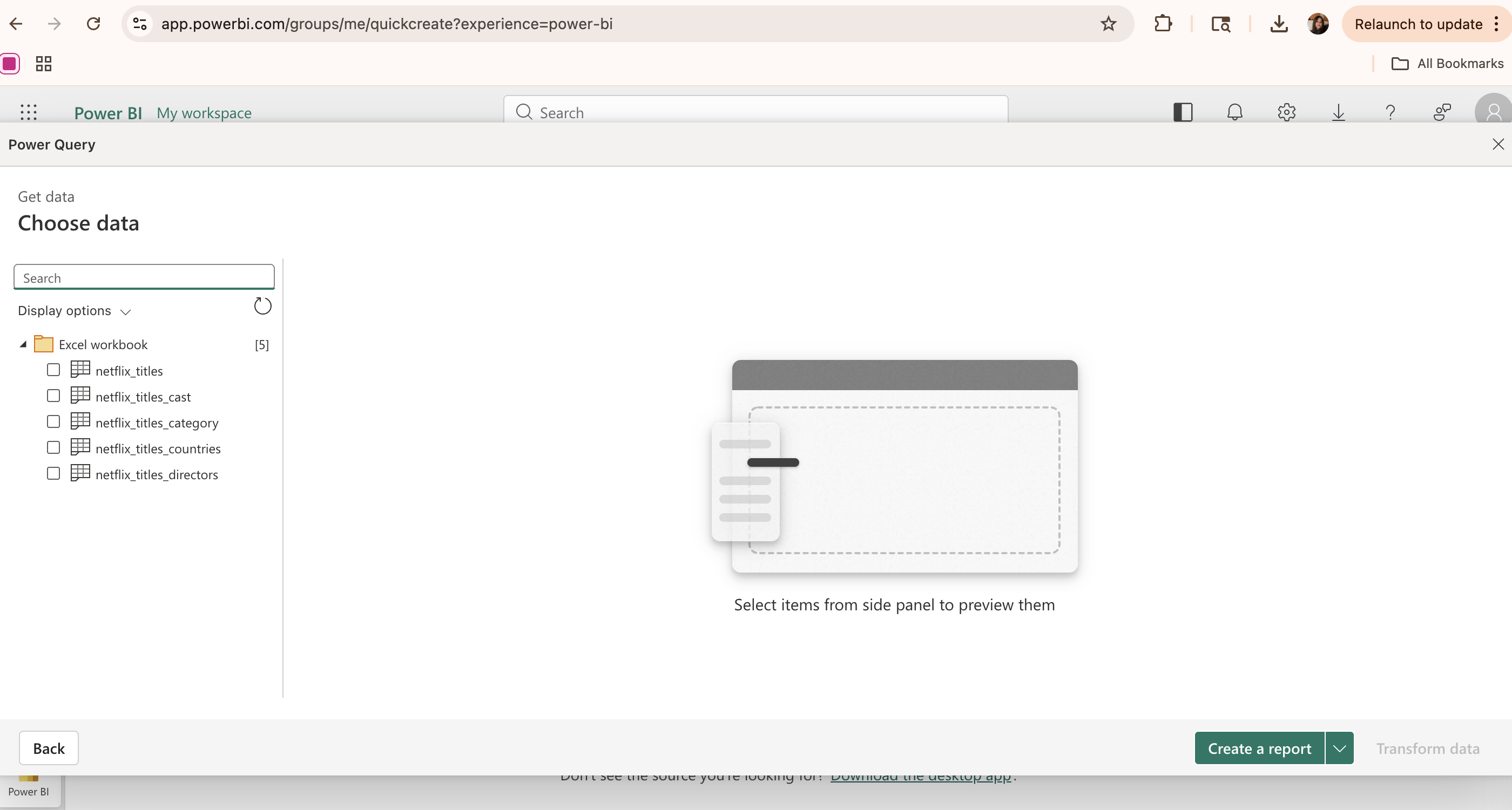
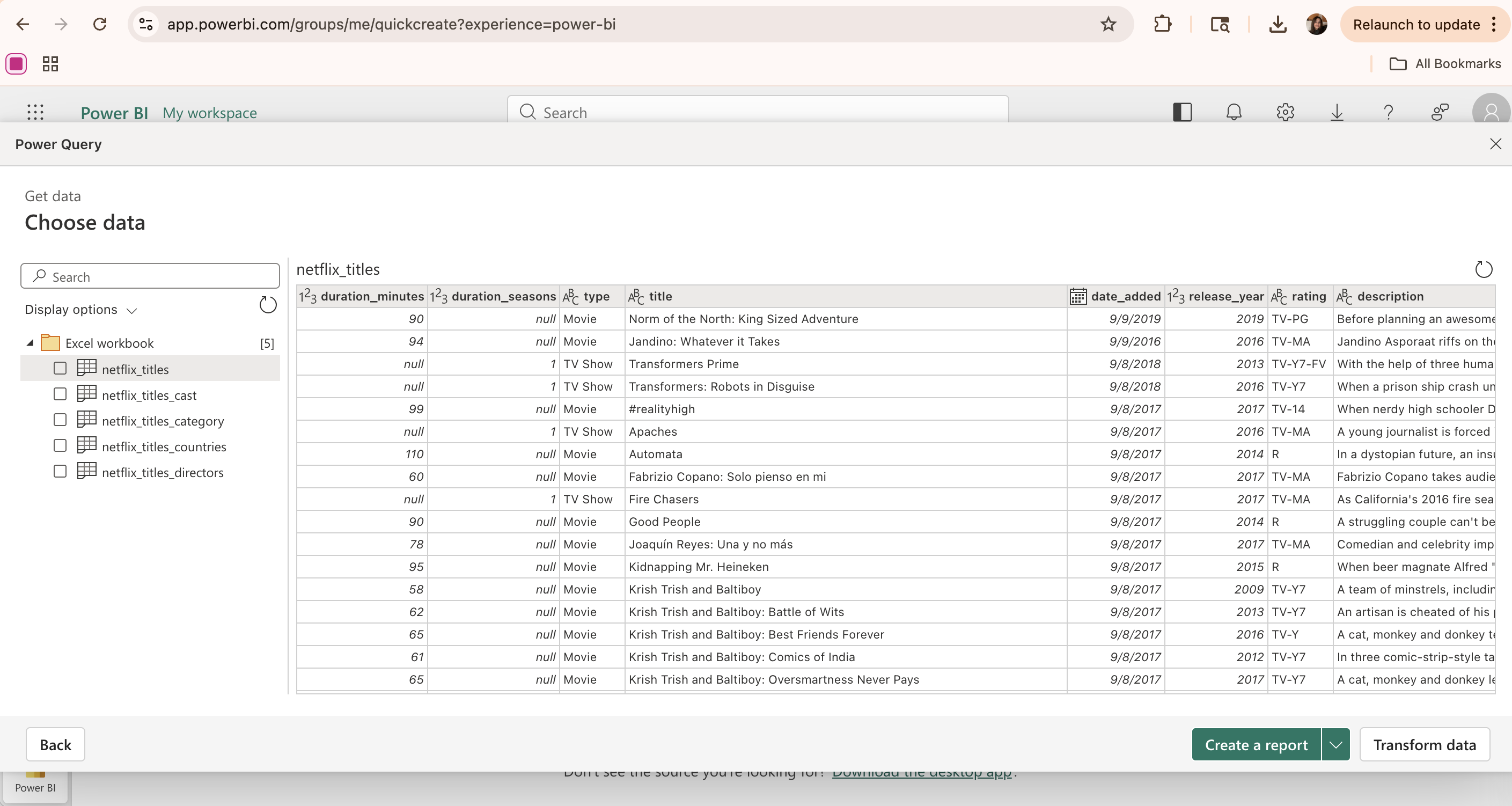
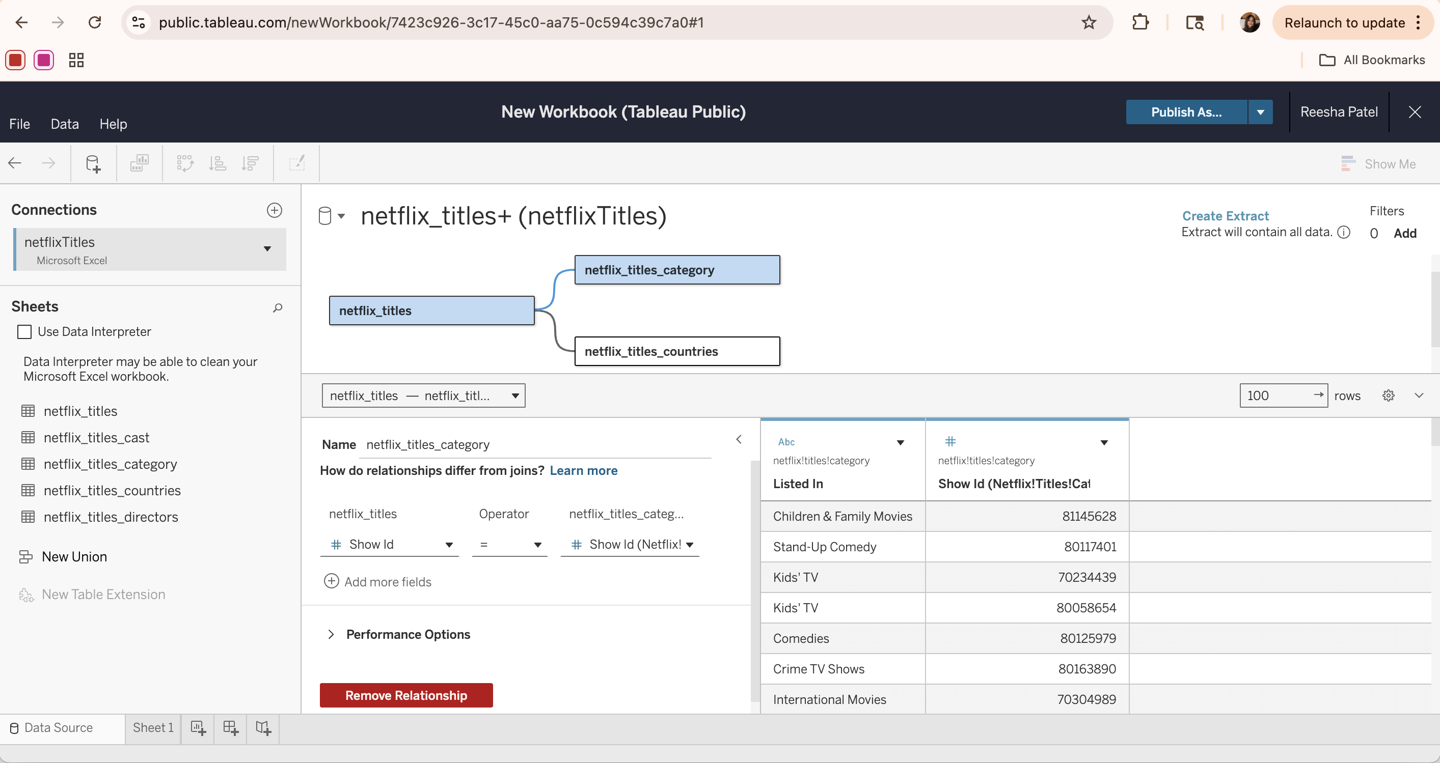
First, navigate to your Tableau profile (this example uses Tableau Public, which is the free online version of the Tableau software) and click the “Create Viz” button. In the popup window, select the data source by either uploading a file or connecting to an external source (e.g. Google Drive). Once loaded, the data appears in the Data Source tab, where tables can be viewed, inspected, and joined if necessary.
The Data Source tab allows for different tables to be connected together by creating a relationship based on a common column (the show_id column in this case). Once all the data tables of interest are added to the page, click Create extract to load the data into Tableau’s in-memory engine for improved performance and faster analysis.
Visualizations
Once the data has been processed and extracted, it is ready for visualization. To start creating a visualization, first create a new empty sheet. In Tableau, each visualization is created on a separate sheet, which can later be combined into a dashboard.
Each sheet consists of three main components. First is the Data and Analytics panel, where the data tables and their fields are populated and can be selected for use in visualizations. The analytics tab provides additional options for further analysis, including trend lines, reference lines, and summaries.
The second component deals with customization of the appearance of the visualization. Here, various aspects of the visuals can be changed, including colors/graphics, size, labels, filters, marks, and other general formatting options.
Finally, the main blank canvas is where the visualization is displayed and updated as data is added. To build a visualization:
- Drag data columns into view fields based on a relationship structure.
- Select or adjust the visualization type using the Marks dropdown menu.
- (Optionally) Click the Show Me button in the top-right corner and select the type of visualization.
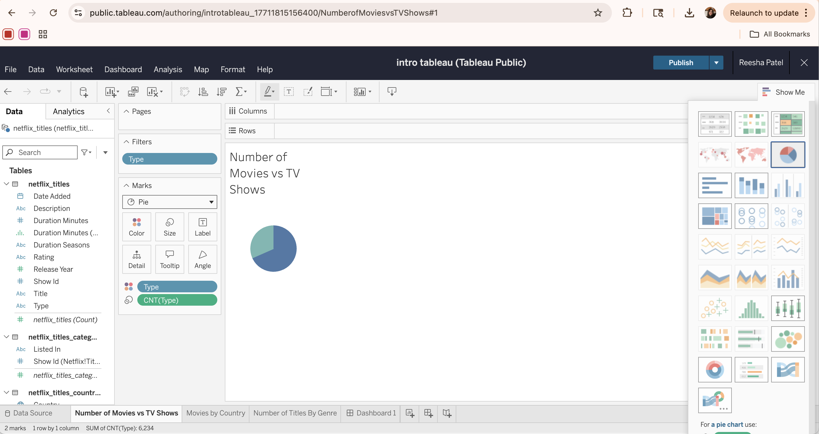
For example, to create a pie chart for the distribution of content types, we can drag the Type column from the netflix_titles table into the Marks field. Then, drag the same Type column again, but change it to a count measure using the drop-down arrow. Then, we can change the Marks type to “Pie”, set the Type column as the color legend, and set the CNT(Type) as a “slice” or angle of the pie.
Optionally, another way to create this same visualization is through the Show Me tab. We can drag the Type column from the netflix_titles table into the Columns field. Then, drag the same Type column into the Rows field, but change it to a count measure using the drop-down arrow. Select the Pie Chart visualization from the Show Me tab to visualize the distribution of content types.
Lastly, we can edit the visualization in the Marks section. First, we can change the color of each pie section to follow a consistent format. We can also add a filter to the type column so we exclude the inconsistent/null values in the data set, and only show titles with a content type of Movie or TV Show. Adding filters helps refine the data and create clearer, more focused visualizations.
Final Dashboard
Once all visualizations are created independently, a new dashboard can be created to combine and summarize the results. Each individual visualization can be dragged onto the dashboard and arranged to create a comprehensive and clear layout.
This dashboard provides an overview of the data, allowing for multiple relationships to be analyzed at once and for dynamic visualization through filters and selections. This makes it easier to identify overall patterns and draw conclusions from the dataset.
Storylines
One final aspect of Tableau is its Story feature, which allows for data to be presented through a sequence of visualizations. Each story contains multiple “story points,” with each point displaying a certain graphic along with some descriptive caption.
This feature is especially helpful for presentations, especially when guiding a non-technical audience through the data analysis process. Rather than showing all the visualizations at once, a story follows a narrative and highlights key graphics or conclusions along the way. For example, it could start with an overview of the data, then move into each research question and the specific visualization to explain/support it.
Overall, structuring visualizations through storytelling helps communicate the results of data exploration more effectively.