from plotnine import *
import pandas as pd
df = pd.read_feather("data/nyc_crashes_cleaned.feather")
df["borough"] = df["borough"].fillna("Unknown")5 Data Visualization
In this chapter we embrace visualization as a cornerstone of modern data-analysis workflows: turning raw numbers into meaningful visuals that support insight, decision-making and communication. We begin by exploring static and information-rich graphics through plotnine, building on the grammar‐of-graphics approach. Next we extend into spatial data-visualisation using GeoPandas, equipping you to map, project and interpret geospatial patterns. Later sections will introduce further tools and techniques (for example interactive maps or dashboards), but throughout we emphasise the same core questions: Which visual form fits the data and question? How do our design and implementation choices influence what the viewer sees — and what they don’t see? With the tools and principles in hand, you’ll be prepared to insert clear, effective visualisation into your data-science project workflow.
5.1 Grammar of Graphics using Plotnine
5.1.1 Introduction
Hello everyone! My name is Sonia Lucey and I am a Statistical Data Science major.
Today I will be talking about the Grammar of Graphics using Plotnine.
We will use NYC Crash Data (Week of Labor Day, 2025), saved in the Feather format for faster loading.
Just like languages have grammar to structure words and sentences, the Grammar of Graphics gives us a structured framework for building visualizations.
(Wilkinson, 2012)
Every plot can be described using a few key components:
- Data: what dataset you are using.
- Aesthetics: axes, color, size, shape.
- Scales: how values map to axes or colors.
- Geometric objects (geoms): points, bars, lines, etc.
- Statistics: summaries such as counts, means, distributions.
- Facets: break plots into subplots.
- Coordinate system: Cartesian, polar, etc.
5.1.2 Building Plots with Plotnine
The Grammar of Graphics (Wilkinson, 2012). Plotnine implements the Grammar of Graphics in Python ((Sarkar, 2018); (Bansal, 2018)). It is inspired by ggplot2 in R and allows consistent, layered visualizations.
Some examples of what we can create:
- Bar Charts
- Scatter Plots
- Histograms
- Box Plots
- Facet Plots
We’ll build each of these using the NYC crash dataset.
To get started, install and import Plotnine:
When writing plots in Plotnine, follow a logical order that mirrors the Grammar of Graphics:
- Data + Mapping →
ggplot(data, aes(...))
- Geom → what to draw (
geom_bar(),geom_point(), etc.)
- Scales & Labels →
labs(),xlab(),ylab(),ggtitle()
- Coordinates →
coord_flip(),coord_polar()
- Facets →
facet_wrap()orfacet_grid()
- Theme →
theme_minimal(),theme_classic()
5.1.3 Examples of Visualizations
Bar Chart
(ggplot(df, aes(x="borough", fill="borough"))
+ geom_bar()
+ ggtitle("Number of Crashes by Borough")
+ coord_flip()
+ xlab("Borough")
+ ylab("Number of Crashes"))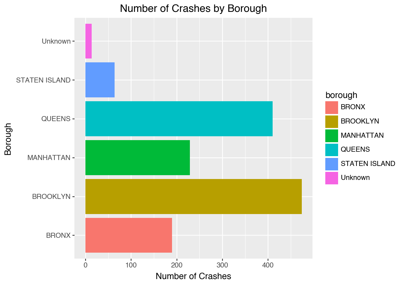
This shows how many crashes happened in each borough.
Scatter Plot
(ggplot(df, aes(x="number_of_persons_injured",
y="number_of_persons_killed"))
+ geom_point(alpha=0.6)
+ labs(title="Injuries vs Fatalities per Crash",
x="Persons Injured",
y="Persons Killed"))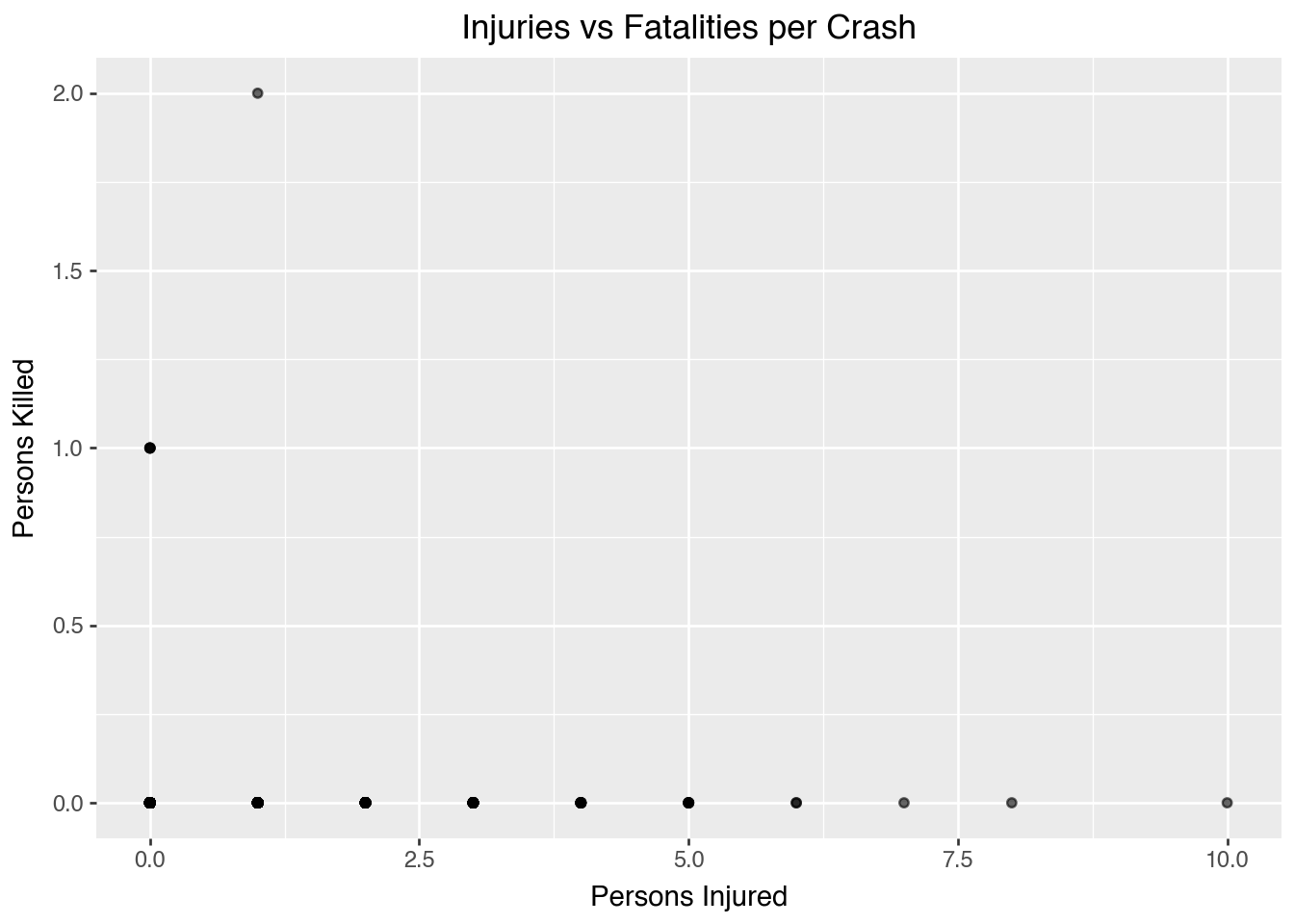
Most crashes cause injuries but not fatalities.
Histogram
df["hour"] = df["crash_datetime"].dt.hour
(ggplot(df, aes(x="hour"))
+ geom_histogram(binwidth=1, color="black", fill="skyblue")
+ ggtitle("Distribution of Crashes by Hour")
+ xlab("Hour of Day")
+ ylab("Crash Count"))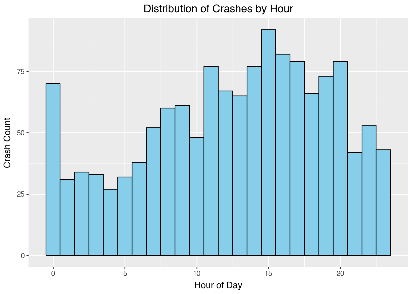
Crashes are elevated throughout the day, with particularly high counts around midday and late afternoon. Midnight also shows an unexpected spike, which may reflect a default rather than commuting patterns.
Box Plot
(ggplot(df, aes(x="borough", y="number_of_persons_injured", fill="borough"))
+ geom_boxplot()
+ ggtitle("Persons Injured by Borough")
+ xlab("Borough")
+ ylab("Number of Persons Injured"))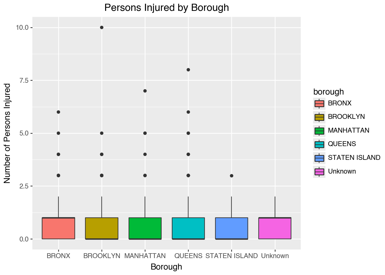
The boxplot compares injury severity between boroughs.
Facet Wrap
df["contributing_factor_vehicle_1"] = (
df["contributing_factor_vehicle_1"]
.astype(str)
.str.strip()
.str.lower()
.replace({"": None, "na": None, "nan": None})
)
top_factors = (df["contributing_factor_vehicle_1"]
.value_counts()
.head(10)
.index)
df_top = df[df["contributing_factor_vehicle_1"].isin(top_factors)]
(ggplot(df_top, aes(x="contributing_factor_vehicle_1", fill="borough"))
+ geom_bar(show_legend=False)
+ facet_wrap("~ borough")
+ theme(axis_text_x=element_text(rotation=90, hjust=1))
+ ggtitle("Top 10 Contributing Factors by Borough"))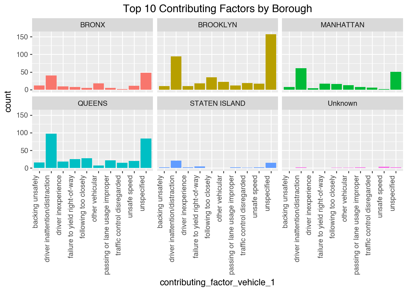
Faceting lets us compare contributing factors side by side across boroughs.
Facet Grid
(ggplot(df, aes(x="hour", fill="borough"))
+ geom_histogram(binwidth=1, alpha=0.6, position="identity")
+ facet_grid("borough ~ .")
+ labs(title="Crashes by Hour of Day Across Boroughs",
x="Hour of Day", y="Number of Crashes"))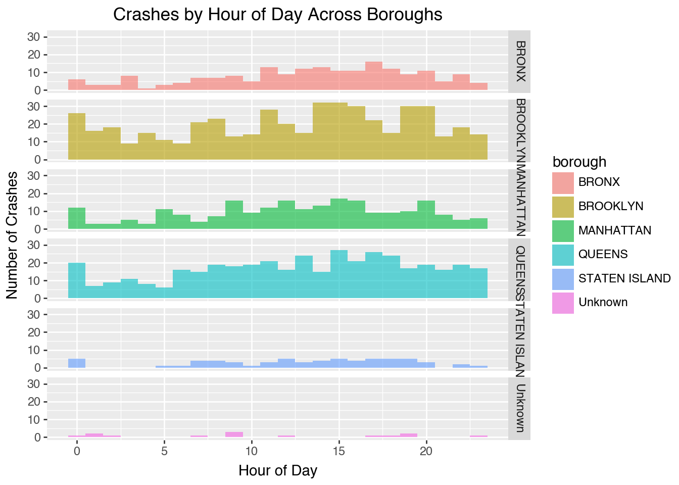
Grid vs. Wrap Faceting allows you to split plots by one or two variables for comparison.
- facet_wrap() arranges plots in a single flexible grid (best for one variable).
- facet_grid() creates a strict row×column layout (best for two variables).
- Key difference: wrap = flexible (one variable), grid = fixed (two variables).
5.1.4 Key Takeaway
The Grammar of Graphics shifts our mindset: instead of asking “what chart type do I need?”, we ask “what grammar components best represent my data and message?”
This makes visualizations flexible, reusable, and less error prone. And once you know the grammar, learning tools like Plotnine or ggplot2 ((Wilkinson, 2012); (Sarkar, 2018); (Bansal, 2018)) becomes much easier. Think of plots not as pictures, but as structured sentences written with this grammar.
5.1.5 Further Readings
- Aeturrell’s Data Visualization Tutorials – Clear, example-driven lessons on Plotnine, ggplot2, and the Grammar of Graphics for data scientists.
- Real Python: Data Visualization with Plotnine – A practical guide to building layered graphics using Plotnine and pandas.
- [GeeksforGeeks: Plotnine in Python] (https://www.geeksforgeeks.org/plotnine-data-visualization-in-python/) – Overview of Plotnine syntax, functions, and common chart types.
- Jeroen Janssens – Data Science at the Command Line – Broader perspective on data workflows and reproducible visualization pipelines.
5.2 Spatial Data with Geopandas
This section is by Alejandro Haerter, a junior majoring in Statistical Data Science and Economics.
5.2.1 Spatial Data and Python
Spatial data is any information which describes the geographic location and shape of features. We might represent these as:
- Points (address, cities)
- Lines (Roads, rivers)
- Polygons (Property parcels, city boundaries, ZIP codes)
Spatial data is everywhere; we see it on maps, it has legal implications; and it often delineates demographic information. In short, a data scientist is certain to encounter spatial data in their career, and should know the tools to work with it.
Traditional Geographic Information Systems (GIS) tools (e.g., ArcGIS, QGIS) are proprietary, require steep learning curves, and do not implement well with the data science workflow. Luckily, with GeoPandas, we can use Python for spatial data analysis, preserving the data science workflow.
5.2.2 Introduction to GeoPandas
GeoPandas is an open source package which adds support for geographic data to pandas objects, first released in 2014. GeoPandas’ two main data structures are the geopandas.GeoSeries, an extension of the pandas.Series, and the geopandas.GeoDataFrame, an extension of the pandas.DataFrame.
GeoPandas is capable of geometric operations, transformations, and plotting, all relevant tools for for operating with spatial data.
GeoPandas requires Folium and Matplotlib as dependencies, both of which for plotting.
5.2.2.1 GeoSeries
geopandas.GeoSeries a subclass of pandas.Series which can only store geometries. Potential geometries include Points, Lines, Polygons, etc. Not all geometries need be the same type, but must be some form of Shapely geometric object.
The GeoSeries.crs attribute stores the coordinate reference system (CRS) information of the GeoSeries. A CRS relates how map coordinates relate to real locations on Earth by specifying a datum (a model of the Earth’s shape), a coordinate system (e.g., Latitude/Longitude, UTM) and units of measurement (e.g., degrees, meters).
5.2.2.2 GeoDataFrame
A GeoDataFrame is the core data stucture of GeoPandas. It can store one or more geometry columns and perform spatial operations. Essentially, it is a pandas.DataFrame combined with one or more GeoSeries.
A mock GeoDataFrame might look like:
city population geometry
0 NYC 8800000 POINT (-74.0060 40.7128)
1 Boston 675000 POINT (-71.0589 42.3601)
2 Chicago 2700000 POINT (-87.6298 41.8781)Importantly, while we can have multiple GeoSeries in a GeoDataFrame, only one GeoSeries at a time is the active geometry column. All geometric operations act on this column; it’s accessed by GeoDataFrame.geometry attribute.
5.2.3 Basic Operations
A file containg both data and geometry can be read by geopandas.read_file(). For this example, I use a dataset which contains geometric information for each of NYC’s five boroughs.
import geopandas as gpd
from geodatasets import get_path
path_to_data = get_path("nybb") # map of NYC boroughs
gdf = gpd.read_file(path_to_data)
gdf| BoroCode | BoroName | Shape_Leng | Shape_Area | geometry | |
|---|---|---|---|---|---|
| 0 | 5 | Staten Island | 330470.010332 | 1.623820e+09 | MULTIPOLYGON (((970217.022 145643.332, 970227.... |
| 1 | 4 | Queens | 896344.047763 | 3.045213e+09 | MULTIPOLYGON (((1029606.077 156073.814, 102957... |
| 2 | 3 | Brooklyn | 741080.523166 | 1.937479e+09 | MULTIPOLYGON (((1021176.479 151374.797, 102100... |
| 3 | 1 | Manhattan | 359299.096471 | 6.364715e+08 | MULTIPOLYGON (((981219.056 188655.316, 980940.... |
| 4 | 2 | Bronx | 464392.991824 | 1.186925e+09 | MULTIPOLYGON (((1012821.806 229228.265, 101278... |
5.2.3.1 Inspecting a GeoDataFrame
GeoPandas syntax is just like pandas. Methods like .head(), .info(), and .shape, .rename, .drop, etc., apply, all work the same. For example, I rename the column geometry to poly, so that I don’t confuse it with the .geometry attribute. (This is an example of good naming practice to avoid conflicts with built-in attributes or methods.)
gdf = gdf.rename(columns={"geometry": "poly"})
gdf.head(1)| BoroCode | BoroName | Shape_Leng | Shape_Area | poly | |
|---|---|---|---|---|---|
| 0 | 5 | Staten Island | 330470.010332 | 1.623820e+09 | MULTIPOLYGON (((970217.022 145643.332, 970227.... |
GeoPandas also has its own functions, methods, and attributes which are specific to it. Recall .geometry, which gives us the active geometry column. This GeoDataFrame is still pointing to a column called "geometry", even though its renamed and doesn’t exist. This can be fixed with .set_geometry.
gdf = gdf.set_geometry('poly')
print(gdf.geometry)0 MULTIPOLYGON (((970217.022 145643.332, 970227....
1 MULTIPOLYGON (((1029606.077 156073.814, 102957...
2 MULTIPOLYGON (((1021176.479 151374.797, 102100...
3 MULTIPOLYGON (((981219.056 188655.316, 980940....
4 MULTIPOLYGON (((1012821.806 229228.265, 101278...
Name: poly, dtype: geometryRecall how to access CRS:
print(gdf.crs)EPSG:2263EPSG:2263 is a CRS specific for New York City. It uses feet for distance operations.
5.2.3.2 Area
If I wanted to find the area enclosed by the polygons, I’d use the .area attribute, which gives the area enclosed by each polygon.
gdf = gdf.set_index("BoroName") # for legibility
gdf["area"] = gdf.area
gdf["area"]BoroName
Staten Island 1.623822e+09
Queens 3.045214e+09
Brooklyn 1.937478e+09
Manhattan 6.364712e+08
Bronx 1.186926e+09
Name: area, dtype: float64Because of EPSG:2263, area is given in square footage. For example, Manhattan is 6.364712e+08 = 636,471,200 ft2 = 22.9mi2.
5.2.3.3 Boundaries and Centroids
Right now, the active geometry column contains polygons. We can access the perimeters and the centroids of these polygons:
gdf["boundary"] = gdf.boundary
gdf["centroid_ft"] = gdf.centroid
gdf[['boundary','centroid_ft']].head()| boundary | centroid_ft | |
|---|---|---|
| BoroName | ||
| Staten Island | MULTILINESTRING ((970217.022 145643.332, 97022... | POINT (941639.45 150931.991) |
| Queens | MULTILINESTRING ((1029606.077 156073.814, 1029... | POINT (1034578.078 197116.604) |
| Brooklyn | MULTILINESTRING ((1021176.479 151374.797, 1021... | POINT (998769.115 174169.761) |
| Manhattan | MULTILINESTRING ((981219.056 188655.316, 98094... | POINT (993336.965 222451.437) |
| Bronx | MULTILINESTRING ((1012821.806 229228.265, 1012... | POINT (1021174.79 249937.98) |
gdf now has boundary and centroid columns as additional geometry columns, but the active column wont change unless specified.
5.2.3.4 Distance Operation
If I wanted to find the distance between the center of Brooklyn and the center of the Bronx, that’s taking the .distance() between two centroids.
# active geometry set to centroid info
gdf = gdf.set_geometry('centroid_ft')
#finds distance between indeces given
gdf.geometry['Bronx'].distance(gdf.geometry['Brooklyn'])79011.6278663779Recall the current EPSG:2263, which is a projection in feet. ~79,000ft \(\approx\) ~15mi.
We have all the pandas functionality available here too, for example, .mean():
from shapely.geometry import Point
cx = gdf["centroid_ft"].x.mean()
cy = gdf["centroid_ft"].y.mean()
geo_center_ft = Point(cx, cy) # Shapely
print(geo_center_ft)POINT (997899.6796377342 198921.55457843072)Gives us a Point position of the centroid of centroids, i.e., the geographic center of NYC. Although, that doesn’t tell us very much…
5.2.3.5 Changing CRS
Rule of thumb: Operations which rely on distance and area should use a Projected CRS (m, ft, km, etc). Geographic CRS (degrees) is better for position information, like Lat/Lon of a location. We use .to_crs().
# new GeoSeries is just a different projection of existing GeoSeries
gdf['centroid_ll'] = gdf['centroid_ft'].to_crs(4326)
gdf['centroid_ll']BoroName
Staten Island POINT (-74.1534 40.58085)
Queens POINT (-73.81847 40.70757)
Brooklyn POINT (-73.94768 40.64472)
Manhattan POINT (-73.96719 40.77725)
Bronx POINT (-73.86653 40.85262)
Name: centroid_ll, dtype: geometrycentroid_ll is centroid reprojected EPSG:4326, now giving coordinates. E.g., the center of the Bronx is at coordinates 40.85°N, 73.87°W.
clon = gdf["centroid_ll"].x.mean()
clat = gdf["centroid_ll"].y.mean()
geo_center_ll = Point(clon, clat) # Shapely
print(geo_center_ll)POINT (-73.95065406867823 40.7126019492116)5.2.3.6 File Writing
When I want to save my GeoDataFrame to the computer, we use GeoDataFrame.to_file. GeoPandas will infer by the file format by the file extension.
# This won't run because geoJSON doesn't support multiple GeoSeries!
gdf.to_file("nyc_boroughs.geojson")I recommend using feather.
# Use Feather!
import pyarrow
gdf.to_feather("nyc_boroughs.feather")Just as pandas can handle file types .csv, .feather, .html, etc., GeoPandas data can also be stored in multipe file types, like .shp, .geojson, and also .feather! These file types are are used by a variety of different GIS software, but they all contain information which can read as a GeoDataFrame.
5.2.3.7 Other Useful Methods
length()Returns length of geometries (useful for LineStrings like roads).intersects(other)
True if two geometries overlap or touch.contains(other)True if one geometry fully contains another.buffer(distance)
Creates a new geometry expanded outward (or inward if negative) by the given distance.equals(other)Checks geometric equalityis_validBoolean check: are geometries valid (no self-intersections, etc.)?
5.2.4 Plotting
GeoPandas is capable of plotting/mapping spatial data on both static and interactive figures, using Matplotlib and Folium respectively.
5.2.4.1 Static Maps
Plotting operations are done on the active geometry column with Matplotlib syntax, .plot().
This code plots the polygons and colors them by their total area:
# active geometry column = poly
gdf = gdf.set_geometry("poly")
gdf.plot('area', legend=True)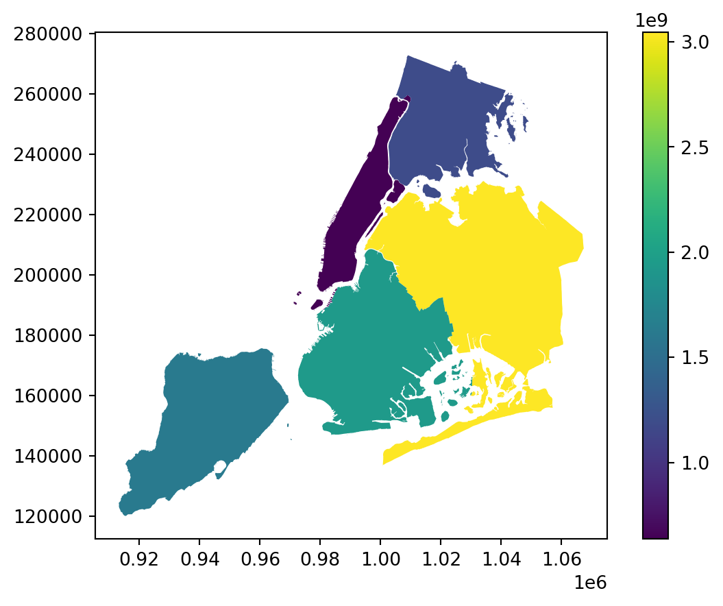
We can map multiple GeoSeries by using one plot as an axis for another. First, we need to verify that centroid_ll and poly are in the same CRS by setting both to EPSG:4326, which gives Latitude and Longitude. I can use the .crs attribute from one GeoDataFrame as input for .to_crs to ensure a match. This code corrects the CRS and plots both centroids and polygons:
# polygons in lat/lon
ax = gdf.set_geometry("poly").to_crs(gdf["centroid_ll"].crs).plot()
gdf.set_geometry("centroid_ll").plot(ax=ax, color="red")
5.2.5 Interactive Maps
Geopandas uses a Folium/Leaflet backend to make interactive maps very easy, using .explore().
This code gives an interactive map of the same data:
gdf = gdf.set_geometry("poly")
gdf.explore("area", legend=False, zoom_to_layer=True)Make this Notebook Trusted to load map: File -> Trust Notebook
5.2.6 Worked Out Example: NYC Collision Data
This section demonstrates the start-to-finish workflow of using GeoPandas on a real-world dataset. We will be using the cleaned NYC collision data, courtesy of Wilson Tang. Additionally, for our spatial data, I’ll be using the .shp file from the NYC Modified Zip Code Tabulation Areas (MODZCTA) dataset. ZIP codes can be reassigned and their boundaries changed;the goal of this dataset is to preserve the ZIP code shapes for geospatial analysis.
Goal: overlay crash locations on a map of NYC.
5.2.6.1 Load and Inspect Data
We begin by installing our required dependencies, and loading our datasets.
import numpy as np
import pandas as pd
import geopandas as gpd
import matplotlib.pyplot as plt
import pyarrow
crash_df = pd.read_feather('data/nyc_crashes_cleaned.feather')
zip_gdf = gpd.read_feather("data/nyc_modzcta_gp.feather")
zip_gdf.head()| modzcta | label | zcta | pop_est | geometry | |
|---|---|---|---|---|---|
| 0 | 10001 | 10001, 10118 | 10001, 10119, 10199 | 23072.0 | POLYGON ((-73.98774 40.74407, -73.98819 40.743... |
| 1 | 10002 | 10002 | 10002 | 74993.0 | POLYGON ((-73.9975 40.71407, -73.99709 40.7146... |
| 2 | 10003 | 10003 | 10003 | 54682.0 | POLYGON ((-73.98864 40.72293, -73.98876 40.722... |
| 3 | 10026 | 10026 | 10026 | 39363.0 | MULTIPOLYGON (((-73.96201 40.80551, -73.96007 ... |
| 4 | 10004 | 10004 | 10004 | 3028.0 | MULTIPOLYGON (((-74.00827 40.70772, -74.00937 ... |
crash_df is our pandas.DataFrame which contains collision data, and zip_gdf is our GeoPandas.GeoDataFrame which contains ZIP code data.
crash_df = crash_df.dropna(subset=["longitude", "latitude"])
zip_gdf = zip_gdf.drop(columns=["label", "zcta"])5.2.6.2 Data Overlay
crash_df doesn’t yet have an active geometry column to use for plotting, but does have Latitude and Longitude information. Function gpd.points_from_xy() can take these inputs (which use EPSG:4326) to produce a GeoSeries of geometric shapely.Point objects. The new crash_gdf GeoDataFrame combines these two.
# Create gdf so we can visualize
crash_gdf = gpd.GeoDataFrame(
crash_df,
geometry=gpd.points_from_xy(crash_df["longitude"],
crash_df["latitude"]),
crs="EPSG:4326"
)
# Double-check: ensure geodataframes same CRS
zip_gdf = zip_gdf.to_crs(crash_gdf.crs)Using Matplotlib syntax, I use add zip_gdf to the .plot(), specifying how I want them to appear. I do the same for crash_gdf.
# Overlay crashes on Borough Polygons
fig, ax = plt.subplots(figsize=(7, 7))
zip_gdf.plot(ax=ax, facecolor="none", edgecolor="black", linewidth=0.8)
crash_gdf.plot(ax=ax, markersize=1, color="red", alpha=0.5)
ax.set_title("NYC Crashes, Labor Day Week 2025")
plt.show()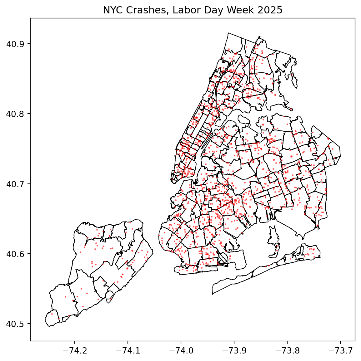
This overlay uses two GeoSeries, each from a different GeoDataFrame. In this case, it was necessary to keep the two seperate, as they have fundamentally different structures.
5.2.6.3 Spatial Joins
There are advantages of using just one GeoDataFrame. We use spatial join function gpd.sjoin(), which parallels pd.merge. This function combines two dataframes by matching keys and a join condition type.
# Crashes put within zips
# predicate="within" requires all of a geometry's points to be within
# the interior of the spatially joined geometry (and none on the exterior)
joined = gpd.sjoin(crash_gdf, zip_gdf, predicate="within", how="left")
# count number of crashes per ZIP; creates new Series
# "modzcta" same as zip code. it says to group by zip code.
counts = joined.groupby("modzcta").size().rename("n_crashes")
# Attach crash counts back to the polygon GeoDataFrame
zip_counts = zip_gdf.merge(counts, on="modzcta", how="left").fillna({"n_crashes": 0})
zip_counts = zip_counts.set_geometry("geometry").to_crs(4326)
zip_counts[["modzcta", "n_crashes"]].head()| modzcta | n_crashes | |
|---|---|---|
| 0 | 10001 | 8.0 |
| 1 | 10002 | 17.0 |
| 2 | 10003 | 9.0 |
| 3 | 10026 | 2.0 |
| 4 | 10004 | 0.0 |
The new GeoDataFrame zip_counts gives us crash count by ZIP code, which allows us new plotting opportunities.
5.2.6.4 Plotting Joined Data
Choropleth maps provide an easy way to visualize how a variable varies across a geographic area or show the level of variability within a region.
# Plot polygons colored by crash counts
fig, ax = plt.subplots(figsize=(7, 7))
zip_counts.plot(ax=ax, column="n_crashes", legend=True)
ax.set_title("Crashes per NYC ZIP")
plt.show()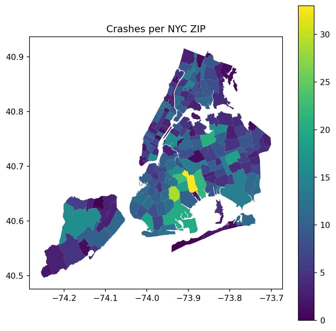
Interactive choropleth maps are especially helpful on websites. tooltip specifies which two variables appear when I hover the mouse over a given polygon.
# render and auto-fit to layer
zip_counts.explore(column="n_crashes",
legend=True,
tooltip=["modzcta","n_crashes"],
zoom_to_layer=True)Make this Notebook Trusted to load map: File -> Trust Notebook
5.2.7 Further Readings
- GeoPandas: See more examples of GeoPandas uses.
- Pandas: Not technically a dependency, but complete understanding of Pandas syntax is necessary to be successful with GeoPandas. See Pandas section in the classnotes.
- Shapely: GeoPandas leverages Shapely for geometric object types and operations. You won’t interface much with Shapely directly, but is helpful to have a basic understanding of.
- Matplotlib: Static plotting operations use Matplotlib syntax.
- Folium: Interactive mapping uses a Folium backend. Folium is a very powerful tool for spatial visualization, which warrants its own topic presentation.
- EPSG: Familiarize yourself with the most common CRS, which are given by unique EPSG codes. The EPSG database currently contrains over 5000 unique entries.
5.3 gmplot
This section was prepared by Jack Perkins.
5.3.1 Introduction
gmplot is a python package that allows for the use and creation of google’s map ping system. A variety of functions allow users to plot points, create shapes, and show directions over space. This allows a developer to show important locations through the use of a familiar interface.
5.3.2 Getting Started
To effectively use gmplot, the user must first install it.
pip install gmplotUpon installation, the user will be able to use all basic features. However, in order to use all feautures and avoid watermarks, the user must acquire a google API key. They can do so at this link. In order to run this code and see the full results, the Maps Javascript API, Geocoding API, and Directions API must be enabled. The API key should be saved in a file `gmKey.txt’.
api_key = open('gmKey.txt').read().strip()5.3.3 Creating a Map
A general map is created using the gmplot.GoogleMapPlotter() function. This function takes 5 arguments.
latitude: takes the latitude for the centure of the map (float)
longitude: takes the longitude for the center of the map (float)
zoom_int: takes an interger for the zoom on the map
map_type: an optional parameter that allows for the selection of different map types such as terrain or satellite (string)
api_key: optional paramter that will remove the ‘for development purposes only tag’ and allow full use of API’s features (string)
The following code creates a map centered around the Storrs campus. It uses the variables center_lat, center_lng, and api_key to simplify the input process.
import gmplot, tempfile, os, shutil
# UConn Storrs center
center_lat, center_lng = 41.8079, -72.2546
gmap = gmplot.GoogleMapPlotter(center_lat, center_lng, 15, apikey = api_key)The .draw() function will create an output using the initialized map. The function produces the maps in an interactive html format. Unless otherwise specified, the file will be saved in the current directory. For the sake of this presentation, the results are shown in a simplified PNG.
# Write to a temporary directory instead of cluttering the project
tmpdir = tempfile.mkdtemp()
html_path = os.path.join(tmpdir, "uconn_base.html")
gmap.draw(html_path)
# Copy to current directory for Quarto to access (then remove temp folder)
shutil.copy(html_path, "uconn_base.html")
shutil.rmtree(tmpdir)A map can also be drawn using a geocode translation. The following function takes a location name as opposed to to coordinates. This code will serve the same function as the original map plotter.
# Create map centered on UConn Storrs
gmapg = gmplot.GoogleMapPlotter.from_geocode("Fenway Park", 15, apikey=api_key)
# Write to a temporary directory instead of cluttering the project
tmpdir = tempfile.mkdtemp()
html_path = os.path.join(tmpdir, "Fenway_geocode.html")
gmapg.draw(html_path)
# Copy to current directory for Quarto to access (then remove temp folder)
shutil.copy(html_path, "Fenway_geocode.html")
shutil.rmtree(tmpdir)5.3.4 Plotting Points
After initializing a map, additional layers can be placed on it. The simplest of those is a marker. The .marker() function allows a pin to be placed on the map. The function takes the location of the pin, a color argument, and title argument. The code below shows the creation of three different markers around Uconn campus.
# Initialize Map
gmap2 = gmplot.GoogleMapPlotter(center_lat, center_lng, 15, apikey = api_key)
# Student Union
gmap2.marker(41.8069, -72.2543, color='blue', title="Student Union")
# Gampel Pavilion
gmap2.marker(41.8052, -72.2544, color='red', title="Gampel Pavilion")
# Homer Babbidge Library
gmap2.marker(41.8067, -72.2520, color='green', title="Library")
# Write to a temporary directory instead of cluttering the project
tmpdir = tempfile.mkdtemp()
html_path = os.path.join(tmpdir, "uconn_markers.html")
gmap2.draw(html_path)
# Copy to current directory for Quarto to access (then remove temp folder)
shutil.copy(html_path, "uconn_markers.html")
shutil.rmtree(tmpdir)Another method for drawing markers is the .scatter() function. The function takes a list of coordinates and marks multiple points at once. The additional fields are size and marker. Setting marker to false will show a larger circle as compared to the point marker seen in .marker().
The code below shows the .scatter() function in action.
# set desired longitudes and latitudes
latitude_list = [ 41.8069, 41.8052, 41.8067]
longitude_list = [-72.2543, -72.2544, -72.2520]
gmap2a = gmplot.GoogleMapPlotter(center_lat, center_lng, 15, apikey = api_key)
gmap2a.scatter( latitude_list, longitude_list, color = 'blue',
size = 40, marker = False)
# Write to a temporary directory instead of cluttering the project
tmpdir = tempfile.mkdtemp()
html_path = os.path.join(tmpdir, "uconn_scatter.html")
gmap2a.draw(html_path)
# Copy to current directory for Quarto to access (then remove temp folder)
shutil.copy(html_path, "uconn_scatter.html")
shutil.rmtree(tmpdir)5.3.5 Drawing Polygons
Additionally, coordinates can be used to create a polygon. Each provided coordinate will be used as an anchor point for the shape. As in .marker() and .scatter(), the color may be changed. The code below is used to create a triangle, using the previous markers as its points.
# set desired longitudes and latitudes
latitude_list = [ 41.8069, 41.8052, 41.8067]
longitude_list = [-72.2543, -72.2544, -72.2520]
gmap3 = gmplot.GoogleMapPlotter(center_lat, center_lng, 16, apikey = api_key)
# Draw a polygon with the help of coordinates
gmap3.polygon(latitude_list, longitude_list,
color = 'blue')
# Write to a temporary directory instead of cluttering the project
tmpdir = tempfile.mkdtemp()
html_path = os.path.join(tmpdir, "uconn_poly.html")
gmap3.draw(html_path)
# Copy to current directory for Quarto to access (then remove temp folder)
shutil.copy(html_path, "uconn_poly.html")
shutil.rmtree(tmpdir)5.3.6 Route Creation
One of the most common uses of google maps is navigation. Fittingly, this use can be executed in gmplot. Most simply, it can be used with .plot(). The function takes a list of coordinates and draws a line sequentially to their locations. This does so in simple straight line distance.
# Create map centered at UConn
gmap4 = gmplot.GoogleMapPlotter(center_lat, center_lng, 15, apikey = api_key)
# Draw the route
gmap4.plot(latitude_list, longitude_list, color='blue', edge_width=4)
# Write to a temporary directory instead of cluttering the project
tmpdir = tempfile.mkdtemp()
html_path = os.path.join(tmpdir, "uconn_route.html")
gmap4.draw(html_path)
# Copy to current directory for Quarto to access (then remove temp folder)
shutil.copy(html_path, "uconn_route.html")
shutil.rmtree(tmpdir)While this may be helful, most routes cannot be utilized as straight lines. As such, one could plot various street corners and turns to make a route along roads. Alternatively, there is the .directions() function. The Directions API is required to utilize the function. There are four arguments for the function.
- Origin: takes the starting coordinates
- Destination: takes the end coordinates
- Waypoints: takes any optional coordinates in between the two
- Travel mode: takes the method of travel in order to give feasible directions (driving, walking)
The following code shows driving directions from the student union to the library, with Gampel being used as a forced throughpoint.
# Create map centered at UConn
gmap5 = gmplot.GoogleMapPlotter(41.8079, -72.2546, 15, apikey=api_key)
# Define origin and destination
origin = (41.8069, -72.2543) # Student Union
destination = (41.8067, -72.2520) # Homer Babbidge Library
# Optional waypoints
waypoints = [(41.8052, -72.2544)] # Gampel Pavilion
# Add directions
gmap5.directions(origin, destination, waypoints=waypoints,
travel_mode='driving')
# Write to a temporary directory instead of cluttering the project
tmpdir = tempfile.mkdtemp()
html_path = os.path.join(tmpdir, "uconn_directions.html")
gmap5.draw(html_path)
# Copy to current directory for Quarto to access (then remove temp folder)
shutil.copy(html_path, "uconn_directions.html")
shutil.rmtree(tmpdir)5.3.7 gmplot Conclusion
gmplot is a user friendly tool for creating shared understanding between developer and user. It uses a common interface and has basic tools for displaying locations. However, it requires use of an API and has limited features for displaying data.
5.3.8 Folim Overview
Foium is an alternative to gmplot. Folium is a python package that allows for the creation of interactive maps. To begin, the folium package must be installed.
pip install foliumA map in folium is initialized similar to gmplot. The folium.Map function takes locational arguments and the desired zoom. As opposed to being saved through html, it can be stored as an object. When called, the map will appear in the output.
import folium
m = folium.Map(location=[41.8079, -72.2546], zoom_start=15)
mMake this Notebook Trusted to load map: File -> Trust Notebook
Folium contains additional features to display data:
- Create markers
- Create shapes
- Create lines
- Create heatmaps
5.3.9 Further Readings
5.4 Animations
This section was created by Justin Tran, an Undergraduate Junior majoring in Applied Data Analysis with minors in Public Policy and Urban and Community Studies.
For this section, we will demonstrate Matplotlib’s FuncAnimation tool, a powerful way to turn static plots into grand visualizations.
5.4.1 What is Data Animation?
Data Animation is the process of showing change over time through a continously updating plot.
It is commonly used to visualize progress, simulations, or changing datasets, including:
- Simulations like rolling dice.
- A scatterplot which updates with new data.
- A line chart that grows over time, like exponential graphs.
5.4.2 Static vs Animated Plots
5.4.2.1 Static Plots
- Pros
- Quick to interpret as all the data is shown at once.
- Low computational cost as it’s fast to render.
- Reproducible as it’s the same image each time.
- Cons
- Hard to illustrate motion or trends.
- Overcrowding data can make it hard to understand.
- Less engaging over animated plots.
5.4.2.2 Animated Plots
- Pros
- Shows progressions over time, ideal for simulations.
- Can show patterns and change in dynamics.
- More engaging and interactive.
- Cons
- Harder to render as it uses more code and storage.
- Can be hard to see if motion is too fast.
- Can distract audiences if overused.
5.4.3 Matplotlib
Created in 2008 by John D. Hunter, Matplotlib is one of Python’s most used library for plotting and visualization. You are able to create line, scatter, bar, and histogram plots. You can customize colors, labels, and configure layouts. For this section, we can use Matplotlib’s advanced modules like animations to make more dynamic visualizations.
The specific tool we are focused on is matplotlib.animation.FuncAnimation, it is used to update our plot frame-by-frame.
5.4.3.1 Installation of Matplotlib and FuncAnimation
To use FuncAnimation, you first will need to install Matplotlib. Inside your terminal, use the corresponding manager you currently use.
pip install matplotlib # Users with pip
conda install -c conda-forge matplotlib # Users with conda
pixi add matplotlib # Users with pixi
uv add matplotlib # Users with uvTo ensure that you installed matplotlib correctly, run this code to check it’s version. If you get a version number, then it is installed.
import matplotlib
print(matplotlib.__version__)Once you’ve installed matplotlib, now it’s time to import it. To import, run these codes.
import matplotlib.pyplot as plt5.4.4 Creating Static Plots
Normally, you may want to create a simple plot where you are rolling a dice and see the probability of you rolling a six. So, we will create a line plot.
import random
import matplotlib.pyplot as plt
random.seed(3255)
# The Function
def prob_six(trials):
results = []
prop_six = []
for i in range(trials):
# roll a 6-sided die
roll = random.randint(1, 6)
# Adds a value only if it rolls a 6
results.append(roll == 6)
prop_six.append(sum(results) / len(results))
return prop_six
# Matplotlib's pyplot
plt.figure(figsize=(6, 3))
plt.hlines(1/6, 0, 500, linestyles='dashed', color='gray')
plt.plot(prob_six(500), color='tab:green')
plt.ylim(0, 1)
plt.title("Rolling a Die — Probability of Getting a 6")
plt.ylabel("Proportion of 6s")
plt.xlabel("Number of Rolls")
plt.show()You can also use different types of charts, like bar charts. This example will show how many times each number gets rolled when we roll a dice hundreds of times.
import random
import matplotlib.pyplot as plt
random.seed(3255)
# The Function
trials = 1000
rolls = [random.randint(1, 6) for _ in range(trials)]
counts = [rolls.count(i) for i in range(1, 7)]
# Matplotlib's pyplot
plt.figure(figsize=(6, 4))
plt.bar(range(1, 7), counts, color='gold', edgecolor='black')
plt.title("Rolling a Die — Frequency of Each Face")
plt.xlabel("Die Face")
plt.ylabel("Frequency")
plt.xticks(range(1, 7))
plt.show()5.4.5 FuncAnimation
Now, to use FuncAnimation, we need to understand how to call it and all the required arguments within.
from matplotlib.animation import FuncAnimation
anim = FuncAnimation(
fig,
update,
frames,
interval,
repeat
)fig= The Matplotlib figure that will be animatedupdate= The update function that’s called once per frameframes= The total number of frames- Will be
range(n), where n is the total number of frames
- Will be
interval= The delay between frames in milliseconds- interval=
50means 20 frames per second
- interval=
repeat= Whether you would like to loop the animation- Either
FalseorTrue
- Either
Now, to do the animation on the probability of rolling a 6, this is the code to run.
from matplotlib.animation import FuncAnimation
prop_six = prob_six(500)
frames = range(len(prop_six))
# This starts to create the figure
fig, ax = plt.subplots(figsize=(8, 4))
# This is the update function
def update(frame):
ax.clear()
ax.set_title("Rolling a Die — Probability of Getting a 6")
ax.set_ylabel("Proportion of 6s")
ax.set_xlabel("Number of Rolls")
ax.hlines(1/6, 0, frame+1, linestyles='dashed', color='gray')
ax.set_ylim(0, 1)
# This shows the percentage at each frame
ax.text(
frame+1,
prop_six[frame] * 1.05,
f'{prop_six[frame]:.3f}',
weight='bold',
color='tab:green'
)
ax.plot(range(1, frame+1), prop_six[:frame], color='tab:green')
# Now we create the animation
anim = FuncAnimation(fig, update, frames=frames, repeat=False, interval=50)
# This saves as a gif
anim.save("dice_prob.gif", writer="pillow", fps=20)
plt.close(fig)[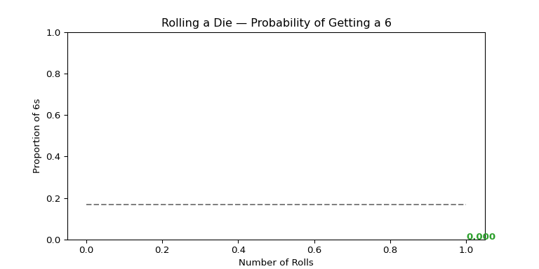 ]
]
from matplotlib.animation import FuncAnimation
num_faces = 6
trials = 1000
rolls = []
# Creating the figure
fig, ax = plt.subplots(figsize=(6, 4))
# The update function
def update(frame):
ax.clear()
rolls.append(random.randint(1, num_faces))
counts = [rolls.count(i) for i in range(1, num_faces + 1)]
# Bar chart
ax.bar(range(1, num_faces + 1), counts, color="gold", edgecolor="black")
ax.set_title("Rolling a Die — Frequency of Each Face")
ax.set_xlabel("Die Face")
ax.set_ylabel("Frequency")
ax.set_xticks(range(1, num_faces + 1))
ax.set_ylim(0, 300)
# Adds counts above each bar
for i, count in enumerate(counts, start=1):
ax.text(i, count + 5, str(count), ha='center', weight='bold', color='navy')
# Creating the animation
anim = FuncAnimation(fig, update, frames=range(trials), repeat=False, interval=20)
anim.save("dice_bar.gif", writer="pillow", fps=30)
plt.close(fig)[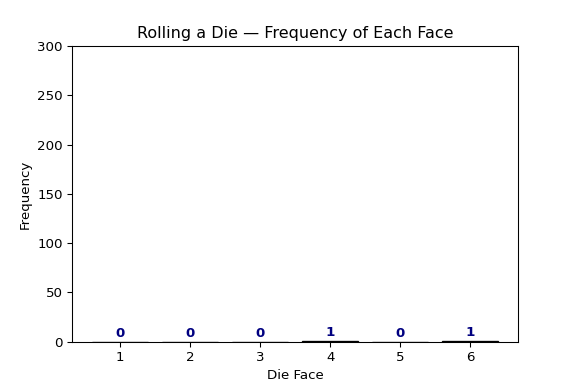 ]
]
5.4.6 Animating Crash Locations in NYC
Using the crash data from this semester, something you may want to see is the location of every crash on a map. This is something FuncAnimation does extremely well.
For this example, we will be installing contextily.
5.4.6.1 Downloading contextily
pip install contextily # Users with pip
conda install -c conda-forge contextily # Users with conda
pixi add contextily # Users with pixi
uv add contextily # Users with uv5.4.6.2 Setting up data and creating a GeoDataFrame
import pandas as pd
import geopandas as gpd
import matplotlib.pyplot as plt
from matplotlib.animation import FuncAnimation
import contextily as cx
df = pd.read_feather("ids-f25/data/nyc_crashes_cleaned.feather")
df["crash_datetime"] = pd.to_datetime(df["crash_datetime"], errors="coerce")
df = df.dropna(subset=["latitude", "longitude", "borough"])
# Creating hourly bins and sorting it chronologically
df["hour_bin"] = df["crash_datetime"].dt.floor("h")
df = df.sort_values("hour_bin")
# We convert it to a GeoDataFrame so we can plot on a map
gdf = gpd.GeoDataFrame(
df,
geometry=gpd.points_from_xy(df.longitude, df.latitude),
crs="EPSG:4326"
).to_crs(epsg=3857)
# For style, we can color code each borough for more contrast
borough_colors = {
"MANHATTAN": "red",
"BROOKLYN": "gold",
"QUEENS": "limegreen",
"BRONX": "royalblue",
"STATEN ISLAND": "purple"
}
gdf["color"] = gdf["borough"].str.upper().map(borough_colors).fillna("gray")5.4.6.3 Starting FuncAnimation section
# Creating the bounds
xmin, ymin, xmax, ymax = gdf.total_bounds
pad_x = (xmax - xmin) * 0.05
pad_y = (ymax - ymin) * 0.05
xmin, xmax = xmin - pad_x, xmax + pad_x
ymin, ymax = ymin - pad_y, ymax + pad_y
# This creates the figure again
fig, ax = plt.subplots(figsize=(8, 8))
ax.set_title("NYC Motor Vehicle Collisions — Aug 31 to Sep 6, 2025", fontsize=14)
ax.set_axis_off()
cx.add_basemap(ax, crs=gdf.crs, source=cx.providers.CartoDB.Positron, zoom=11)
# Now we build each frame, which we use by per hour
hours = sorted(gdf["hour_bin"].unique())
def update(frame):
ax.clear()
ax.set_axis_off()
ax.set_xlim(xmin, xmax)
ax.set_ylim(ymin, ymax)
cx.add_basemap(ax, crs=gdf.crs, source=cx.providers.CartoDB.Positron, zoom=11)
# Making it cumulative so all points are visible
current_time = hours[frame]
subset = gdf[gdf["hour_bin"] <= current_time]
# Plot crash points
ax.scatter(
subset.geometry.x,
subset.geometry.y,
s=8,
c=subset["color"],
alpha=0.6,
edgecolor="none"
)
# Dynamic title per hour
ax.set_title(f"NYC Motor Vehicle Collisions\nUp to {current_time:%b %d %Y %H:%M}",
fontsize=12)
# Creating the Animation
anim = FuncAnimation(fig, update, frames=len(hours), repeat=False, interval=100)
anim.save("nyc_crashes_map.gif", writer="pillow", fps=10)
plt.close(fig)[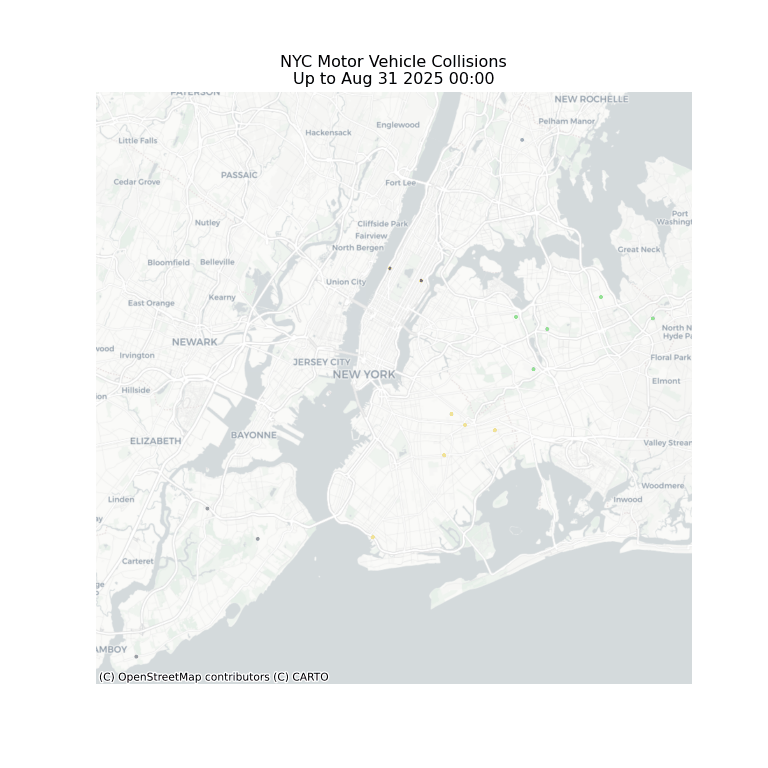 ]
]
5.4.7 Crash Causes Pie Chart
Another example that we can use is seeing the proportion of causes of crashes in NYC.
5.4.7.1 Setting up the necessary variables for the Pie Chart
import pandas as pd
import matplotlib.pyplot as plt
from matplotlib.animation import FuncAnimation
df = pd.read_feather("../ids-f25/data/nyc_crashes_cleaned.feather")
df["crash_datetime"] = pd.to_datetime(df["crash_datetime"], errors="coerce")
# Creating the daily bins
df["date"] = df["crash_datetime"].dt.date
# Wanting the top causes
top_causes = (
df["contributing_factor_vehicle_1"]
.value_counts()
.head(6)
.index
)
df = df[df["contributing_factor_vehicle_1"].isin(top_causes)]
# Aggregate daily counts
daily_counts = (
df.groupby(["date", "contributing_factor_vehicle_1"])
.size()
.reset_index(name="count")
)
dates = sorted(daily_counts["date"].unique())
# For asesthetic, use different colors
cause_colors = {
cause: color for cause, color in zip(
top_causes,
["#d62728", "#ff7f0e", "#2ca02c", "#1f77b4", "#9467bd", "#8c564b"]
)
}5.4.7.2 Using FuncAnimation to create the Pie Chart
# Setting up the figure
fig, ax = plt.subplots(figsize=(11, 10))
ax.set_aspect("equal")
# This is trying to fix the white space so labels aren't cut off
plt.tight_layout(pad=5)
plt.subplots_adjust(left=0.05, right=0.92, top=0.9, bottom=0.1)
# Setting the first frame
def pie_chart(ax, date):
current_data = daily_counts[daily_counts["date"] == date]
current_data = current_data.set_index("contributing_factor_vehicle_1").reindex(top_causes).fillna(0)
sizes = current_data["count"]
labels = current_data.index
colors = [cause_colors.get(label, "gray") for label in labels]
ax.pie(
sizes,
labels=labels,
colors=colors,
startangle=90,
autopct="%1.1f%%",
labeldistance=1.2,
pctdistance=0.8
)
ax.set_title(f"NYC Crash Causes — {date}", fontsize=16, pad=20)
# Draw initial frame
pie_chart(ax, dates[0])
# Creating the update function
def update(frame):
ax.clear()
ax.set_aspect("equal")
pie_chart(ax, dates[frame]) # Calls back first frame layout
plt.subplots_adjust(left=0.05, right=0.92, top=0.9, bottom=0.1)
anim = FuncAnimation(fig, update, frames=len(dates), interval=1000, repeat=False)
anim.save("nyc_crash_causes_pie.gif", writer="pillow", fps=1)
plt.close(fig)[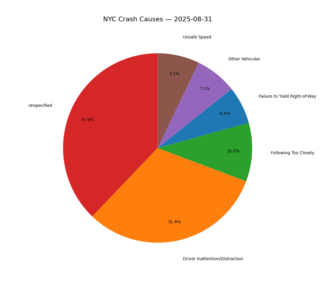 ]
]
5.4.8 Saving Animations
With FuncAnimation, you need to save the animation, unlike just outputting it normally. To do this, there are different formats you can use to save. Below are some of the common ways to save.
5.4.8.1 Gifs
To save the animations as a GIF, we need to use pillow to write it. First, we need to install it.
pip install pillow # Users with pip
conda install -c conda-forge pillow # Users with conda
pixi add pillow # Users with pixi
uv add pillow # Users with uvThen, run the command:
anim.save('name.gif', writer='Pillow', fps=10) # fps can change to
whatever you like.5.4.8.2 MP4s
Just like a GIF, we are doing the same format, however, we change the writer we are using. Instead, we will use ffmpeg.
pip install ffmpeg # Users with pip
conda install -c conda-forge ffmpeg # Users with conda
pixi add ffmpeg # Users with pixi
uv add ffmpeg # Users with uvanim.save('name.mp4', writer='ffmpeg', fps=10)5.4.8.3 Other Formats
There are multitudes of formats in which you save your animation. Depending on what format you want, you may have to use a different writer, otherwise many share the ffmpeg writer.
anim.save('animation.gif', writer='pillow', fps=10)
anim.save('animation.mp4', writer='ffmpeg', fps=10)
anim.save('animation.mov', writer='ffmpeg', fps=10)
anim.save('animation.avi', writer='ffmpeg', fps=10)
anim.save('animation.mkv', writer='ffmpeg', fps=10)
anim.save('animation.webm', writer='ffmpeg', fps=10)
anim.save('frame_%03d.png', writer='imagemagick', fps=10)5.4.9 Interval vs. FPS
You may be confused on the difference when we use both interval when calling FuncAnimation, and fps when saving the animation. Both control the speed, just in different ways.
- Interval
- This is the time it delays between frames in miliseconds.
- This is primarily used when you are rendering it inside your code editor.
- FPS
- This is the number of frames shown per second.
- This is primarily used when you are downloading your animation.
So, when you ultimately want to save your animation, fps is the one you want to focus on as it will override the delay from interval. You do not have to call interval in your function, so you can omit it if you like.
5.4.10 Conclusion
Data animation helps transform static figures into dynamic pieces. By using tools like Matplotlib’s FuncAnimation, we can reveal the change in data over time.
Whether it’s a simulation or real maps of crashes in NYC, animation helps highlights patterns and behaviors that normally isn’t seen in static charts.
Ultimately, it makes complex information easier to interpet and more engaging to share.
5.4.11 References
To learn more about Matplotlib, FuncAnimation, or other articles, please feel free to read them here.